Column Types Explained: Date
This tutorial explains how to configure date column types within the 23degrees application. Date columns help you handle time-based data correctly so your charts show trends in the right order and with clean time labels.
You can recognise a date column by the blue clock icon in the column header. Date columns are a great way to ensure your data is sorted sequentially, and to define how dates should be interpreted and displayed. They also enable smarter time axes that automatically adjust the number of labels to the space available.
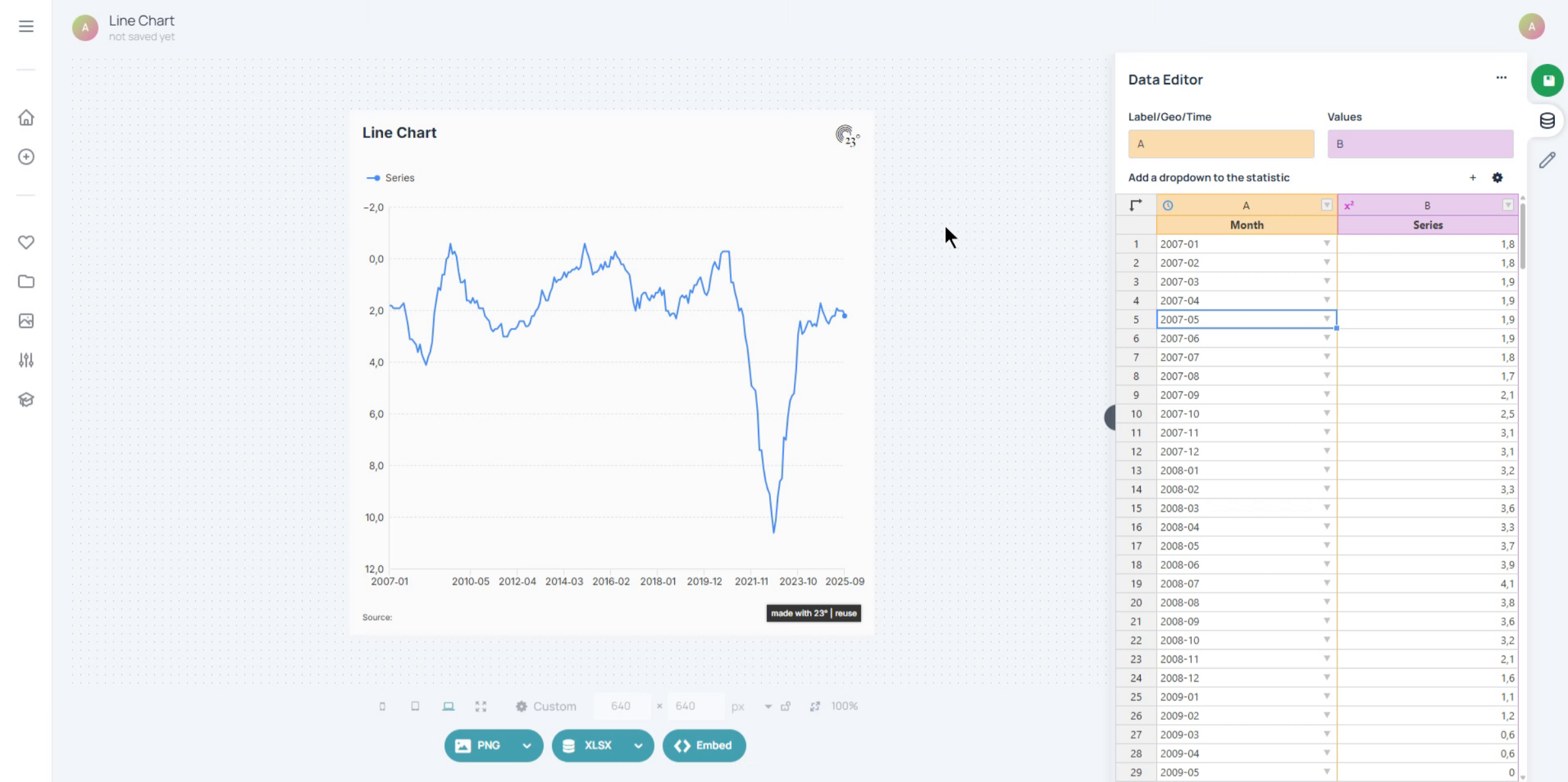
To edit a date column, simply click on the blue clock icon in the column header. This opens the configuration panel where you can control input formats, display formats and other options.
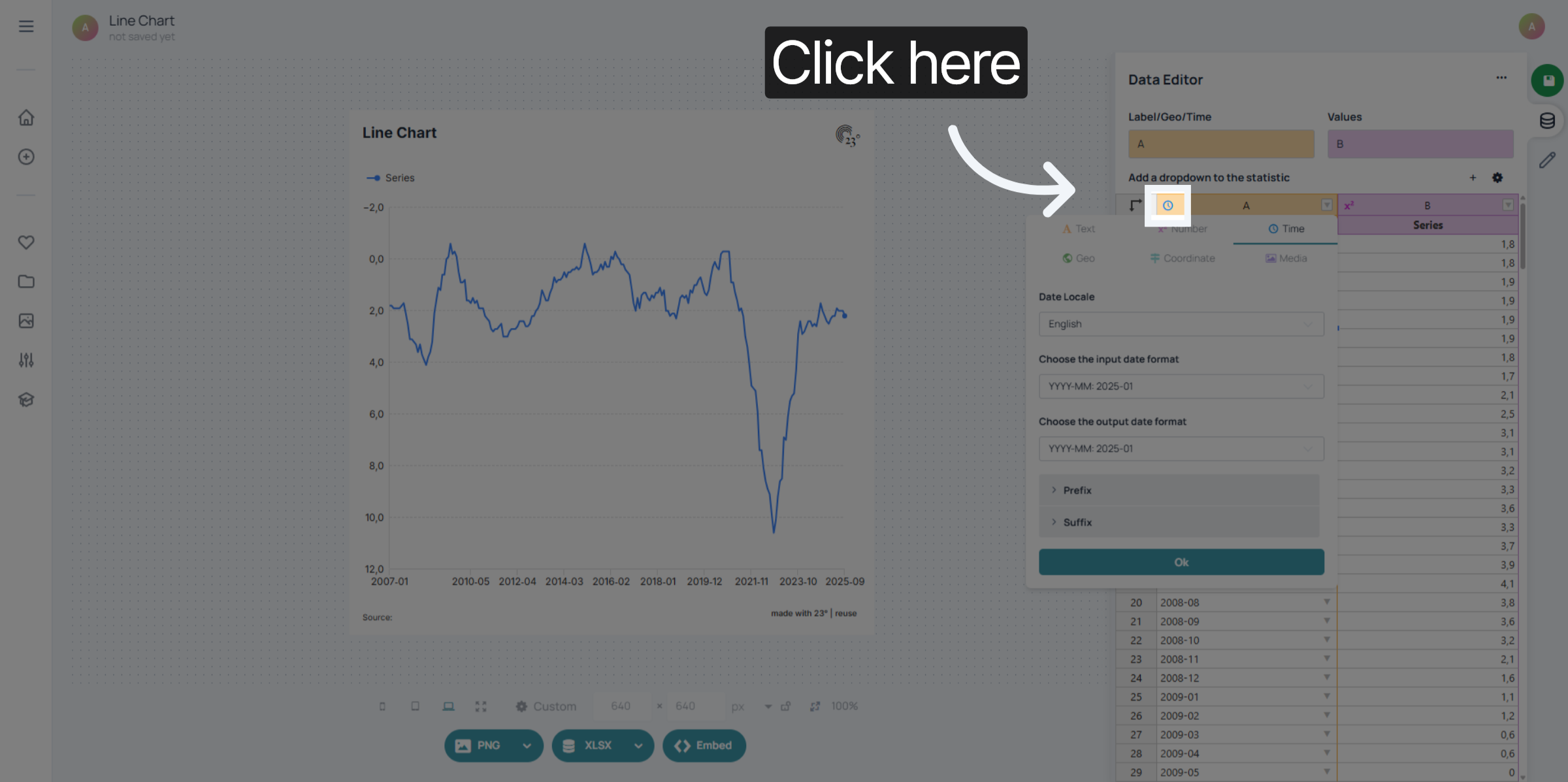
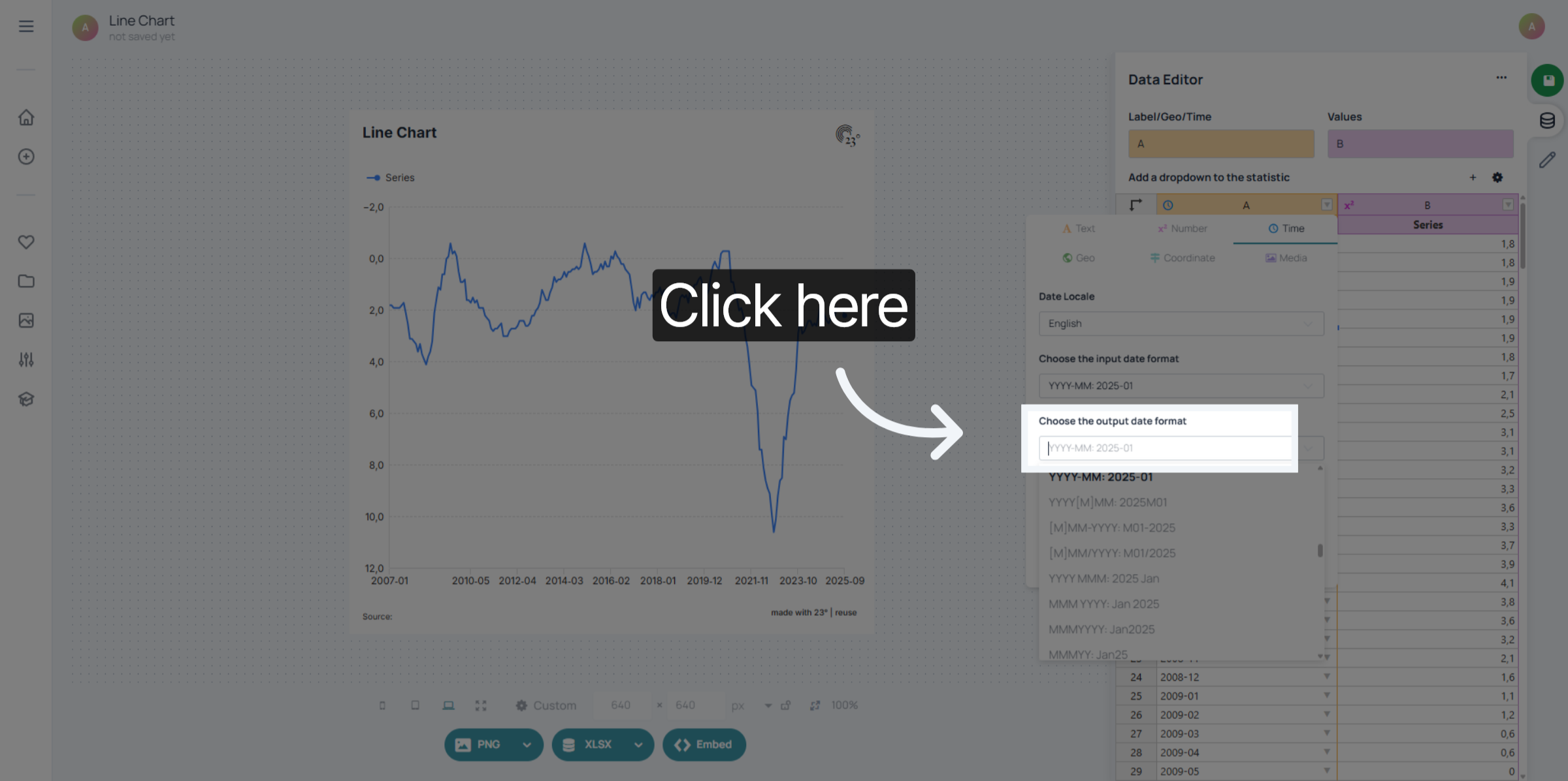
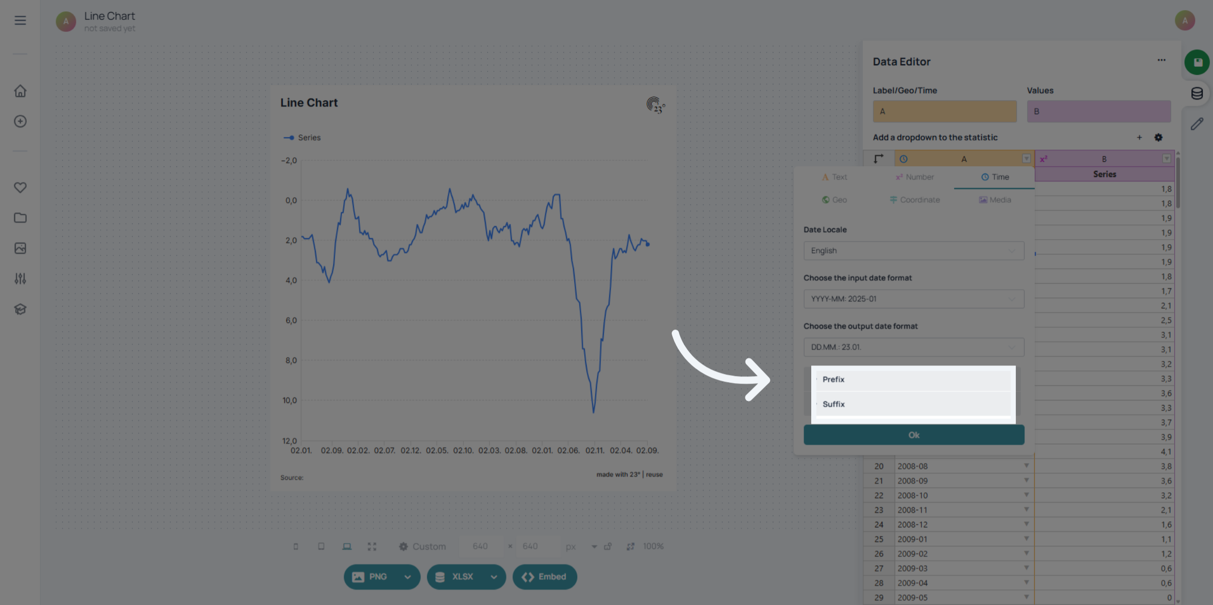
You can select the display language of your date/time – especially useful if you want to show day or month names written out in a specific language. You don’t have to change your original data to adjust the display: just choose from dozens of output formats until you find the one that fits your chart best.
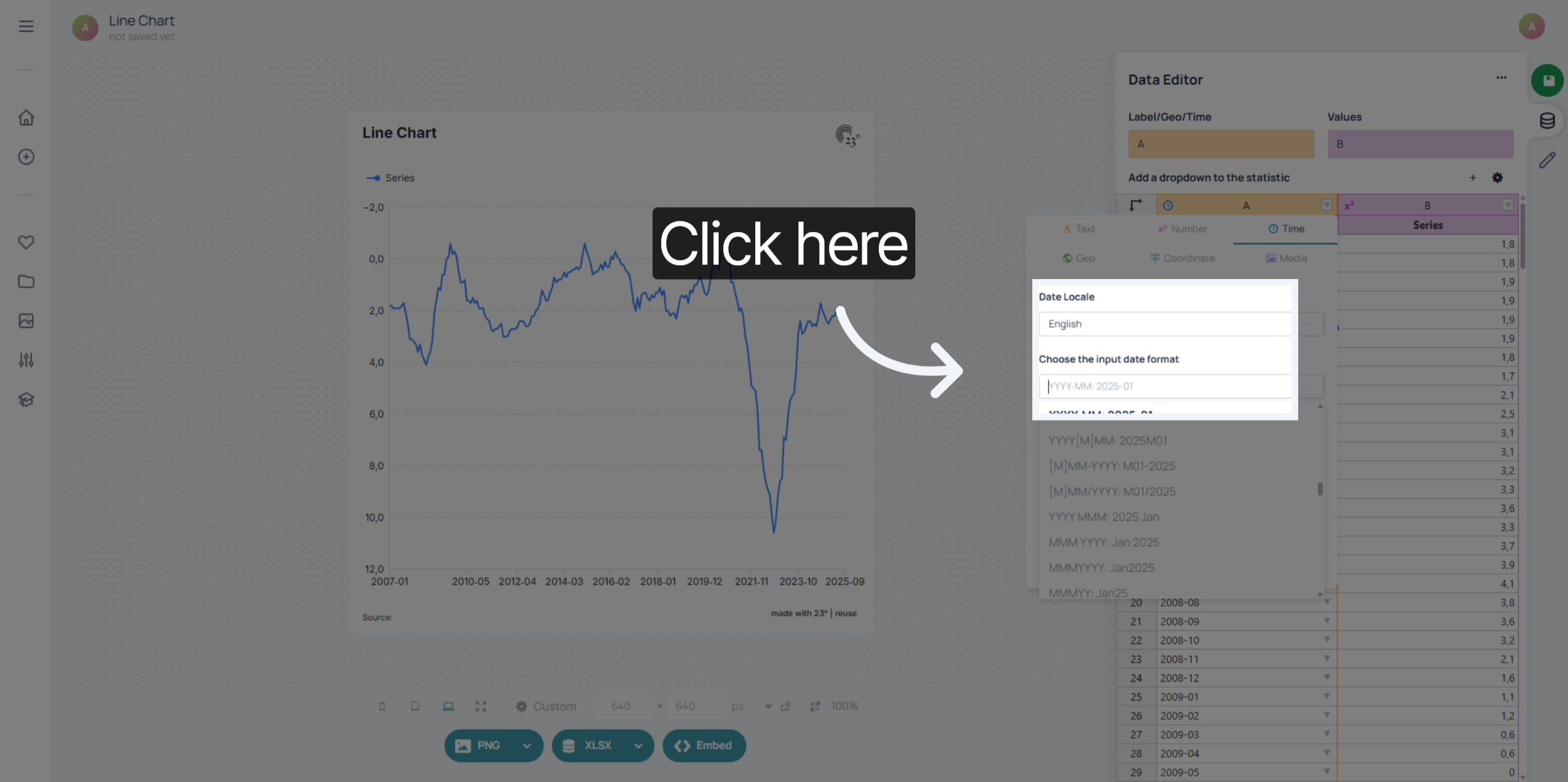
Scroll through the list of formats or enter a date/time pattern in the search bar to find exactly what you need.
You can also add prefixes or suffixes to your date displays if you want to add context like “Year: 2024” or “as of ” before a date.
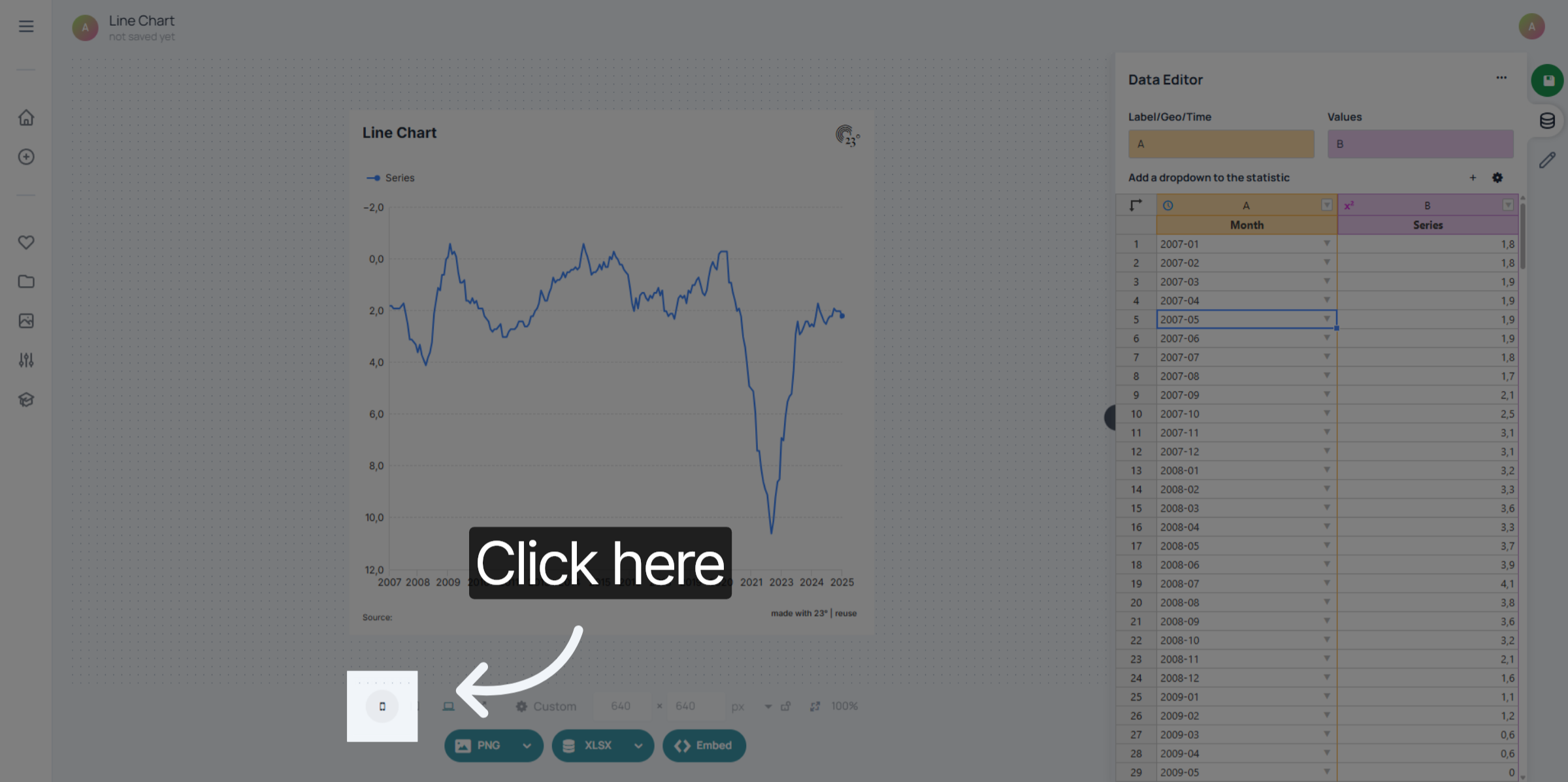
Click on the mobile display preview to see how the time axis behaves on smaller screens. The chart will automatically become more compact, showing fewer labels while keeping the timeline readable and accurate.
You’ve successfully configured your date column types by setting input formats and customizing how dates are displayed in the 23degrees application. This ensures accurate date interpretation and clean visualisation for all your time-based data series.