How to colour bars or columns by value
This tutorial demonstrates how to colour bars or columns depending on their values.
1. Introduction
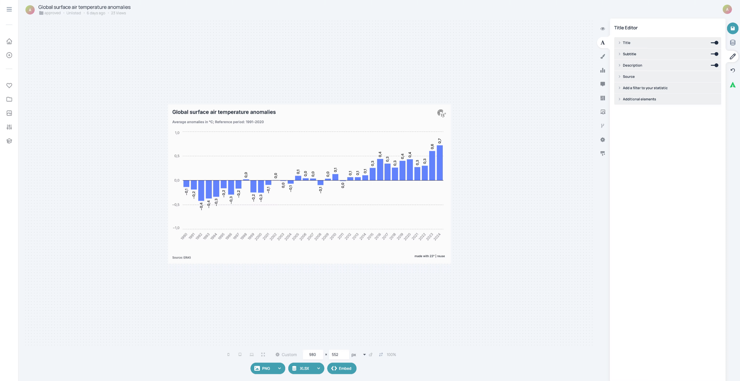
2. Click the Colour Editor
If you created a chart and want to change the colours, lick here to open the Colour Editor.

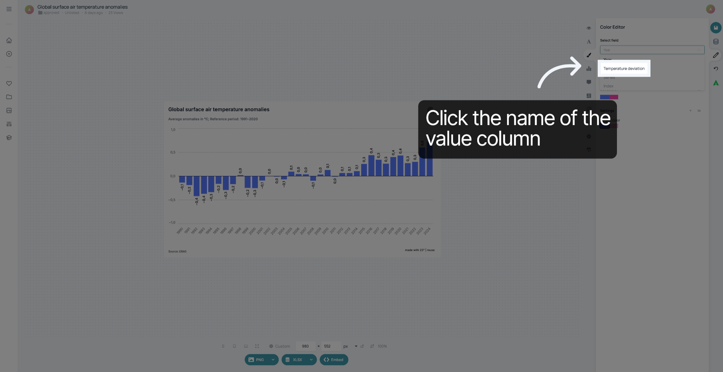
3. Select value column
Select the title of the column in your dataset that contains the values that are displayed.
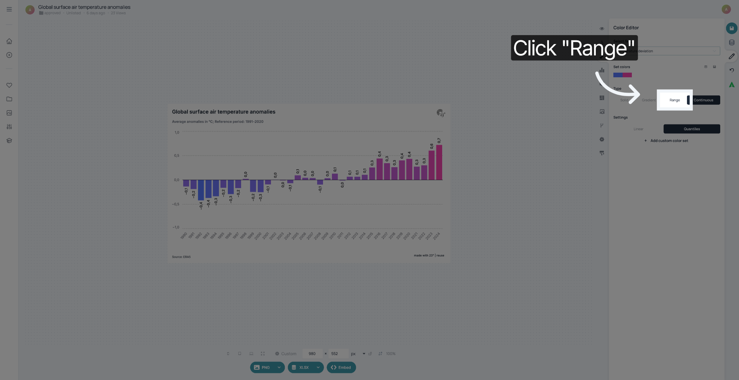
4. Click "Range"
Choose a colour palette of two or more colours and click "Range"
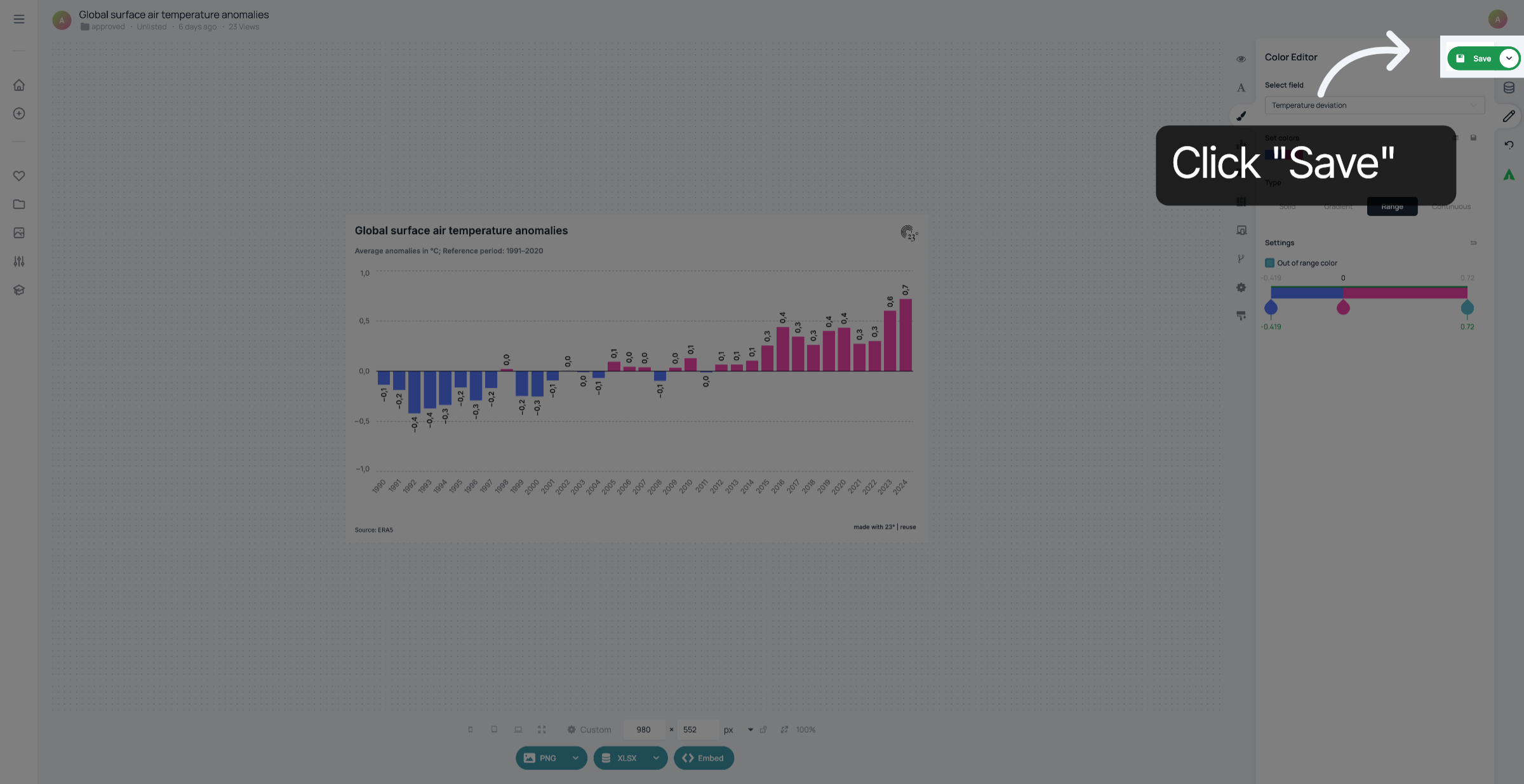
5. Customize thresholds
If you want positive values to have a different colour than negative values, set the threshold to zero.

6. Click "Save"
Don't forget to save your changes.
You have successfully coloured the bars or columns in your chart by value.