Sankey Diagram Data Format in 23degrees
This tutorial is going to show you how you need to prepare your Data to display a sankey diagram.
Sankey diagrams are typically used as distribution charts showing voter flows across elections or budgetary breakdowns
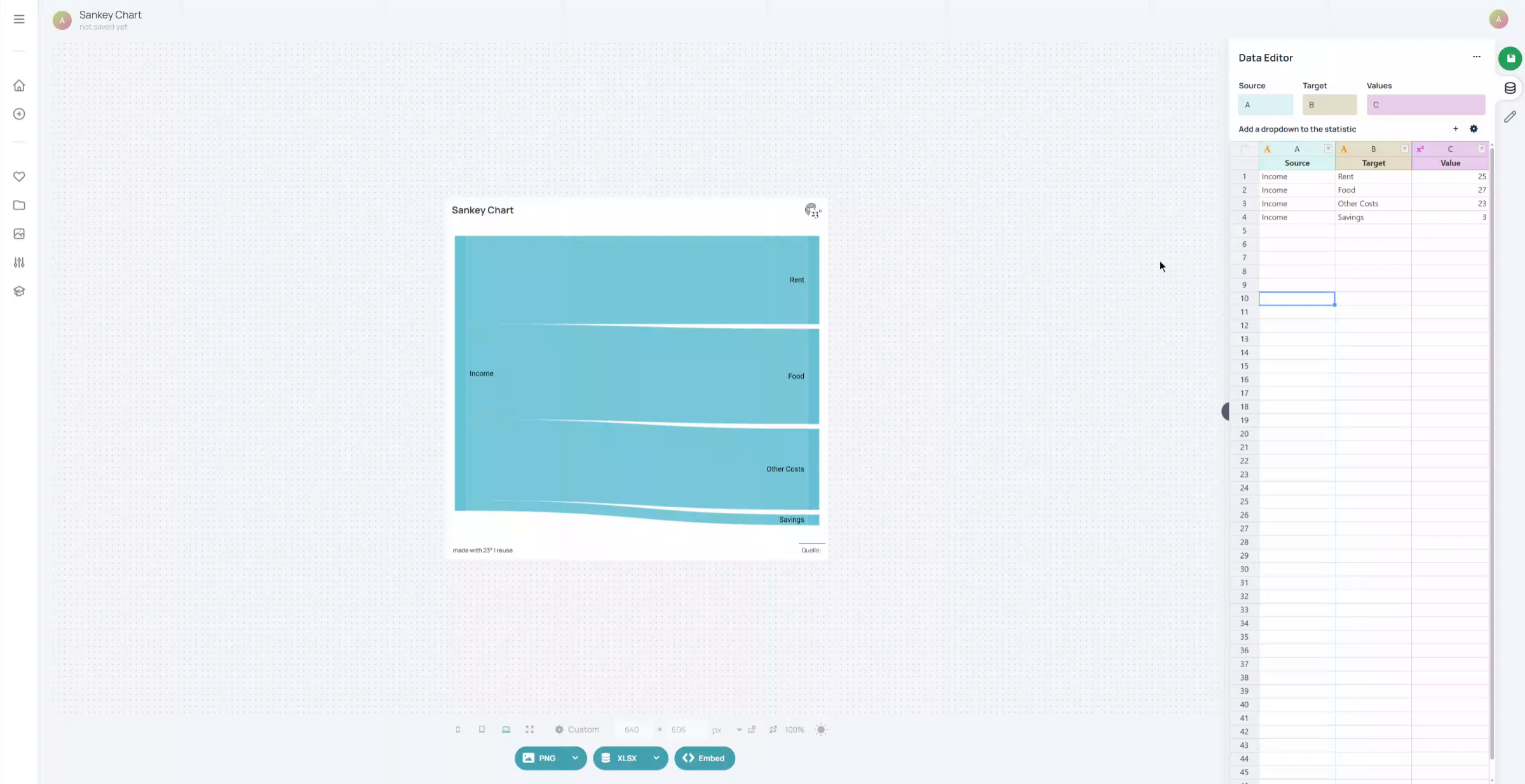
Unlike the like the bar charts where you basically only need a text label and a value the sankey diagramm requires a source and a target field. In our example we have a source "Income" that we want to break down into multiple expenditure targets. In short: the Source field shows you where the flow starts and the targets show where the flows end.
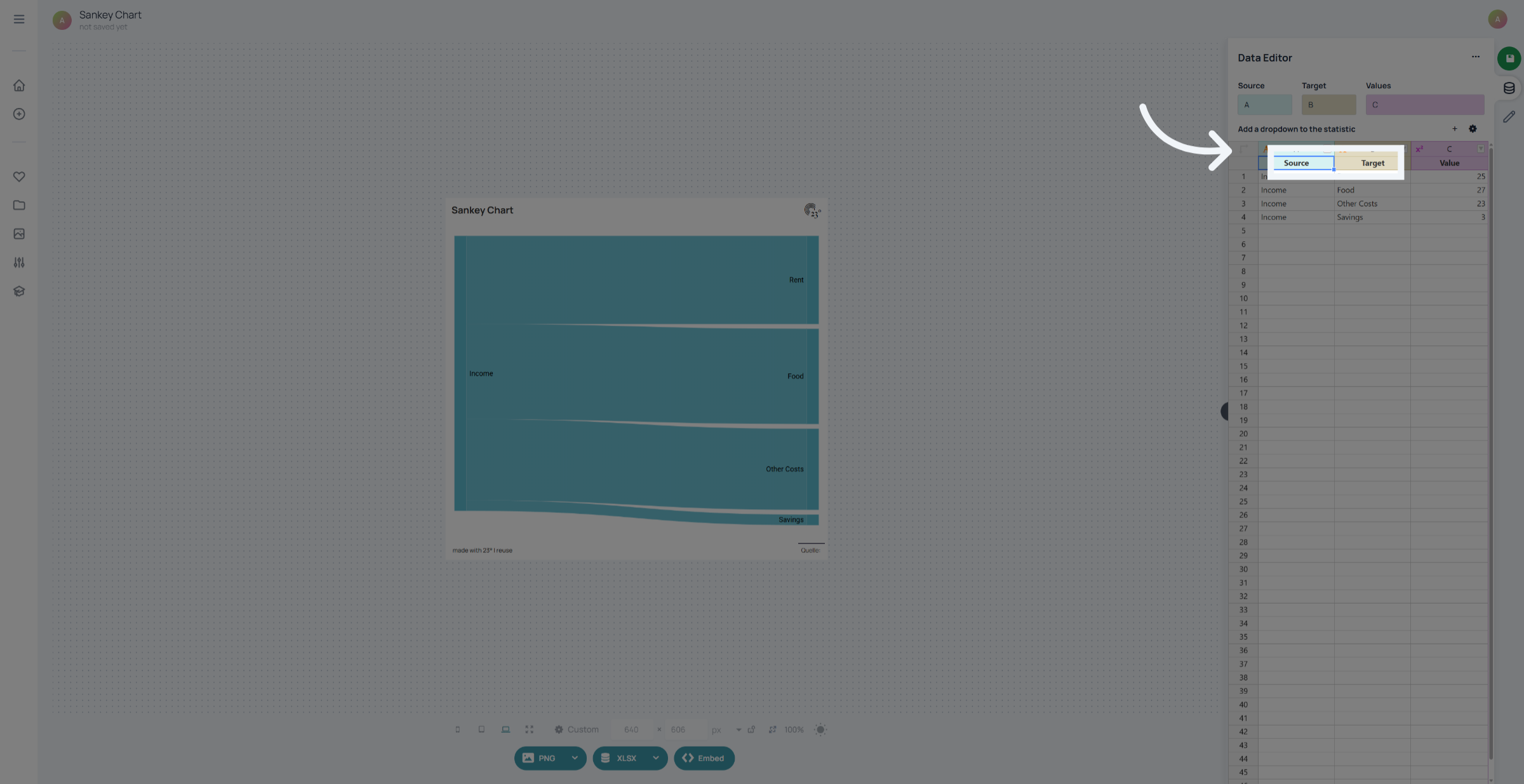
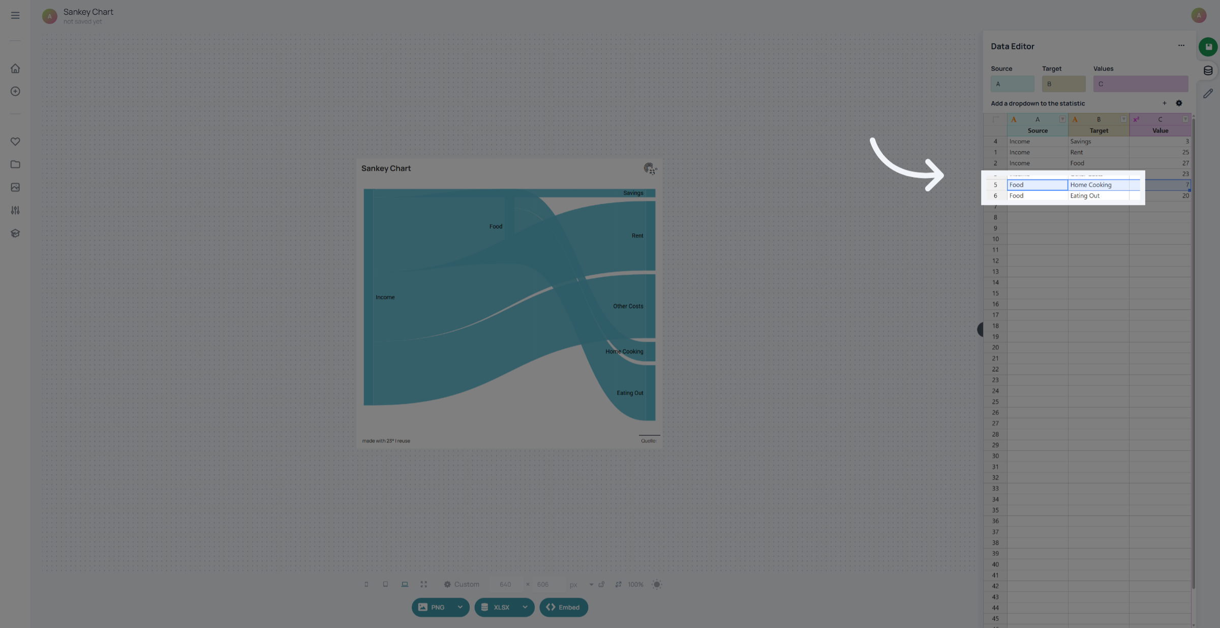
Target fields can also become sourcefields as well. In our example we want to breakdown the food expenditure into further categories. To achieve this we have to add a couple of more rows into our dataset where our target field "food" becomes the new source field. With this we are adding a second level to the sankey flow.
To rearange the order of our sankey elements we can simply click on the row we want to move and move it up or down using drag and drop.
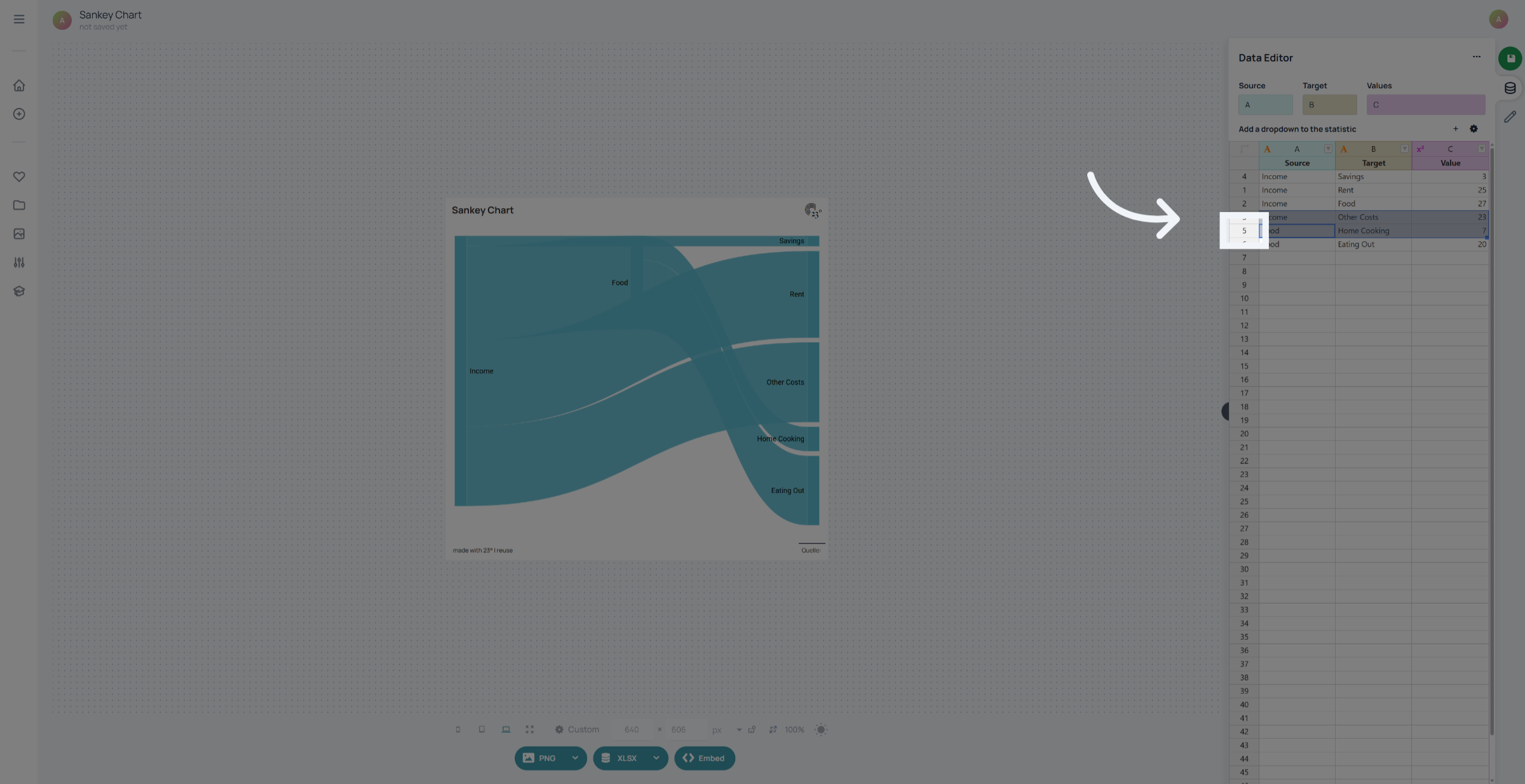
This way we can make sure our sankey diagram is always readable and in the desired order.
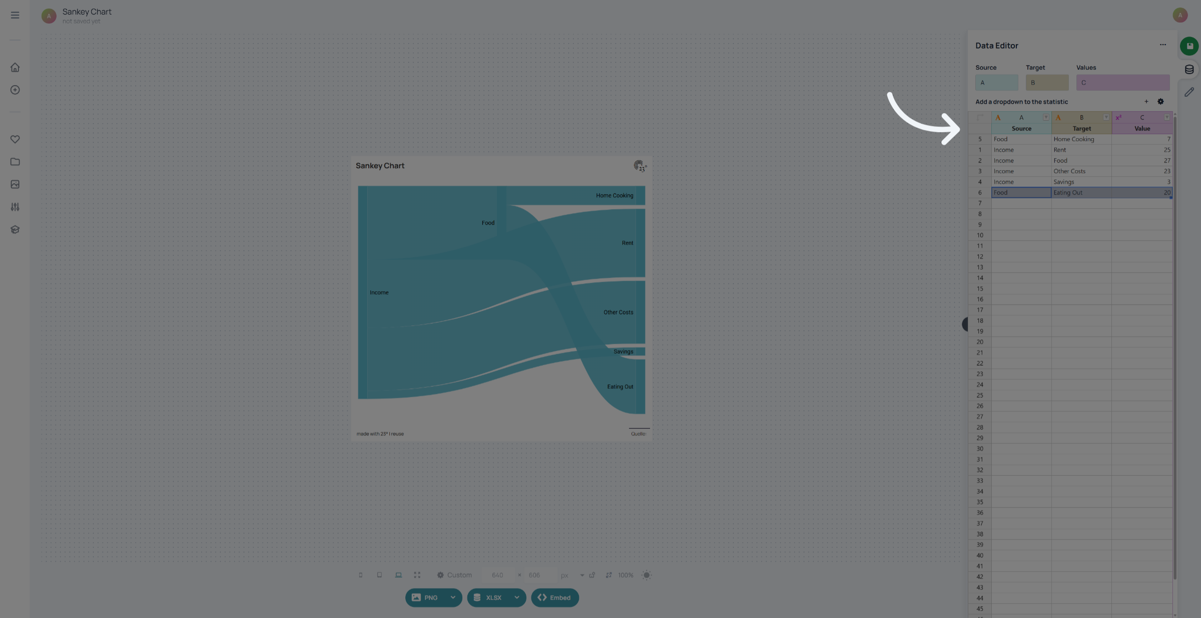
You have successfully formatted the data for a Sankey diagram in 23degrees by setting source and target fields, entering category names, and assigning numeric values. For further customization, explore additional settings or data refinement options within the application.