Create Tooltip Visualization Using 23degrees Platform
This tutorial guides you through creating a tooltip visualization using the 23degrees platform.
In this example we have a map with the sdg score of every country. We want to add a timeline chart with the score evolution of every country that is going to be visible on click
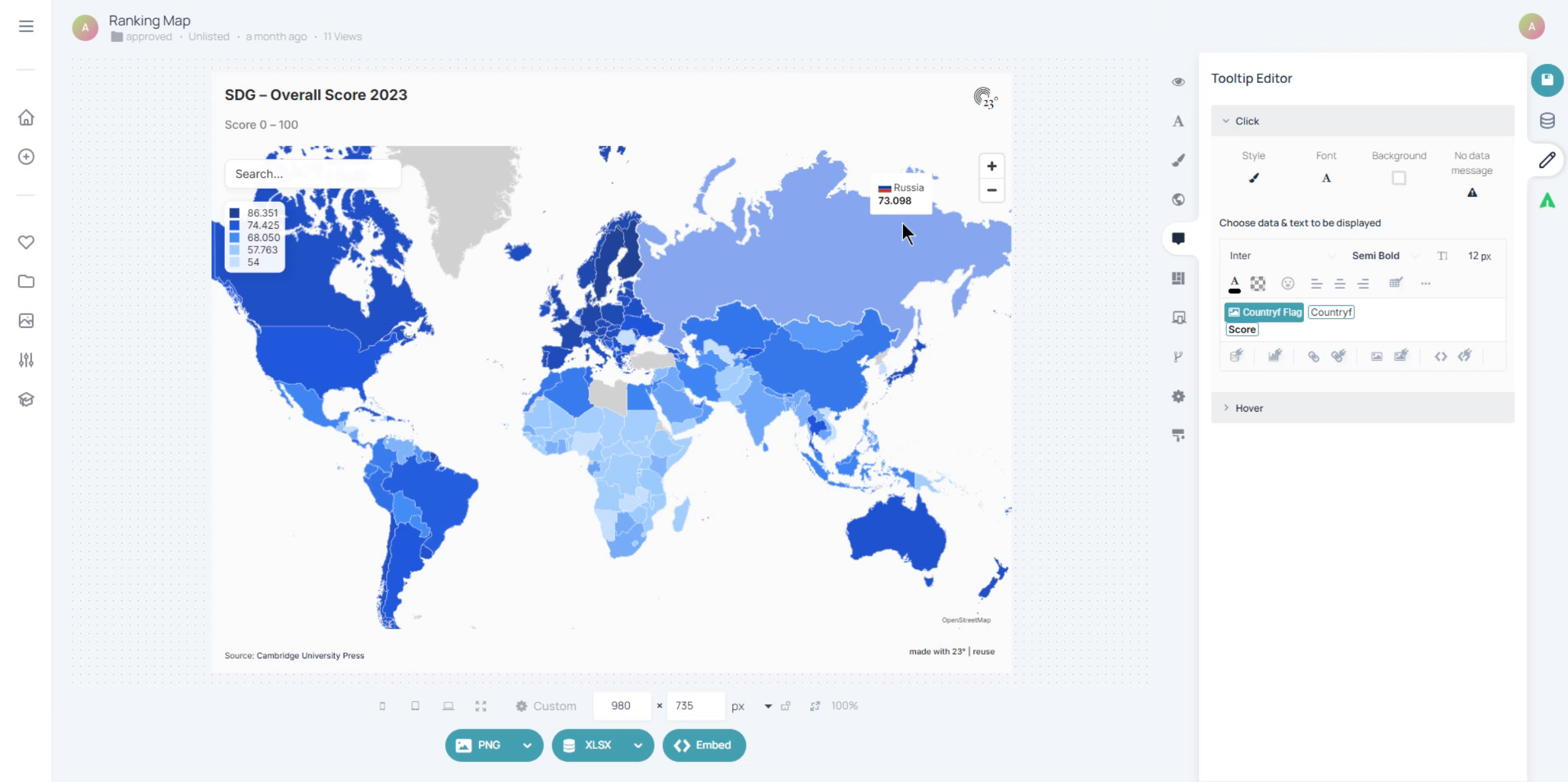
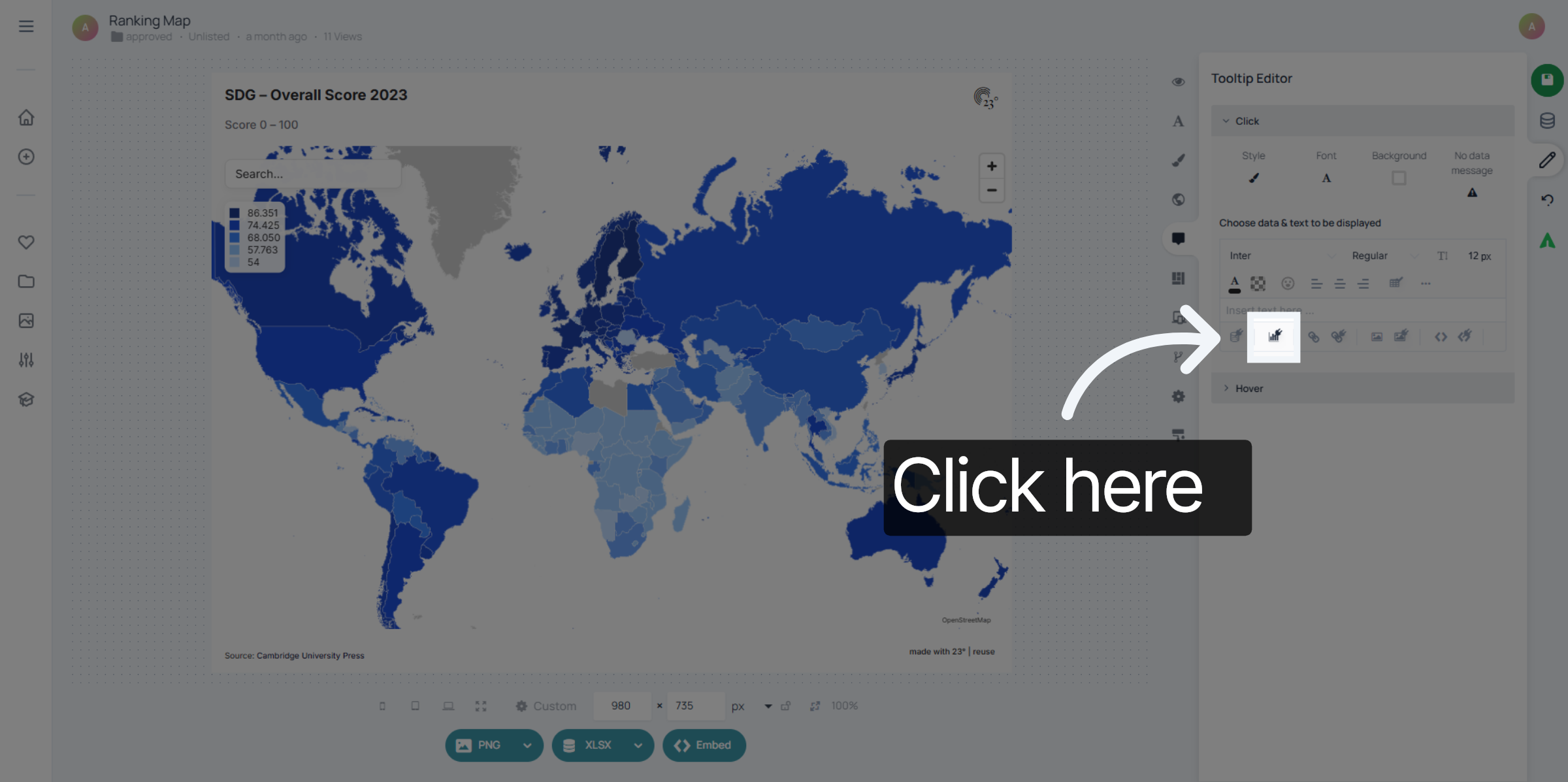
To add a tooltip visualisation click here on the "Add Statistic" Button.
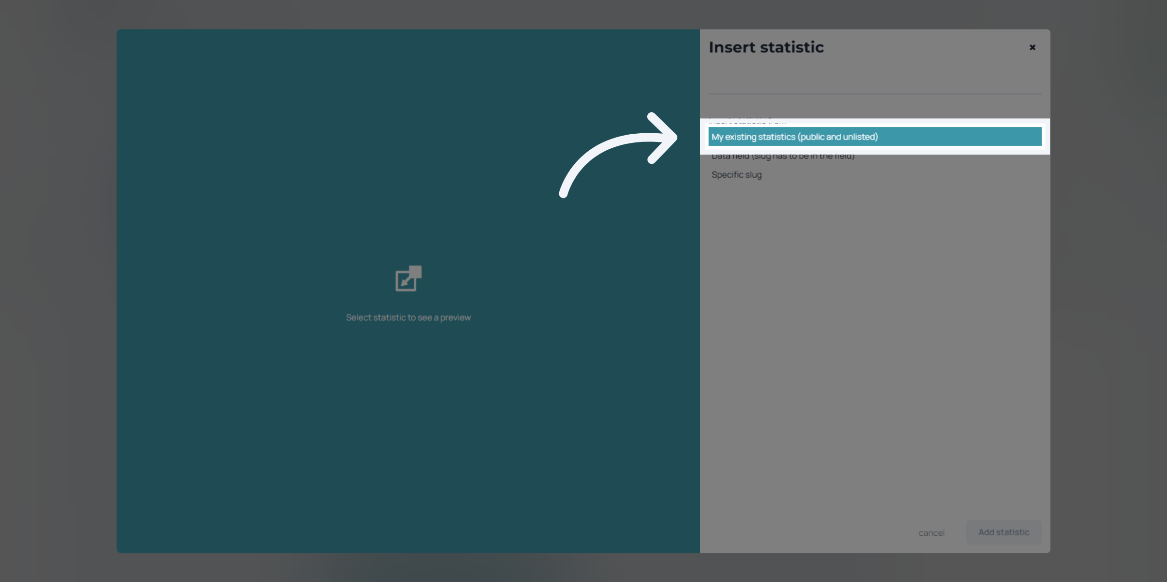
Click on "My existing statistics". Keep in mind: you need to have created the visualisation that you want to put in the tooltip beforehand.
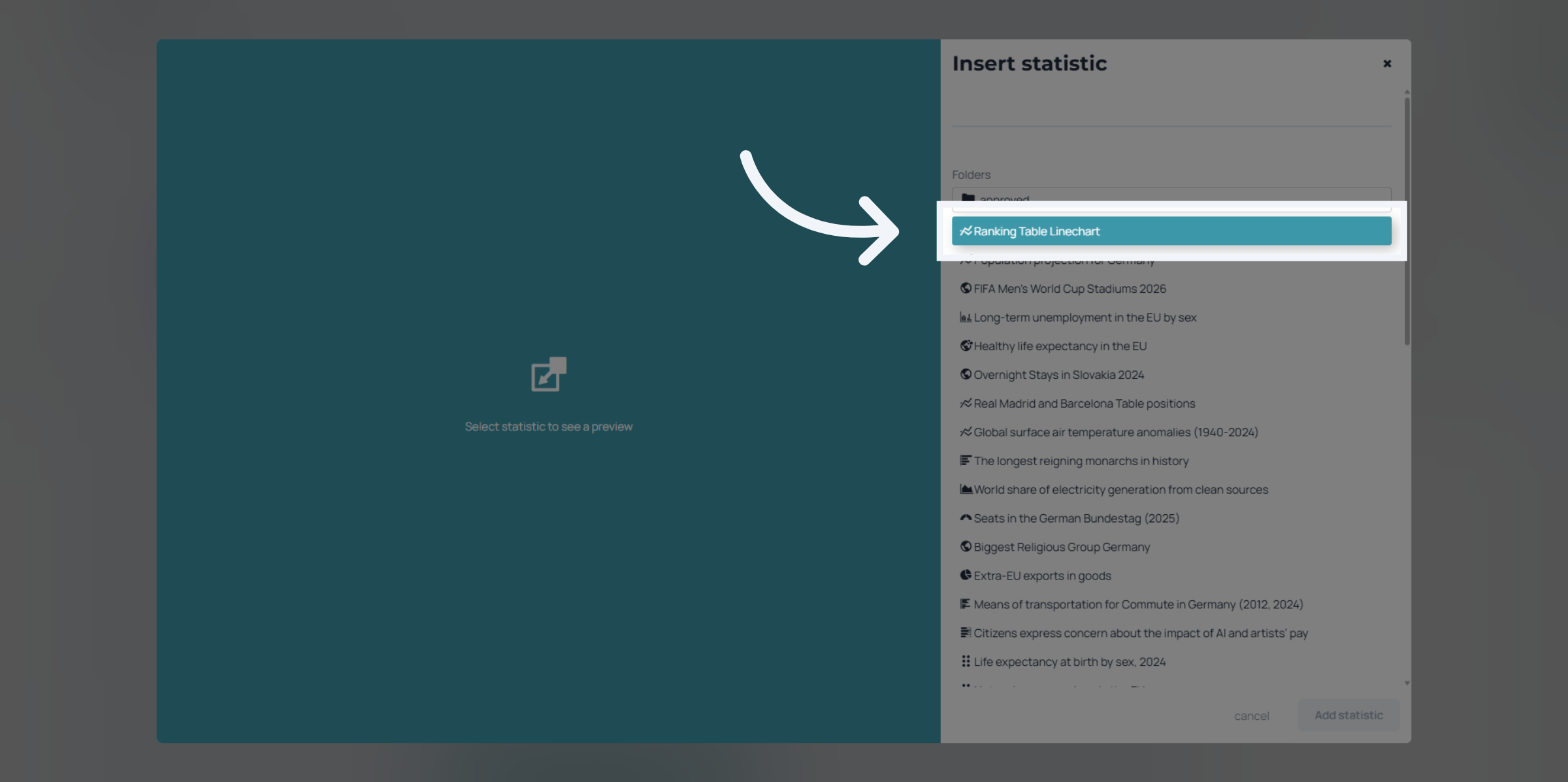
Navigate through your folders to find the statistic you want to insert.
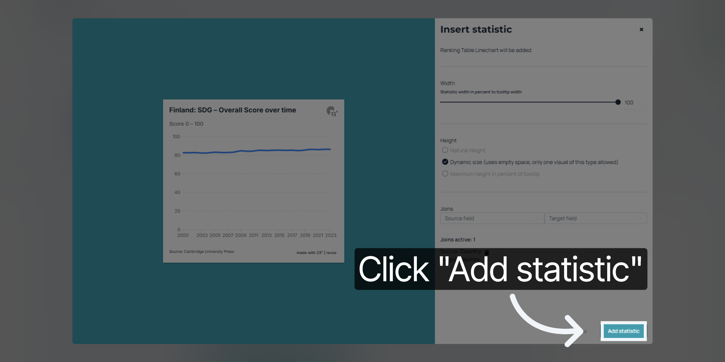
On the left side you see a preview of your chart and on the right side you can set the width and height settings of your visualisation within the tooltip
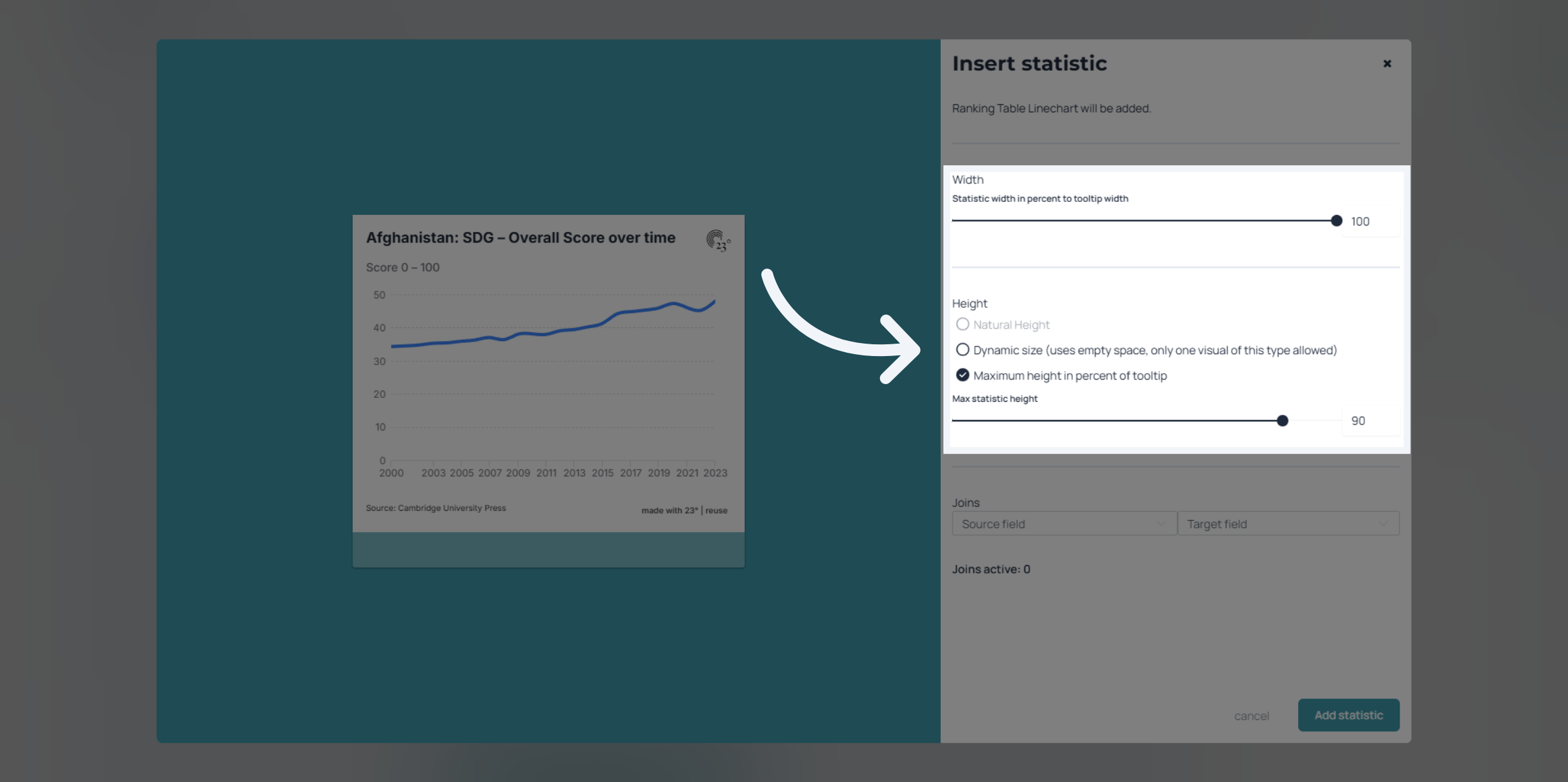
For the tooltip to display the correct country when clicking on it we need to make a join between the two visualisations. In this case both datasets have a country column and thats what we are going to use to join them
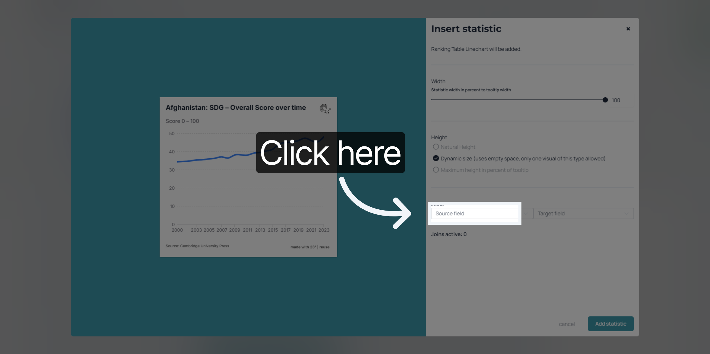
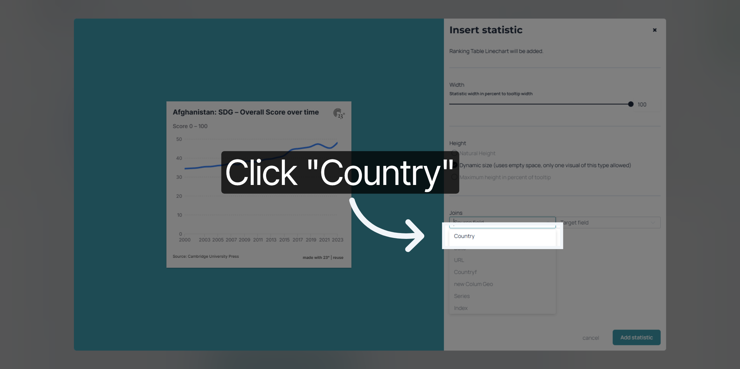
Click "Country" to specify the country data field.
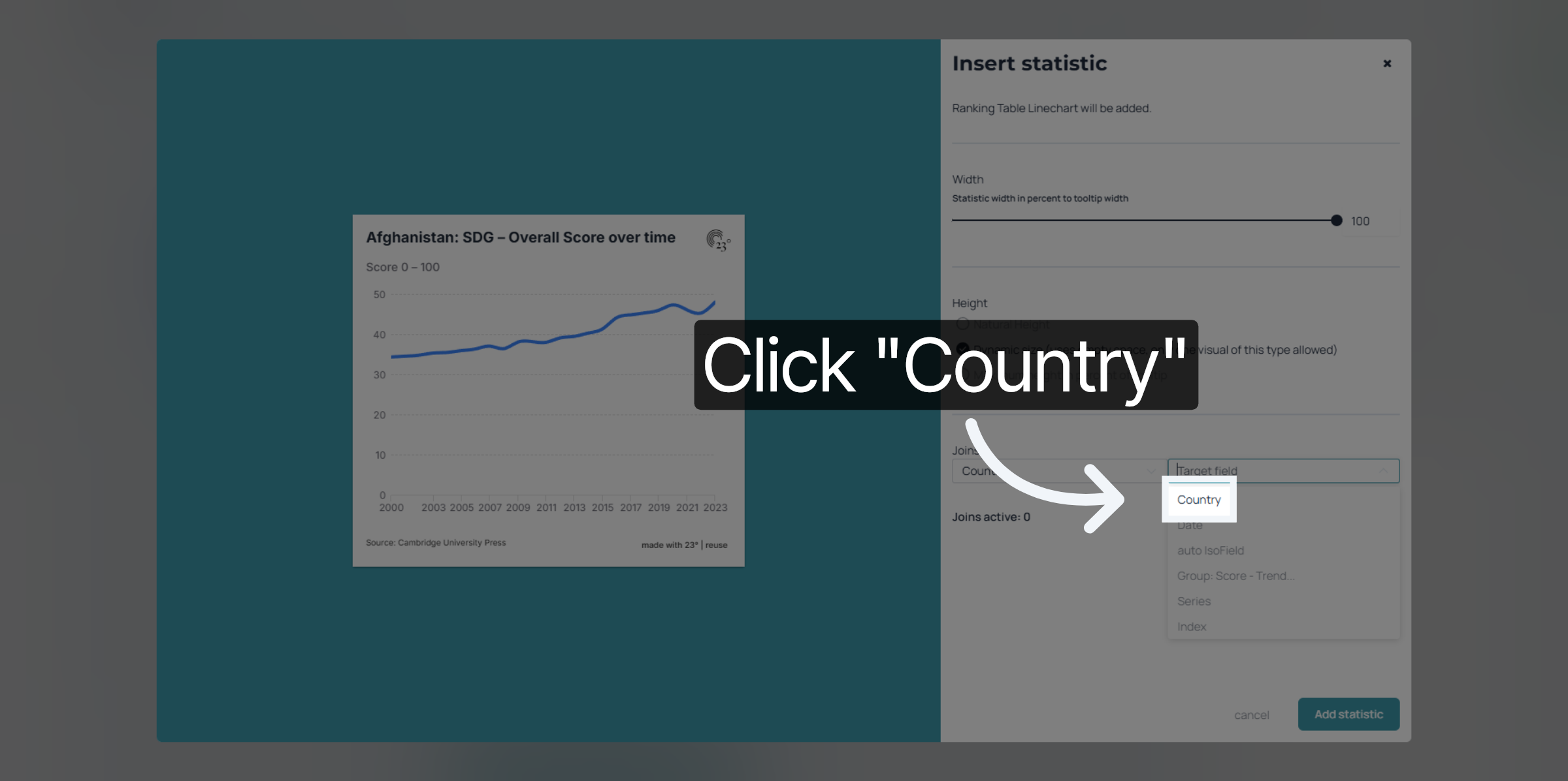
Click "Country" again to confirm your selection.
Click "Add join" to link additional data sources.

Click "Add statistic" to finish
Now when clicking on a country you get shown the corresponding tooltip timeline line chart.
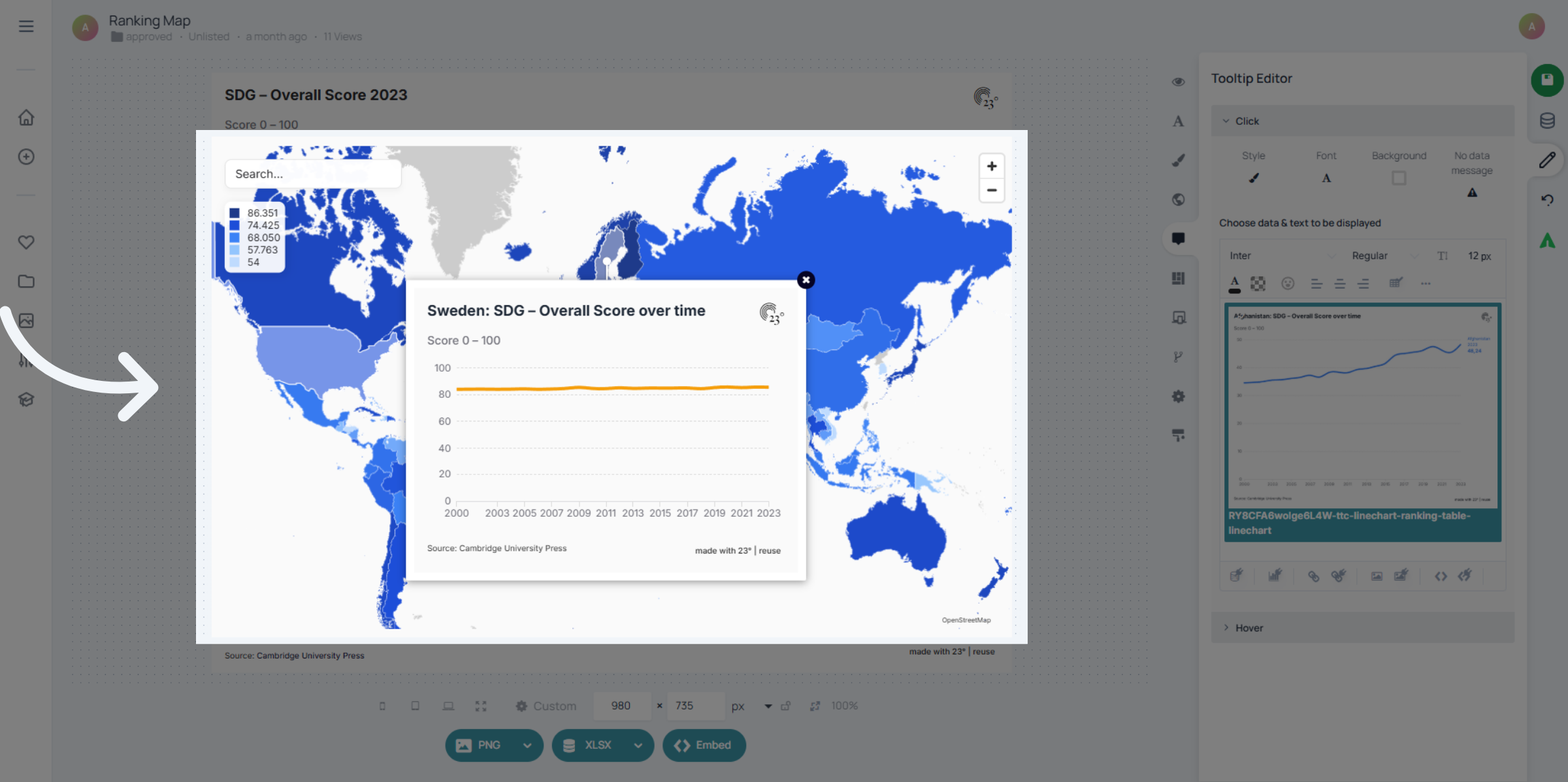
You have successfully created a tooltip visualization by configuring data sources, selecting visualization types, and customizing settings within the 23degrees platform. Next, explore sharing options or advanced customization features to enhance your data presentation.