Column Types Explained: Text
In this tutorial I’m quickly going to explain what text columns are used for in interactive visualisations in the 23degrees application. Text columns are your main way to work with names, categories and labels in your charts.
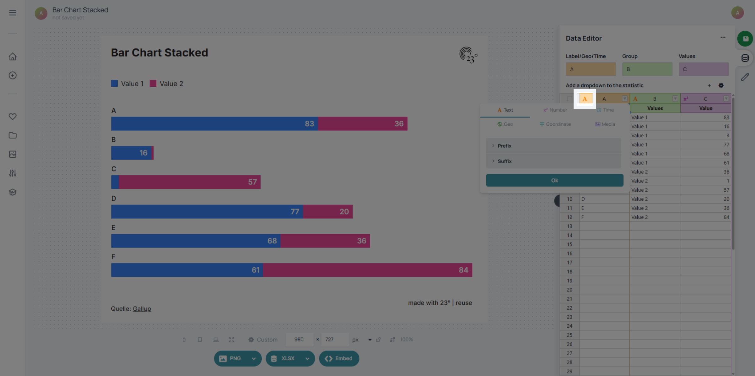
In 23degrees, the text column type can be identified by the orange column colour and the “A” icon. With text columns, you can also add prefixes and suffixes to enhance how labels look in your charts (for example: “District: ” or “ km²”).
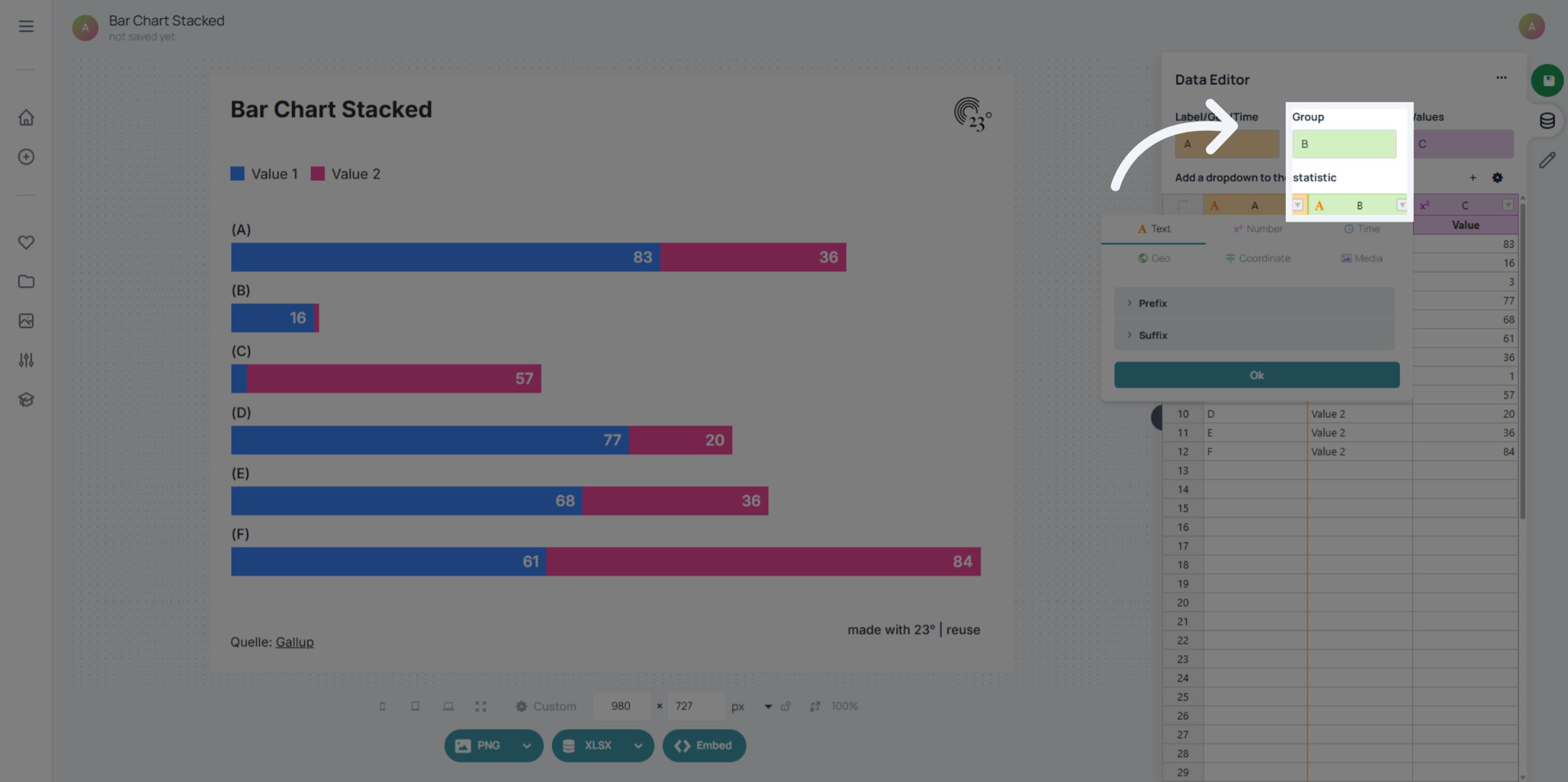
Text columns can be used as a grouping column, especially if you want to colour your charts by category or filter them by a specific group. Each unique text value becomes a category you can work with.
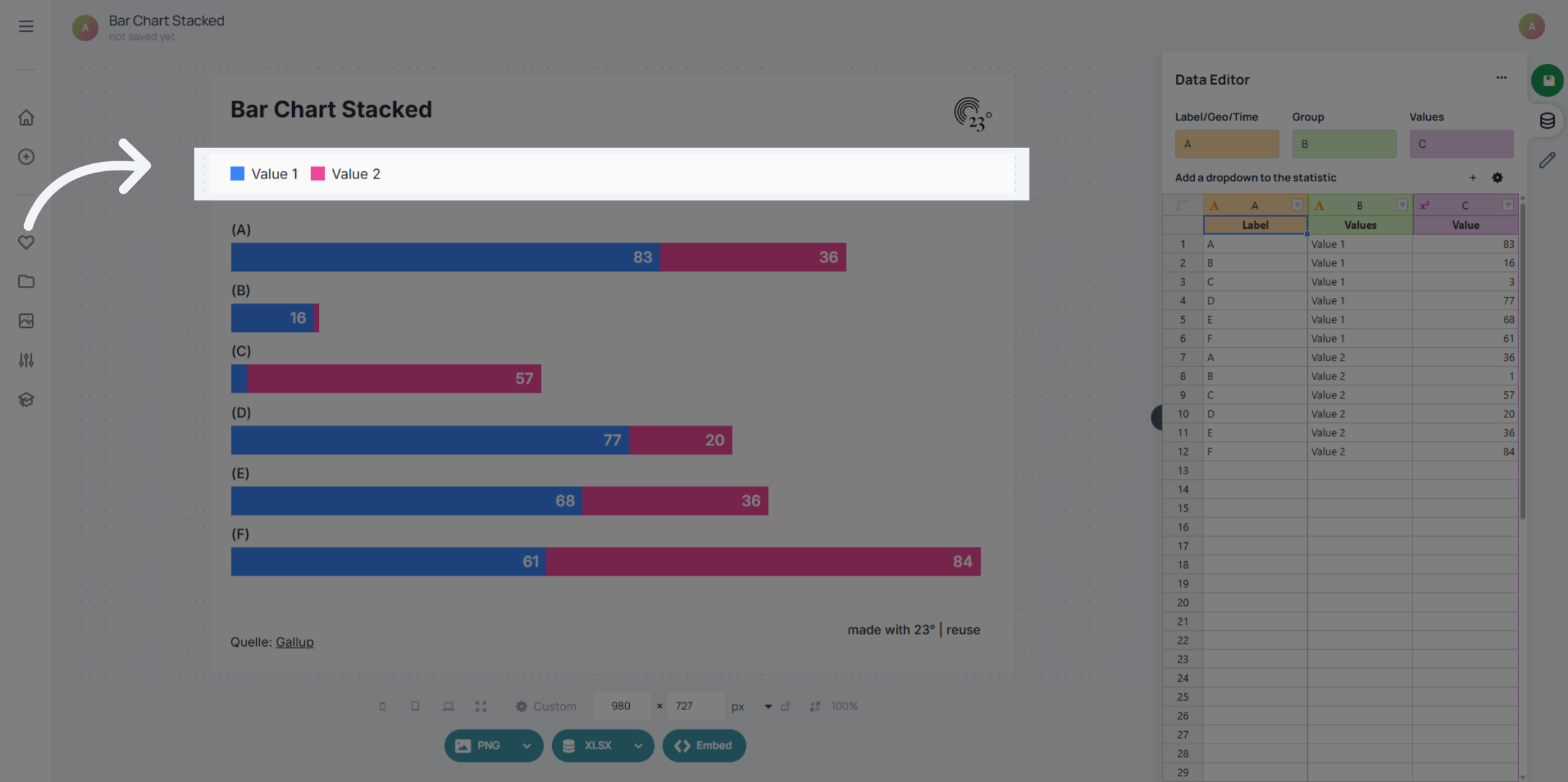
The labels created by a text column are also the labels that appear in the legend. That means the way your text values are written directly controls how categories show up in your chart legend.
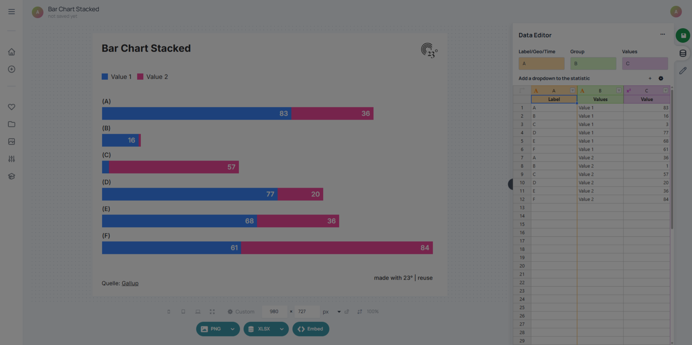
In general, text columns can be used as free-form labels, extra tooltip text, or grouping labels for your data. You can have as many text columns in a dataset as you need, giving you a lot of flexibility for naming, grouping and explaining your visualisations.
Check out other tutorials if you want to learn about other column types and their use cases!