Display Country Flags in Charts Using 23degrees
This tutorial demonstrates how to display country flags within your charts using 23degrees.
You will learn to configure chart labels and insert flag data fields for enhanced visualization.
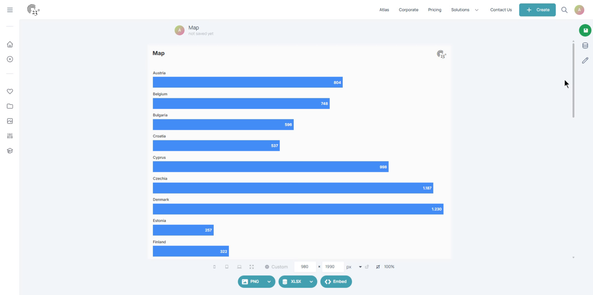
First make sure that your country column is defined as a geo column. click on the data editor to verify.
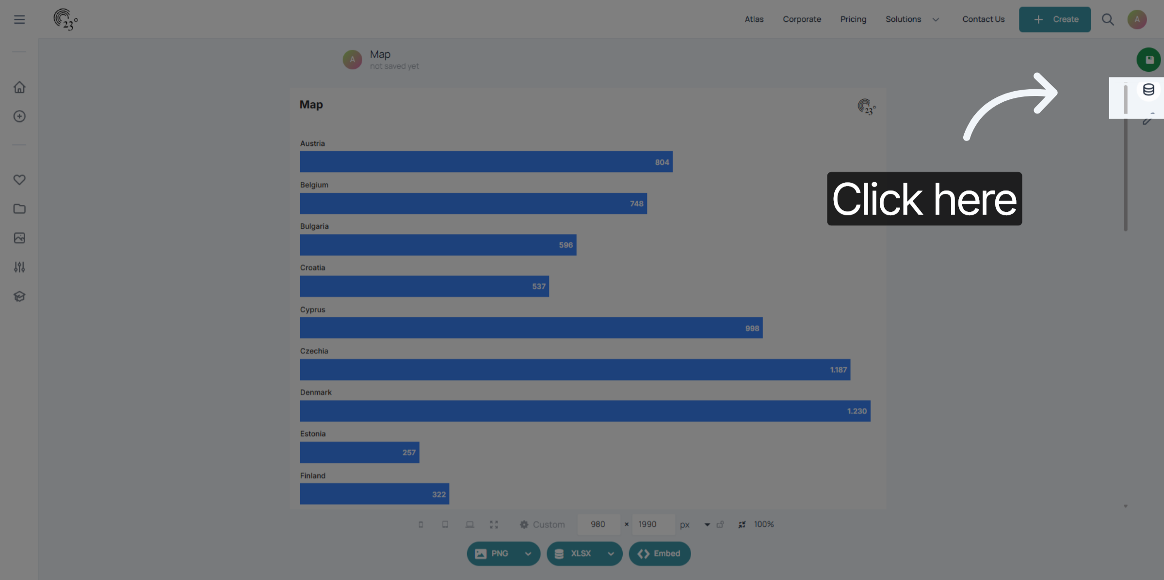
Make sure your country column is a geography. a green globe should be in the column header.
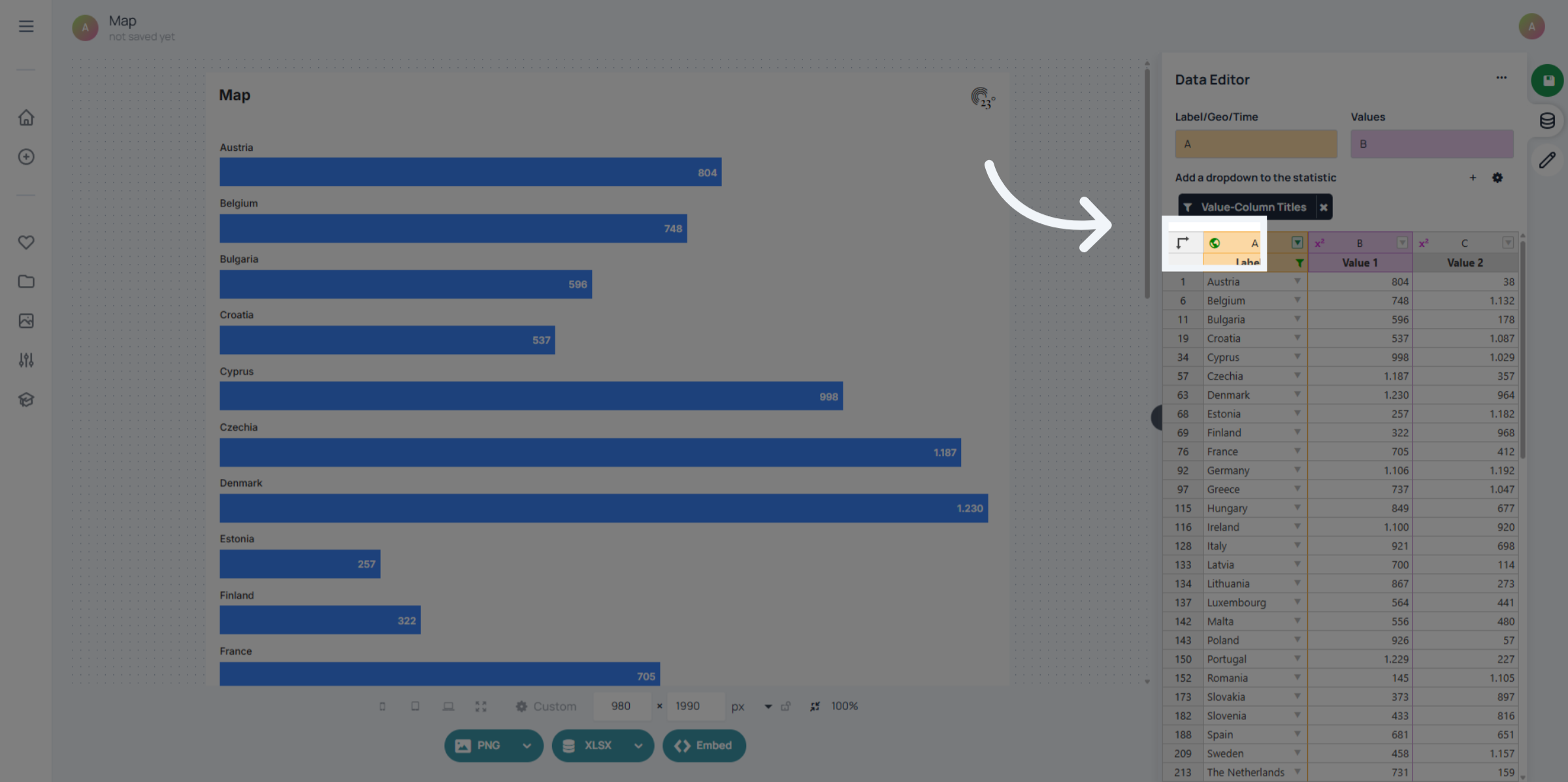
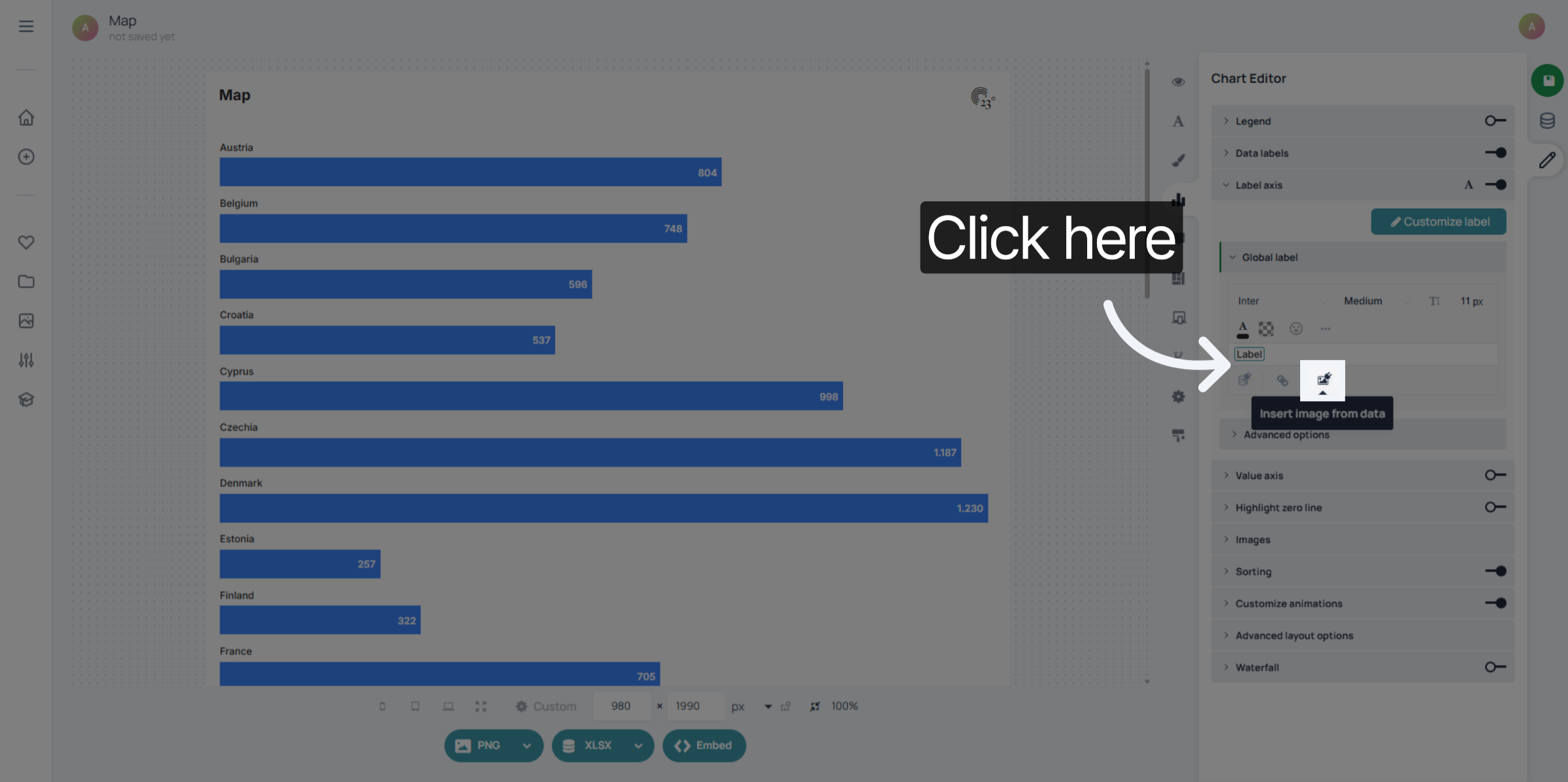
Next go to the label axis in the chart editor.
Click on "Select Image From Data"
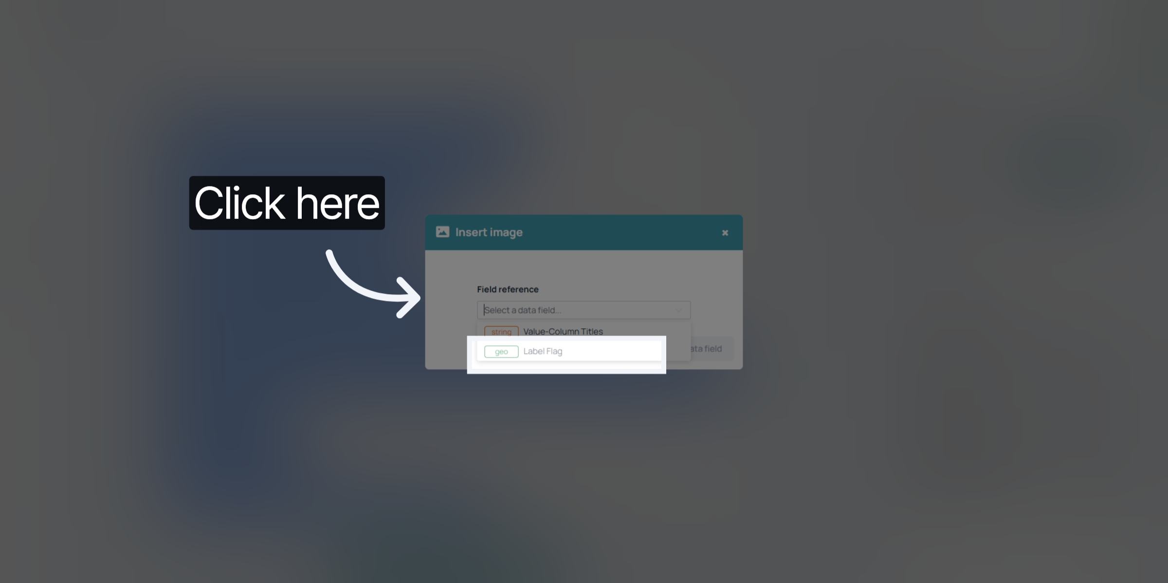
Select your Geo Column
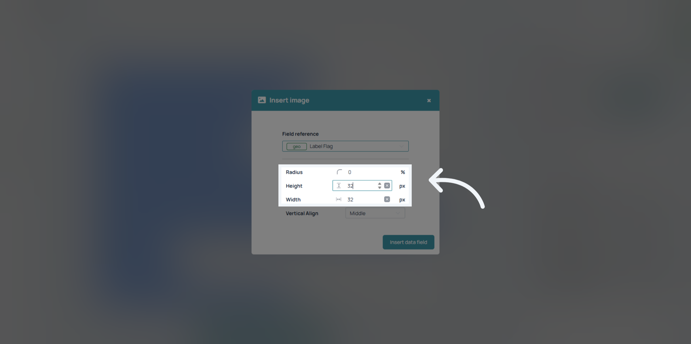
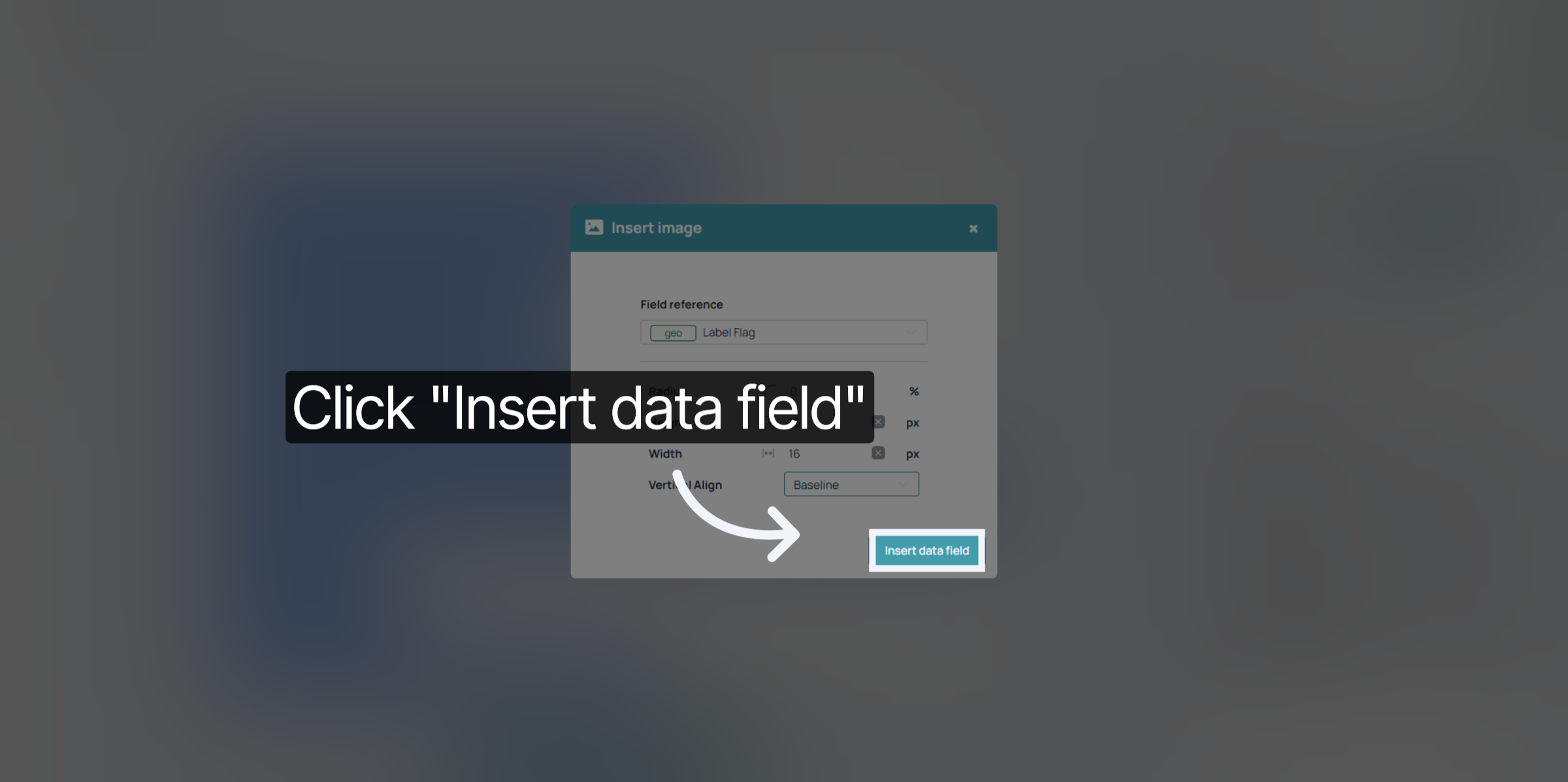
You can select the rounding and the height and width of your flag in pixels.
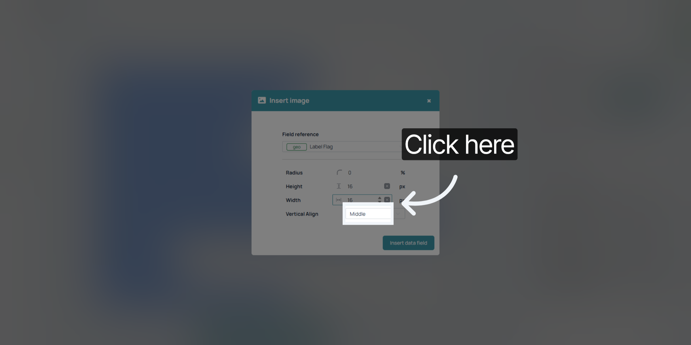
Here you can also set the vertical allignment.
When finished confirm your settings by clicking "insert data field".
And that's already it!
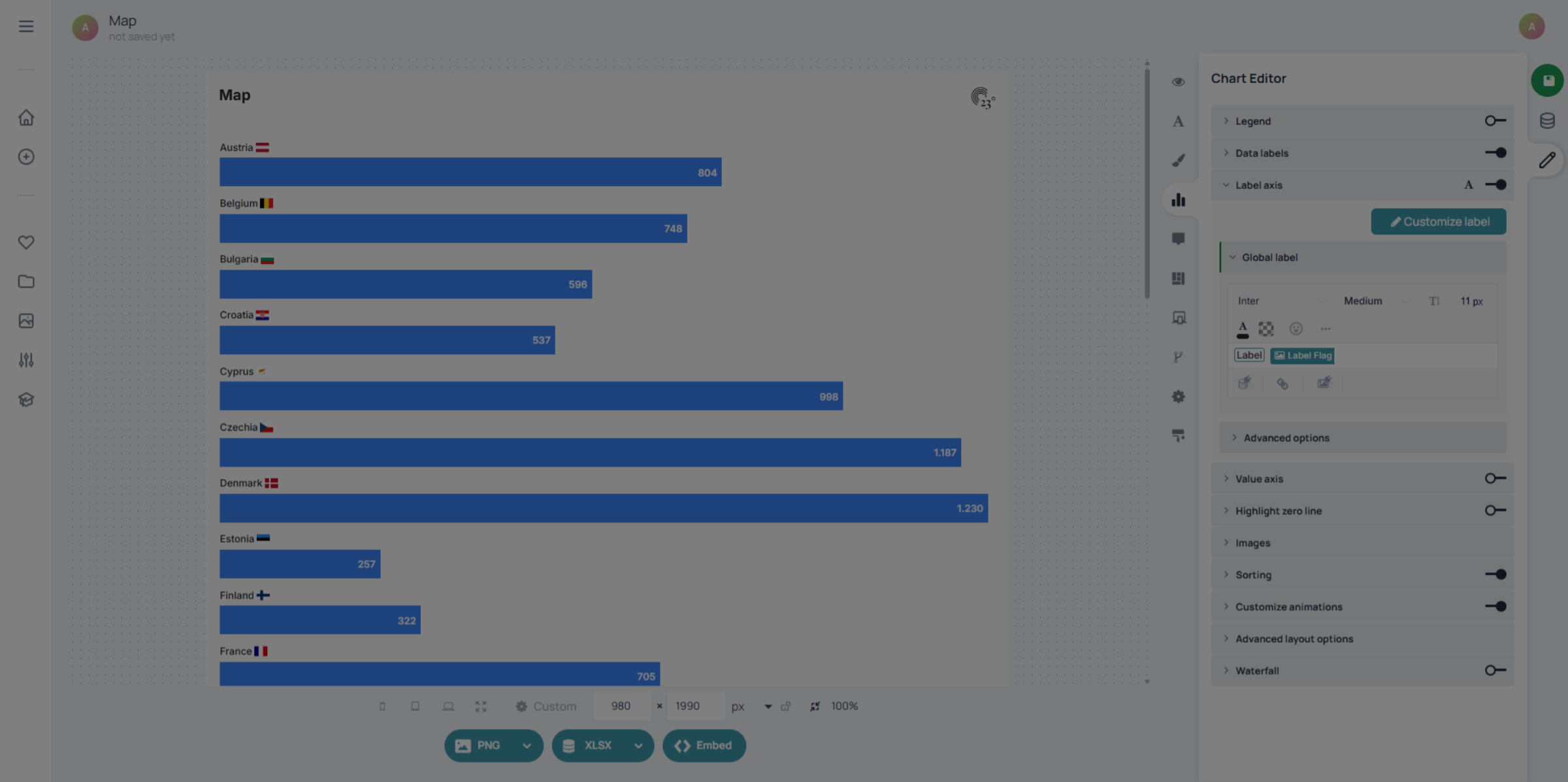
You have successfully configured your chart to display country flags by customizing label settings and inserting the appropriate data fields. This enhances your chart's visual appeal and provides clear geographic context. For further customization, explore additional chart styling options or data integrations within 23degrees.