Create Group Columns in 23° Data Editor
This tutorial guides you through creating a group column in the 23° Data Editor.
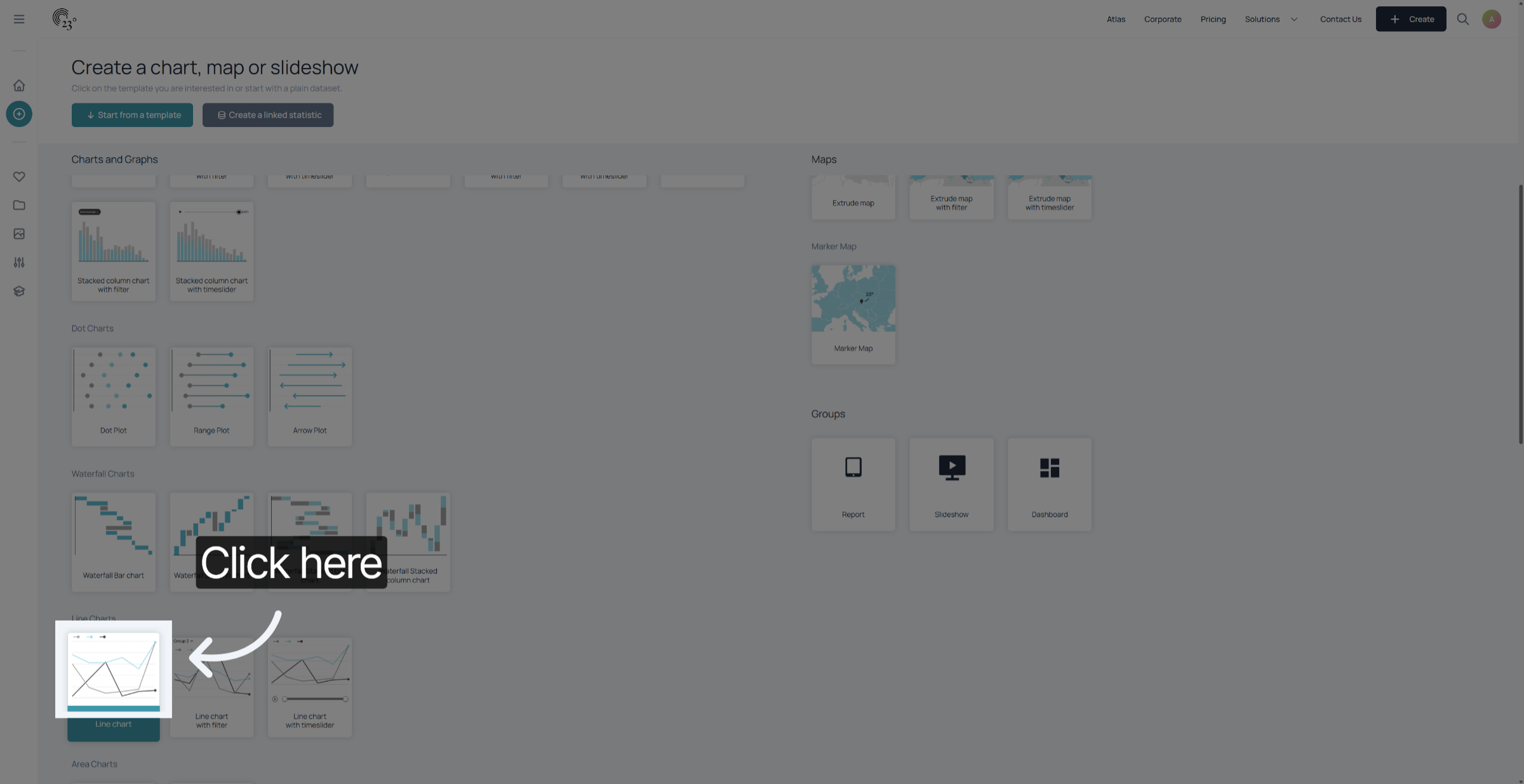
To start of we want to select the correct chart type for our data. In this example we want to create a chart over time showing different models of U.S Population projections which is suitable for a linechart display.
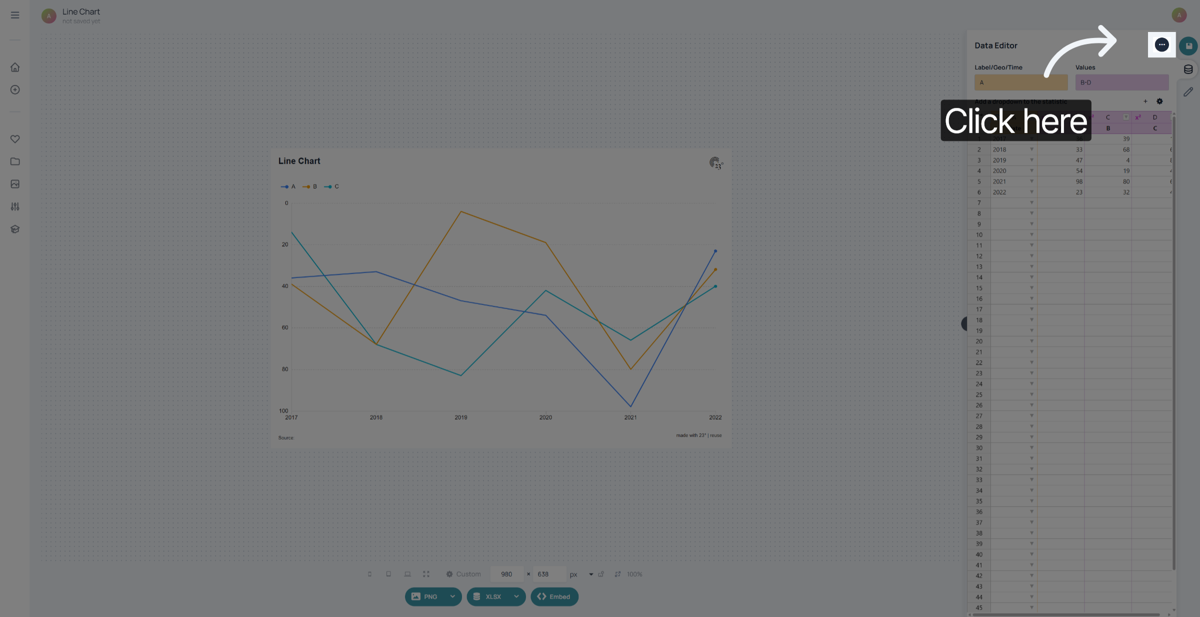
Click here on the 3 dots in the top right corner of the screen
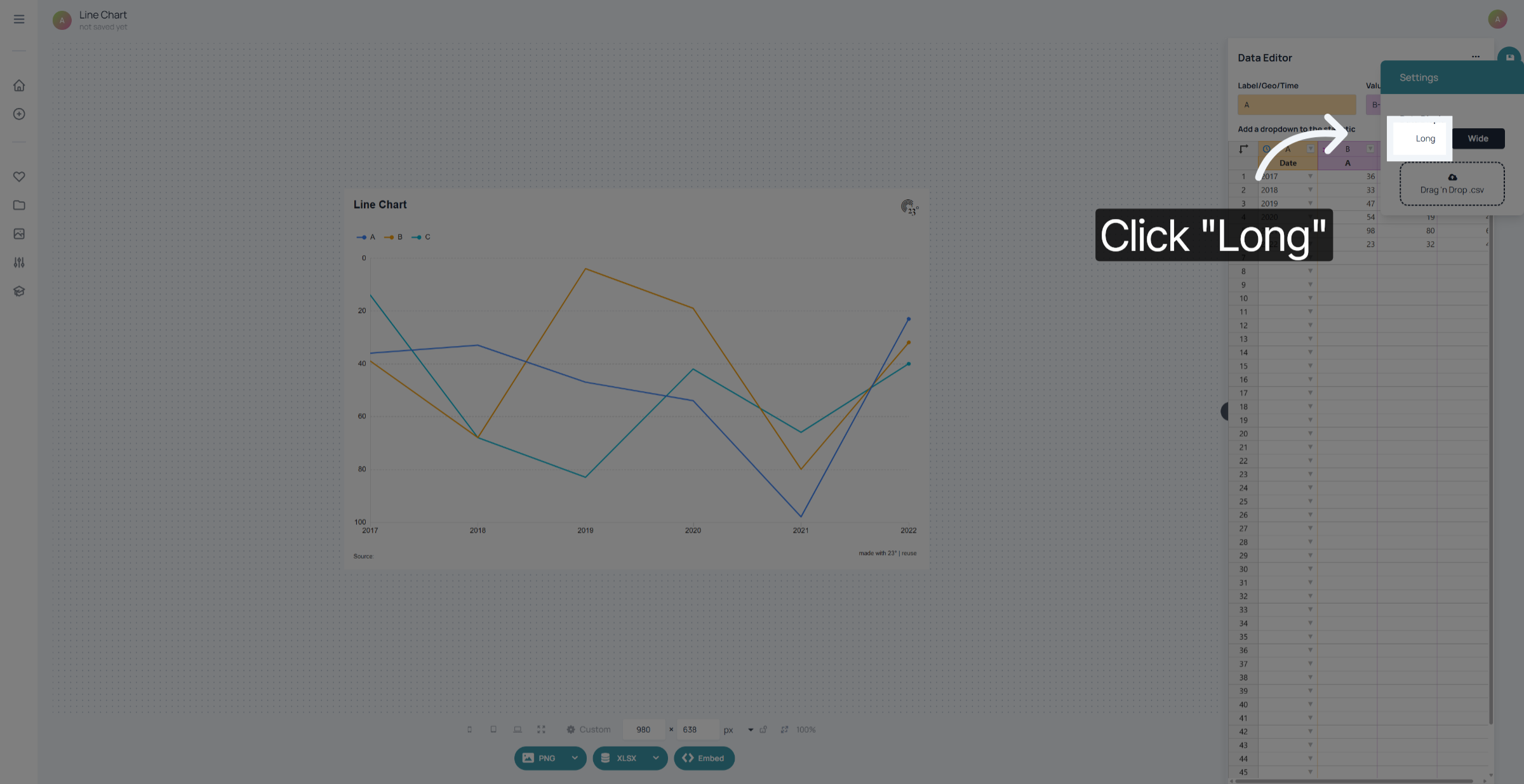
Switch from wide to long format.
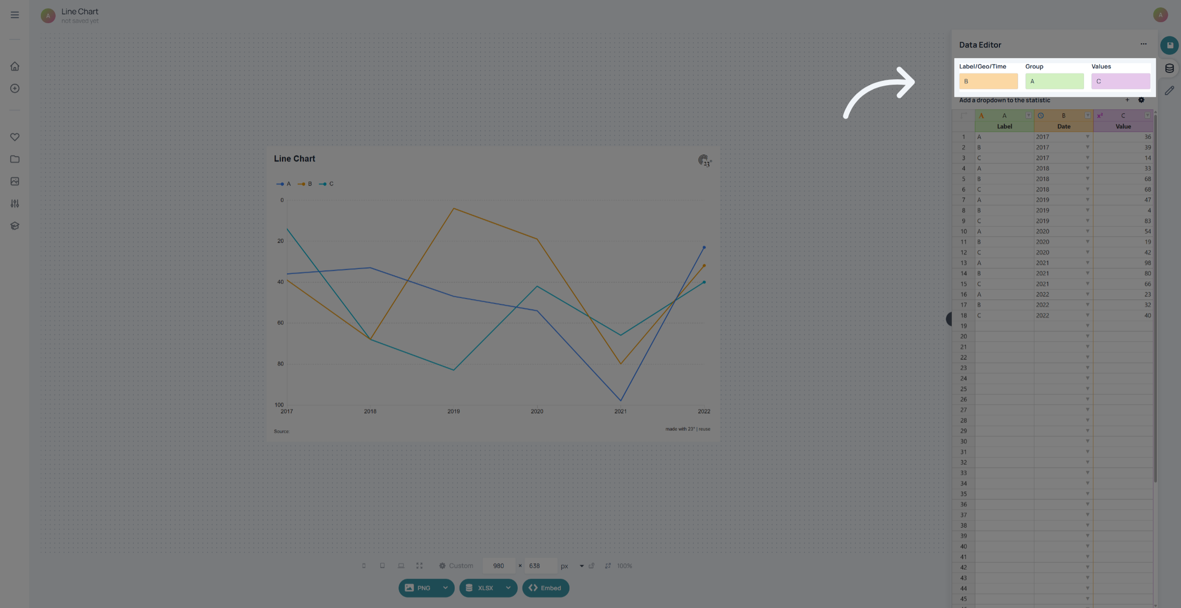
Now additionally to our label and value colums we also have a group column to use.
Paste your data. In this case we are going to copy & paste by clicking in the first header cell.
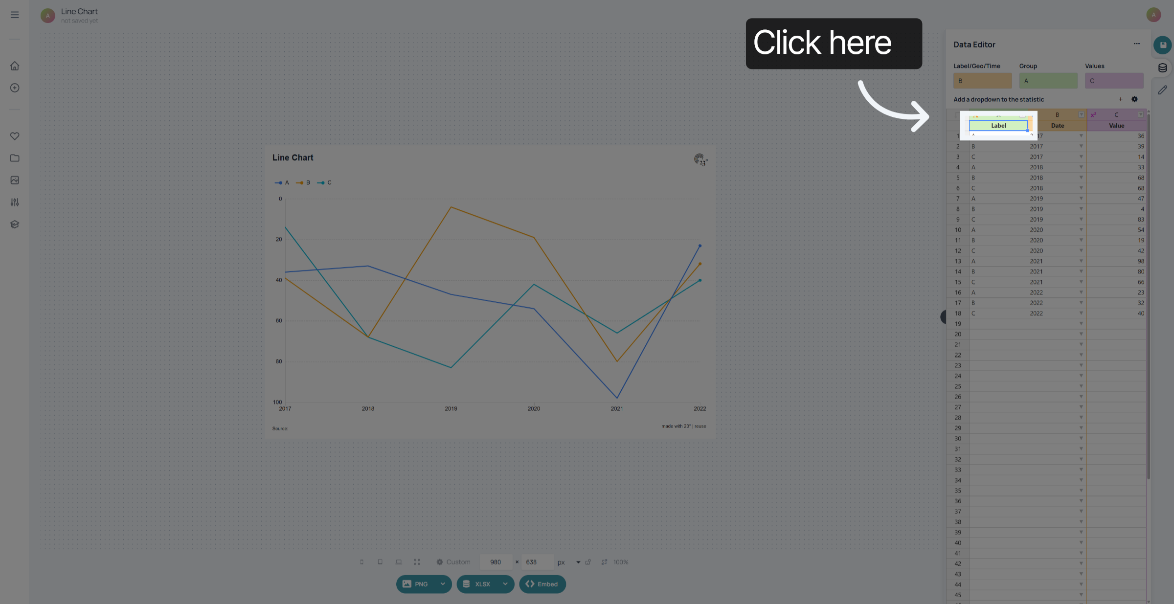
assign the corresponding groups correctly. in this example we want our group to be B, which are our different prediction models and not A which is our year column
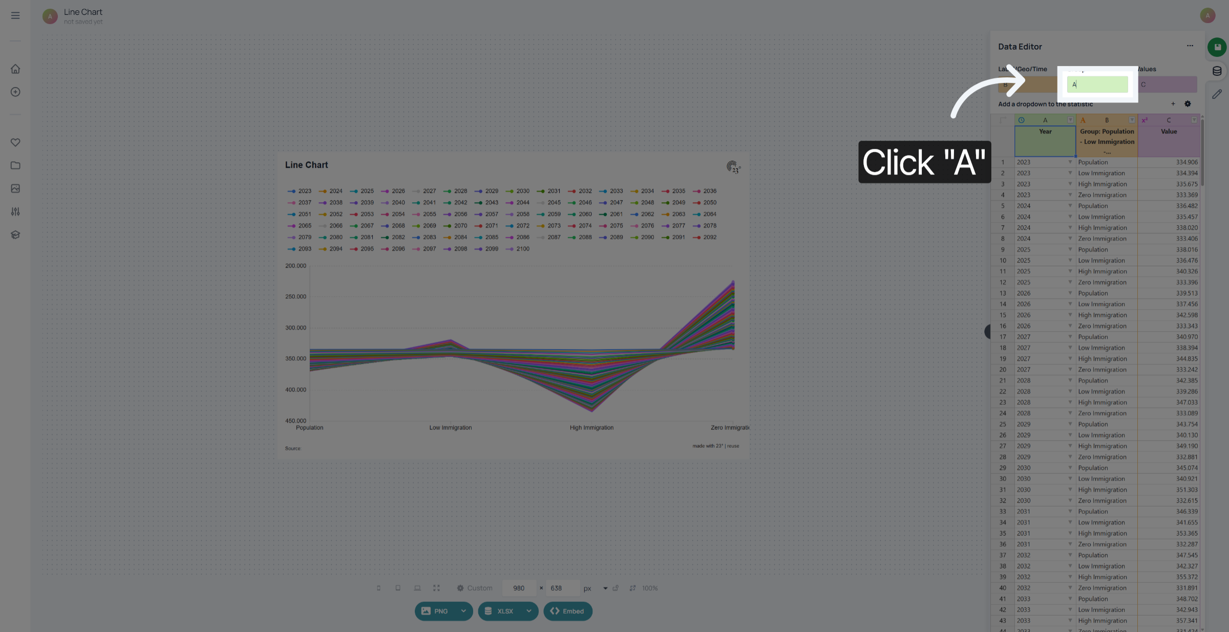
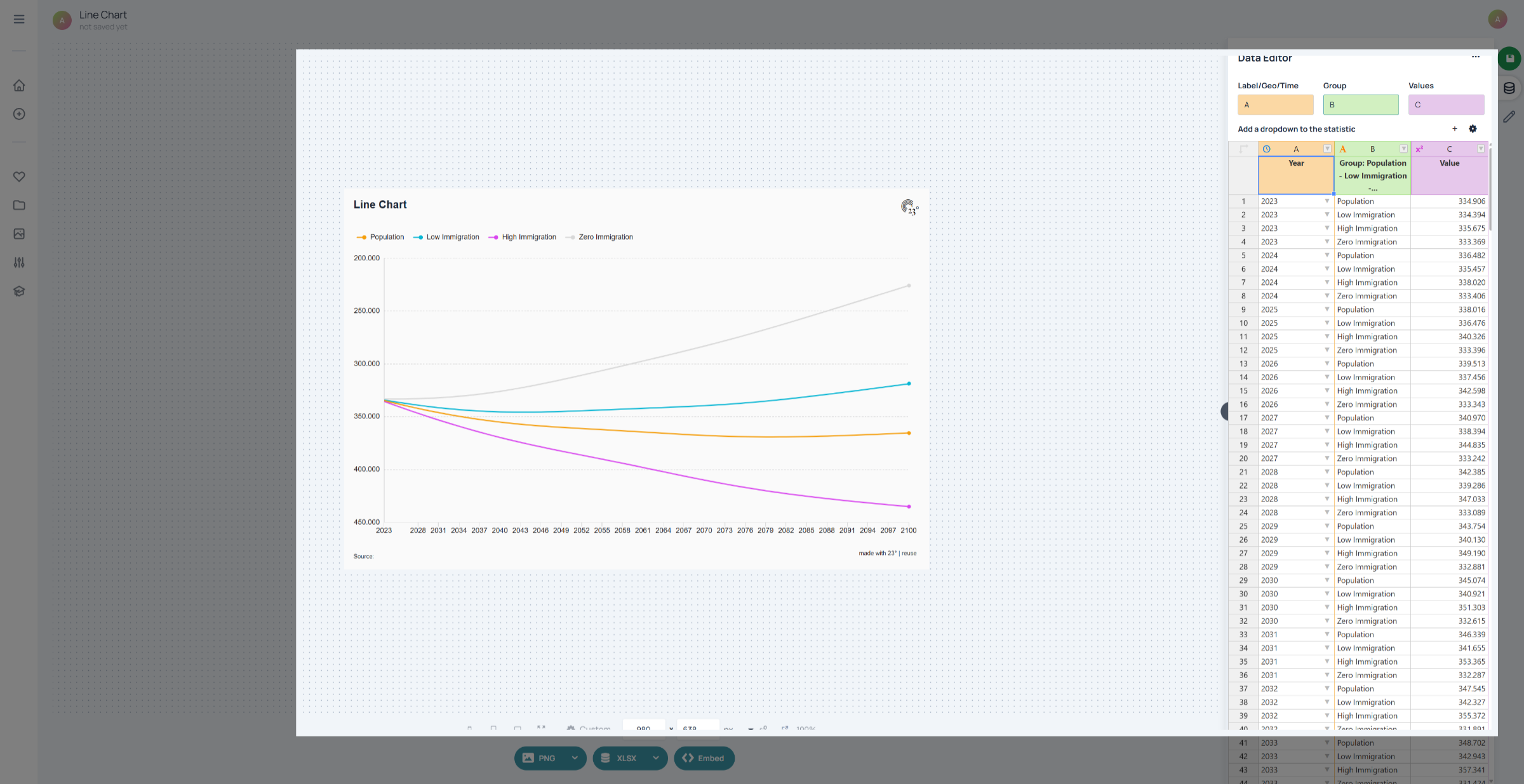
by assigning the Label and Group correctly we now have a chart showing all the population projection models at once.
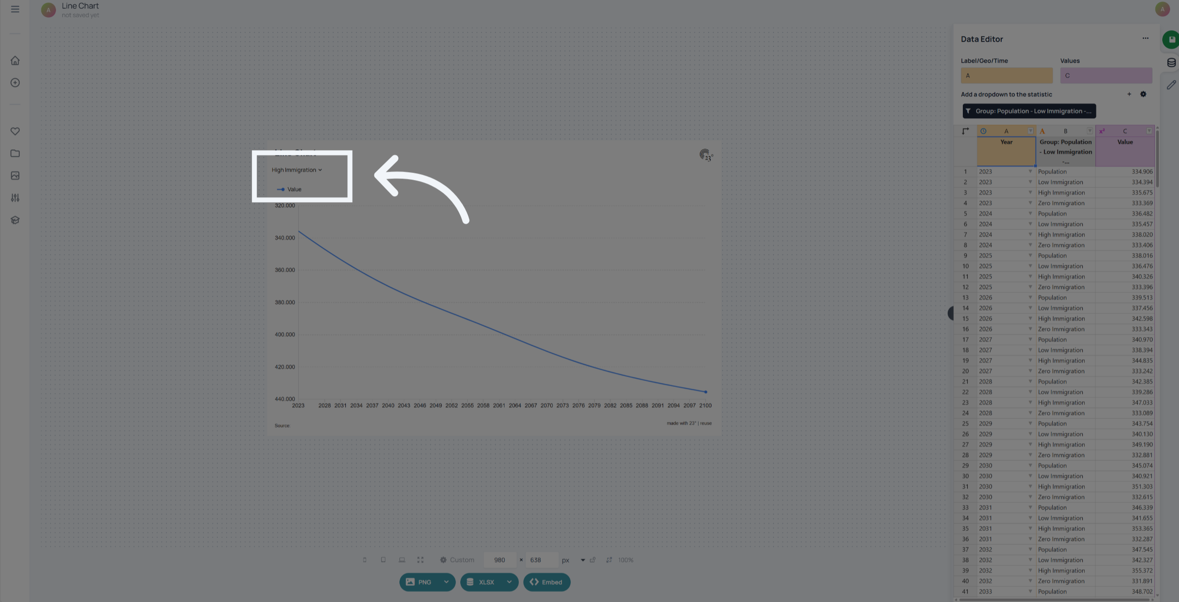
Without the group column we would get a chart where each model has to be filtered seperately.
You have successfully created a group column in the 23° Data Editor.