How to display alternative fields in a visualisation
This tutorial demonstrates how to display fields other than the default in your visualisations.
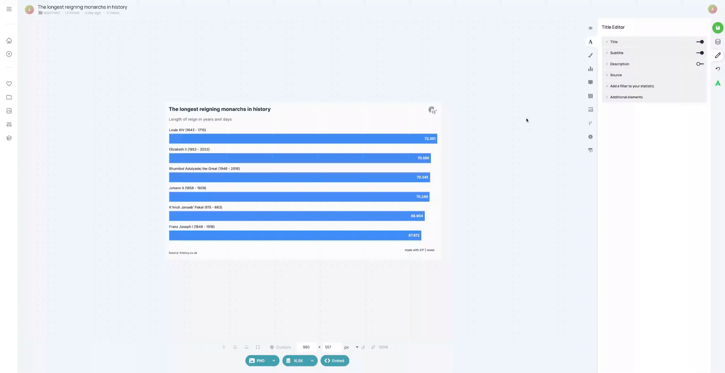
You created a visualisation that shows the number of years as decimals. For example, 72 years and 110 days is displayed as 72.301 years
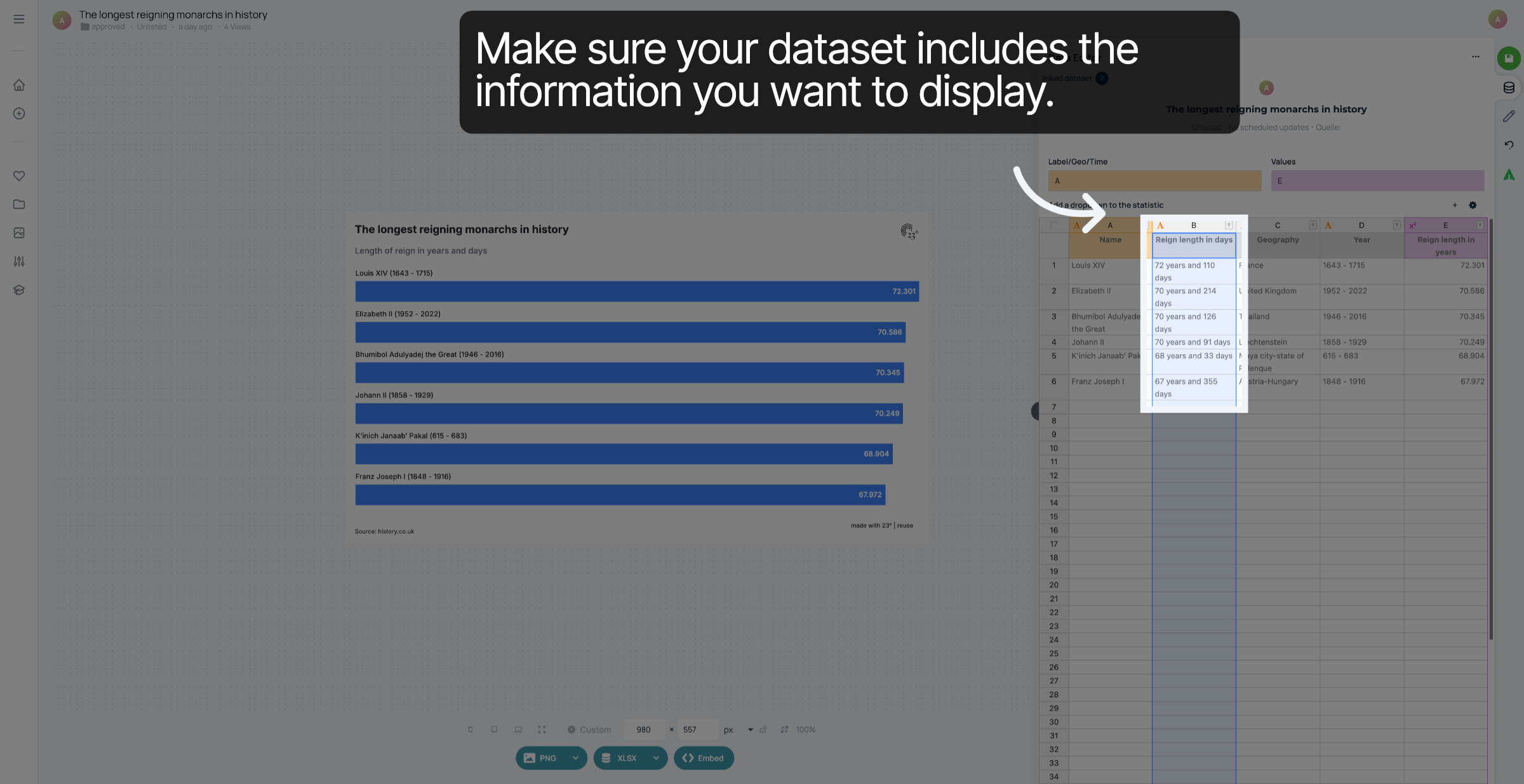
First, make sure your dataset contains the phrasing you want to display. dataset should contain a column with the information you want to display.
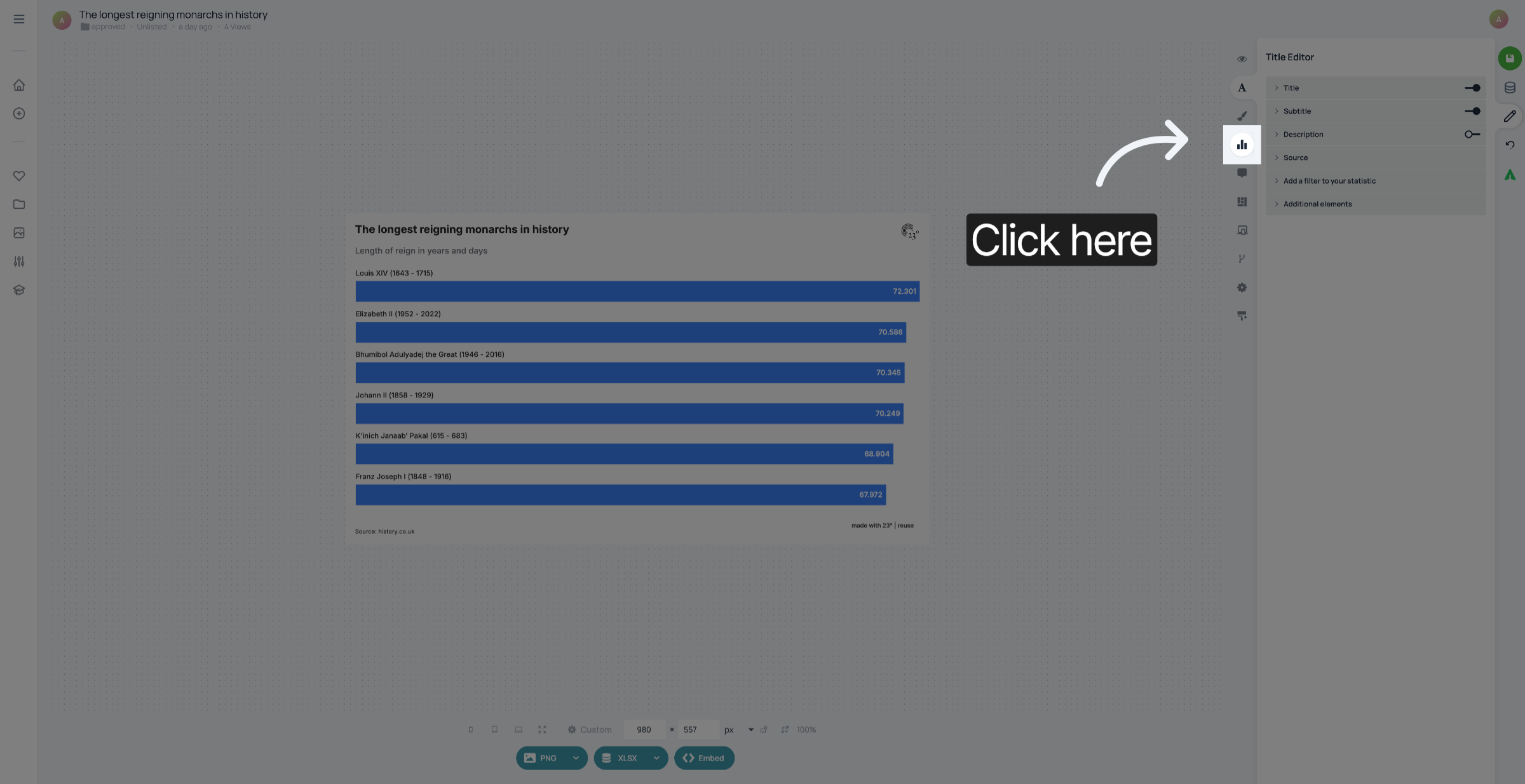
To edit the displayed values, go to the Chart Editor.
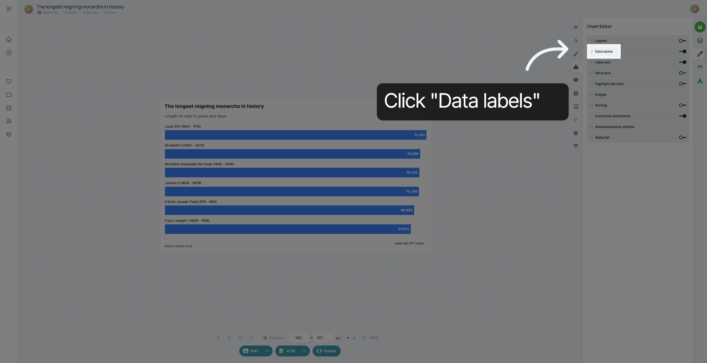
Click "Data Labels".
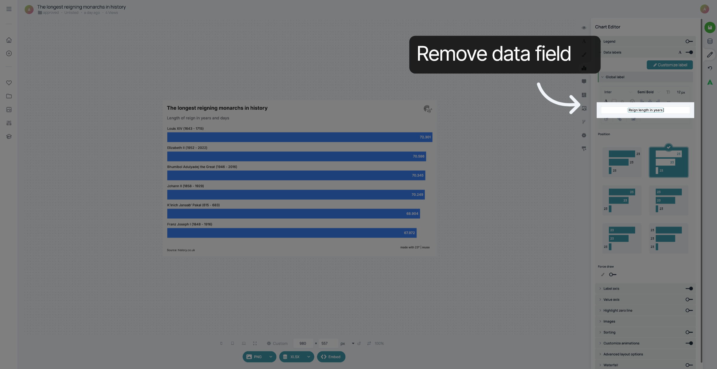
Delete the value field that is currently displayed.
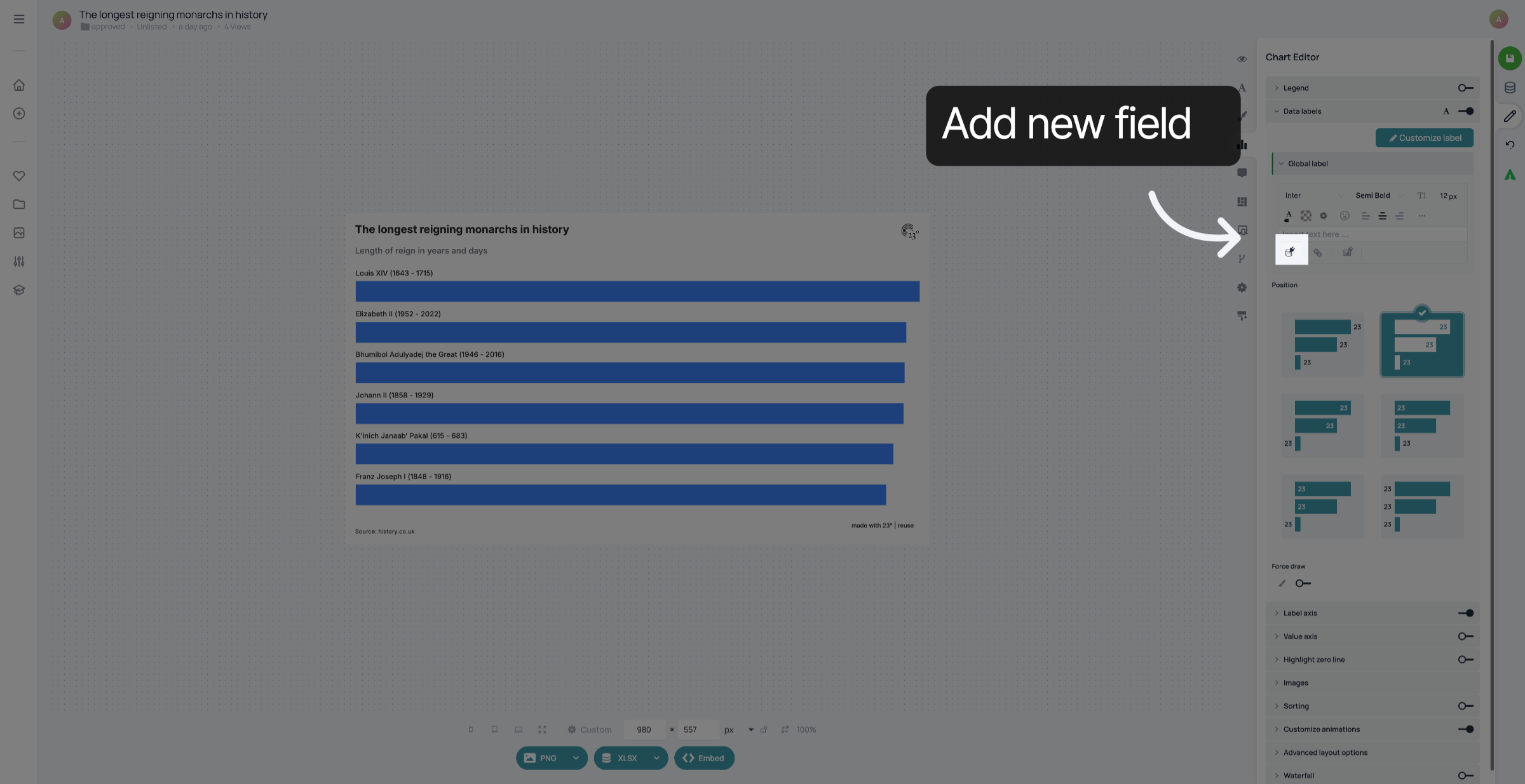
Click here to add a new field
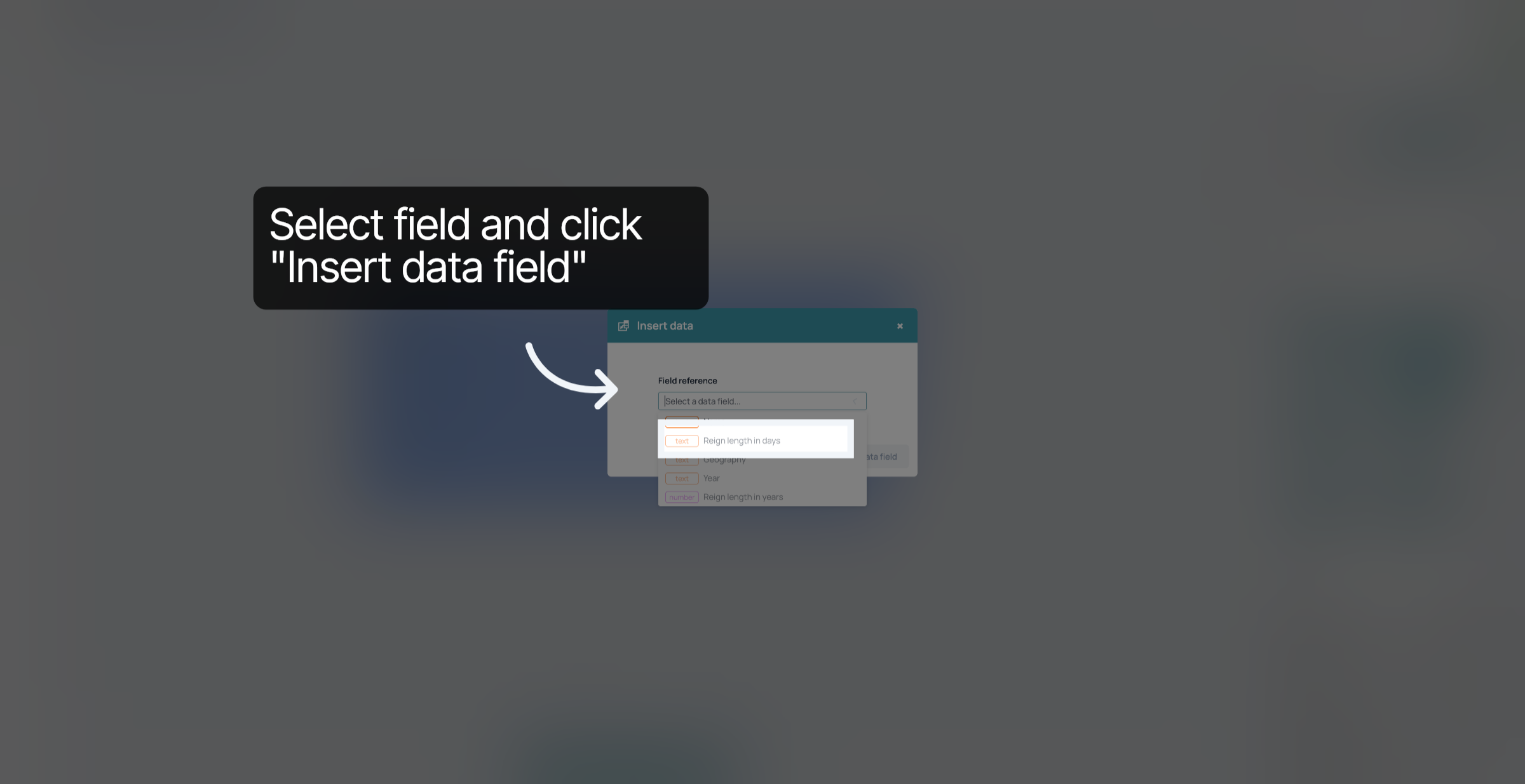
Select the field you want to display and click "Insert data field".
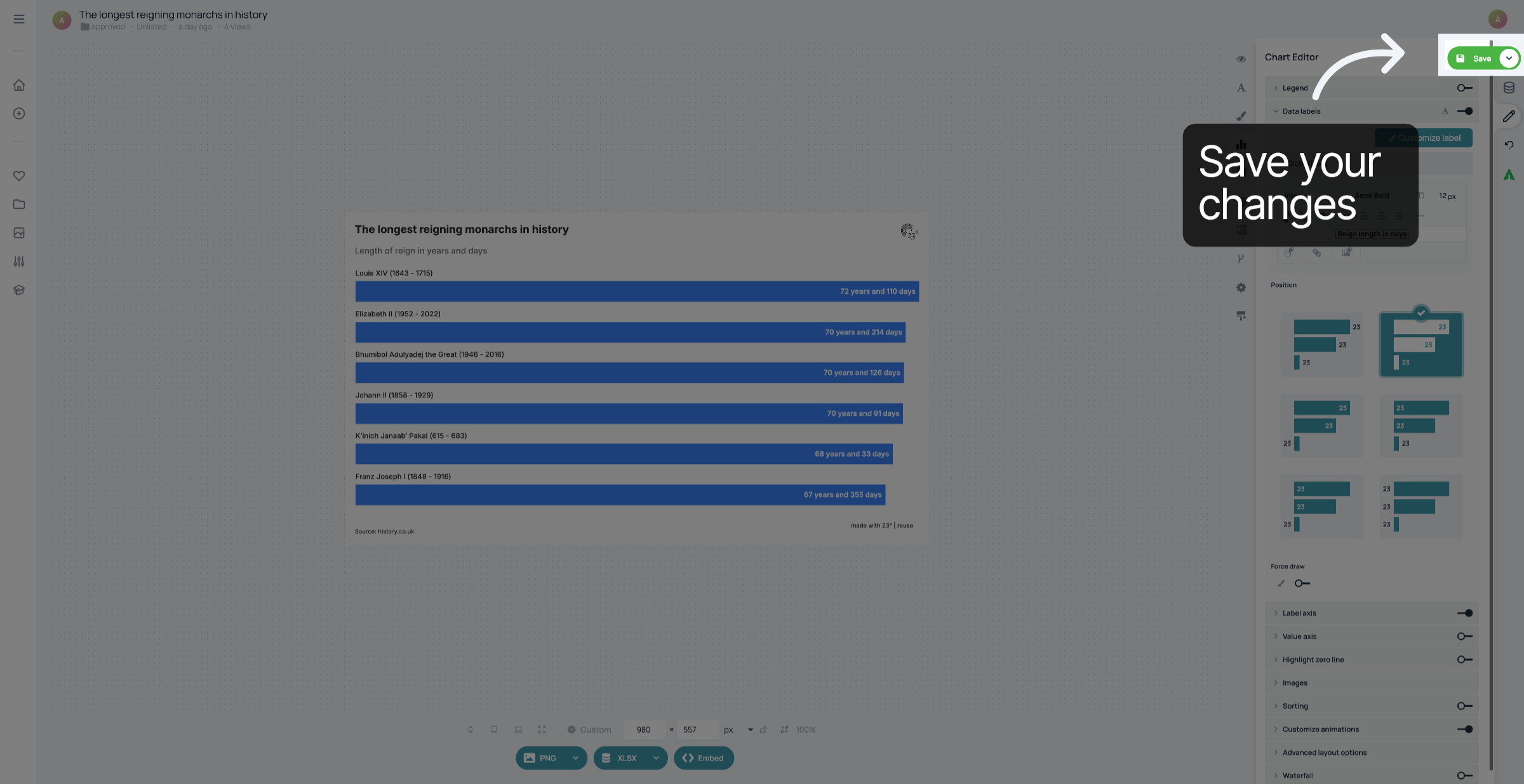
Your chart now displays the years in years and days instead of the decimals. Don't forget to save your changes.
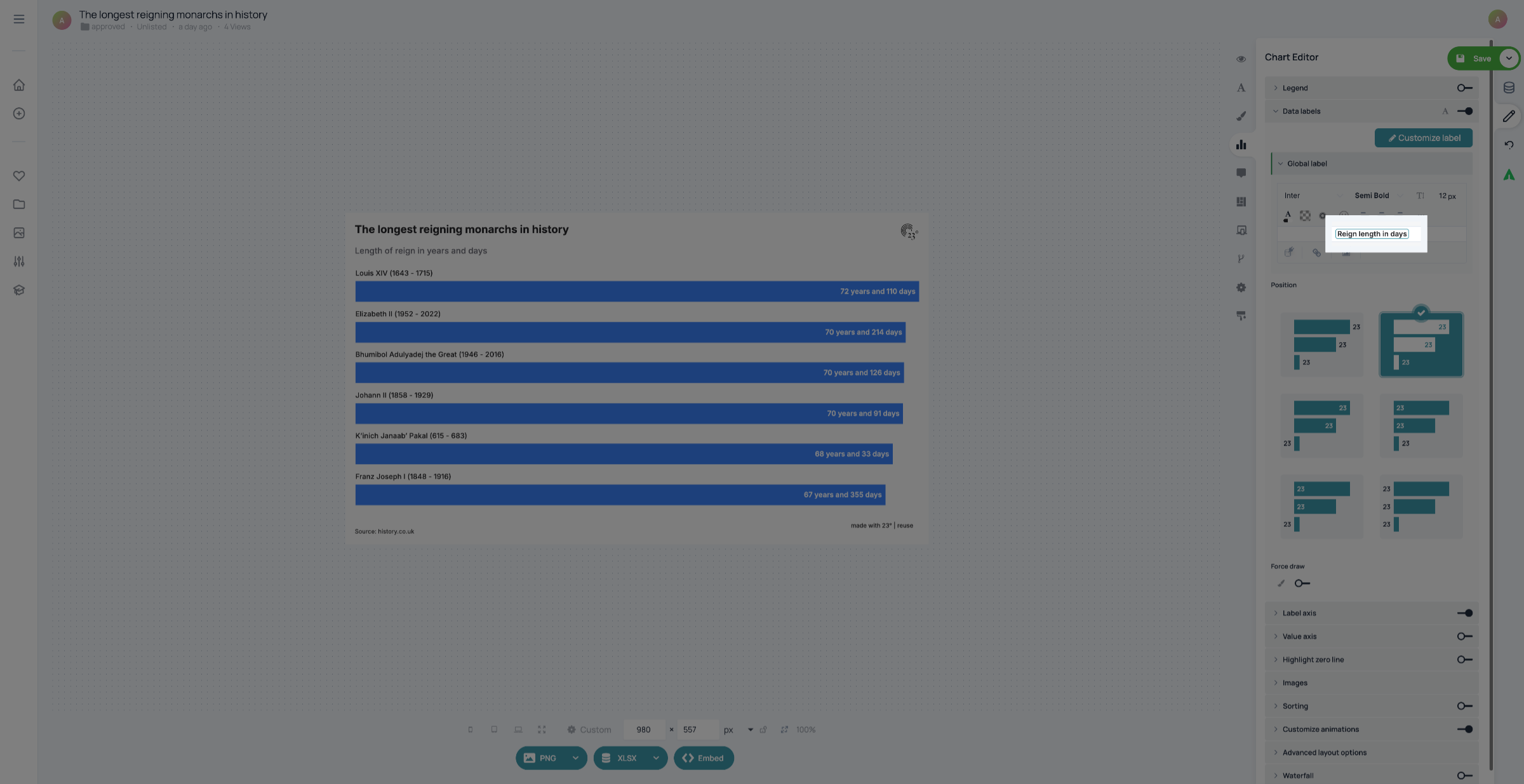
Your chart now displays the years in years and days instead of the decimals. Don't forget to save your changes.
You have successfully customized the 23degrees data display by selecting and inserting an alternative field instead of the default value.