How to add a filter to a visualisation
This tutorial demonstrates how to add a filter to your visualisation.
If you have a visualisation with categories that you want the users to be able to filter by within the visualisation, click here to go to your dataset.
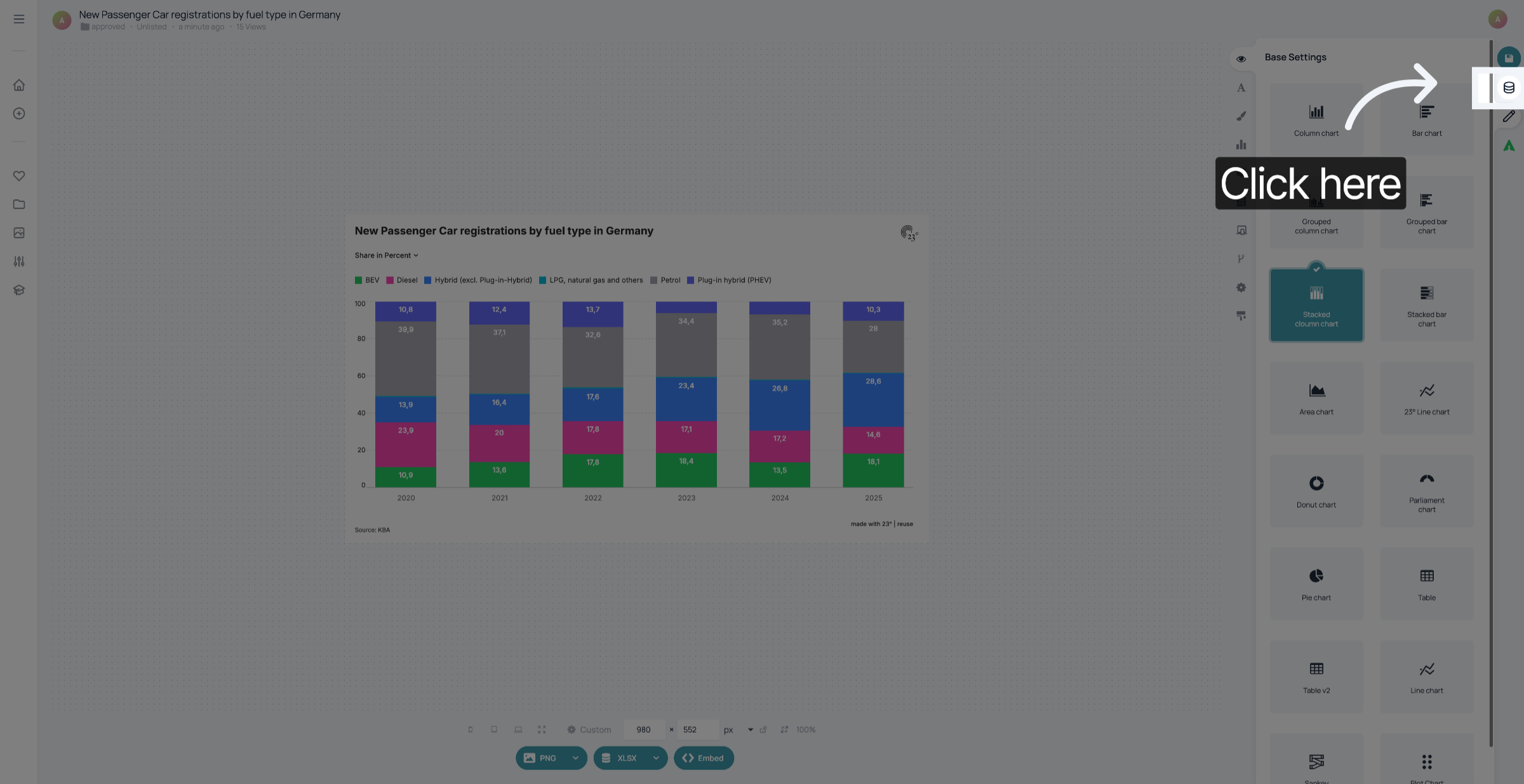
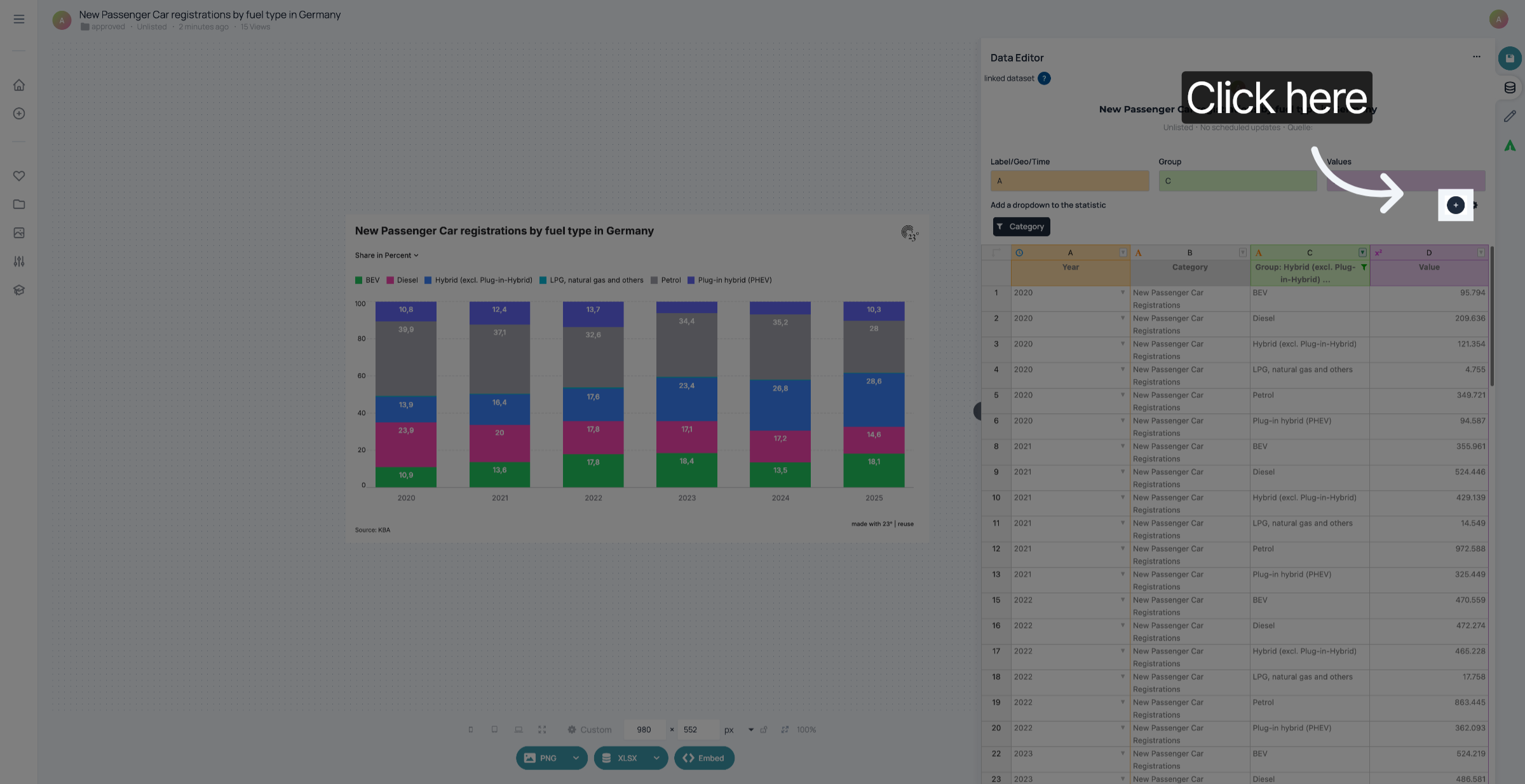
Click the plus sign to add a filter.
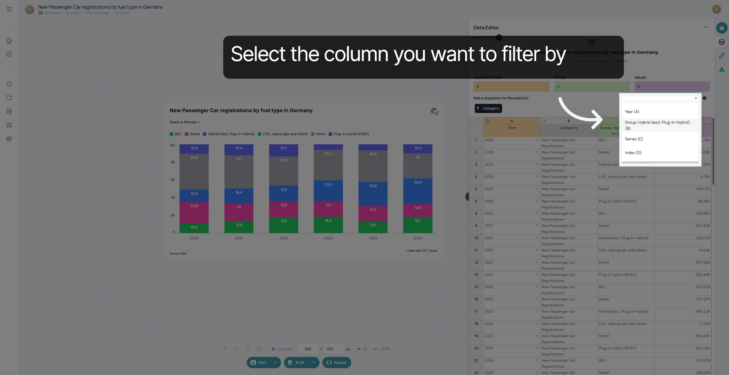
Select the column you want to filter by. Your filter will be added.
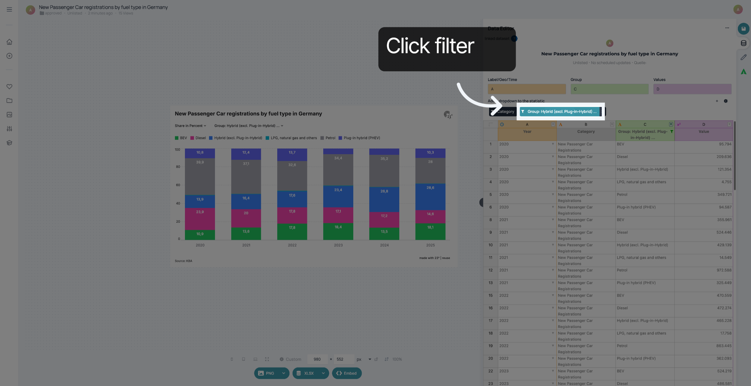
To Edit your filter, click on the name of the column above your dataset.
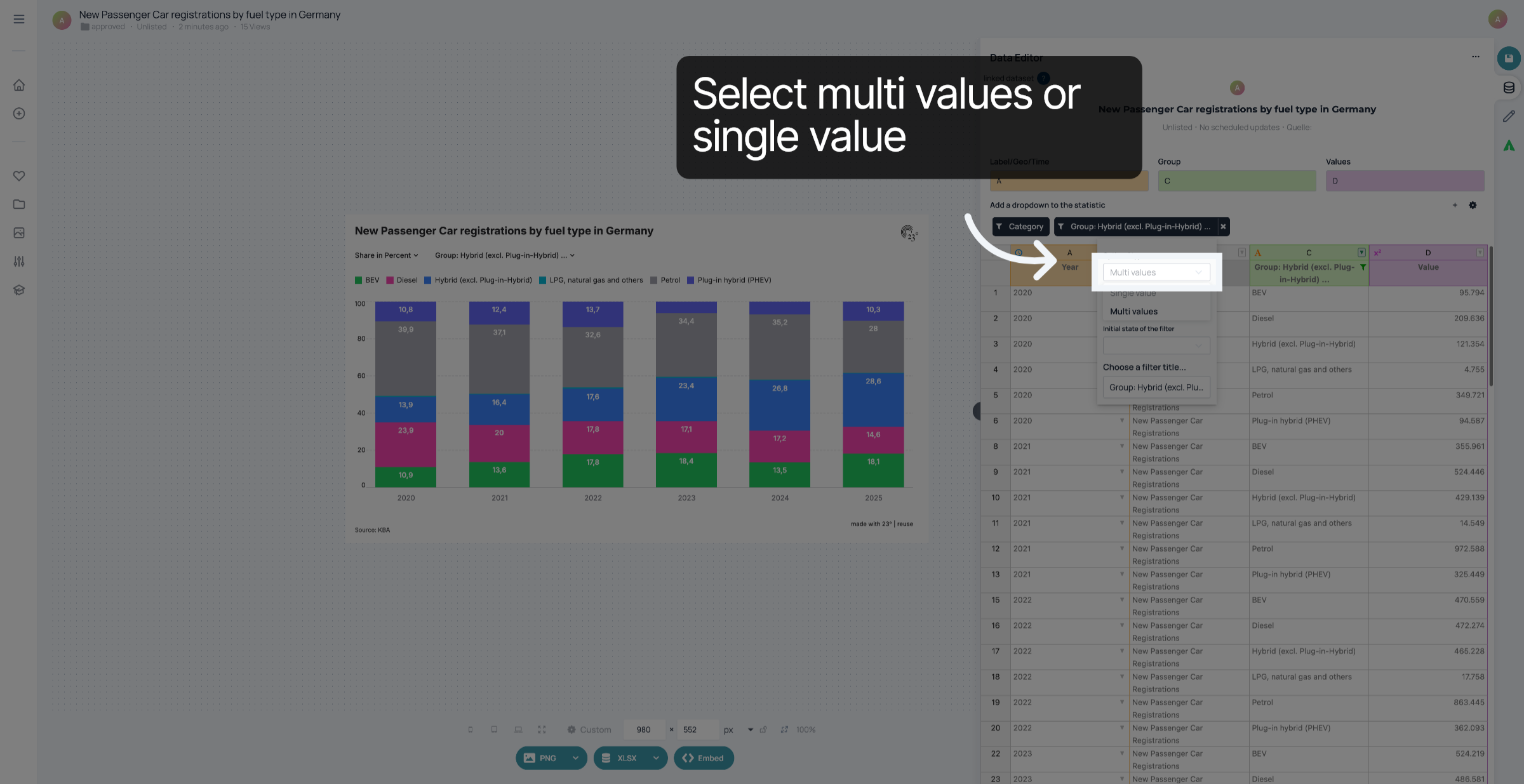
Click "multi values" if you want the users to combine different categories within the filter. If you only want to show one category at a time, click "Single value".
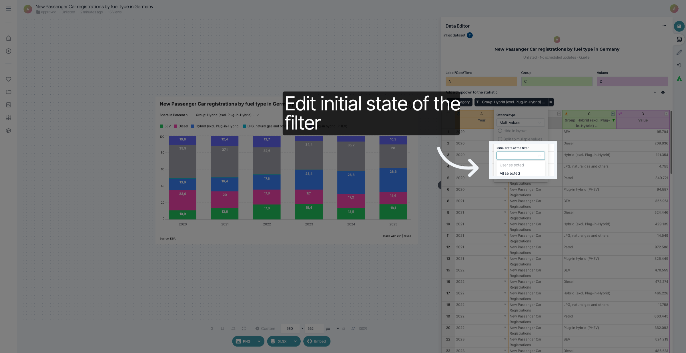
Select "All selected" if you want all of the categories to be displayed when a user opens your visualisation. If you want a selection talready in place, click "User selected" and select the categories you want to display directly in the filter within the visualisation.
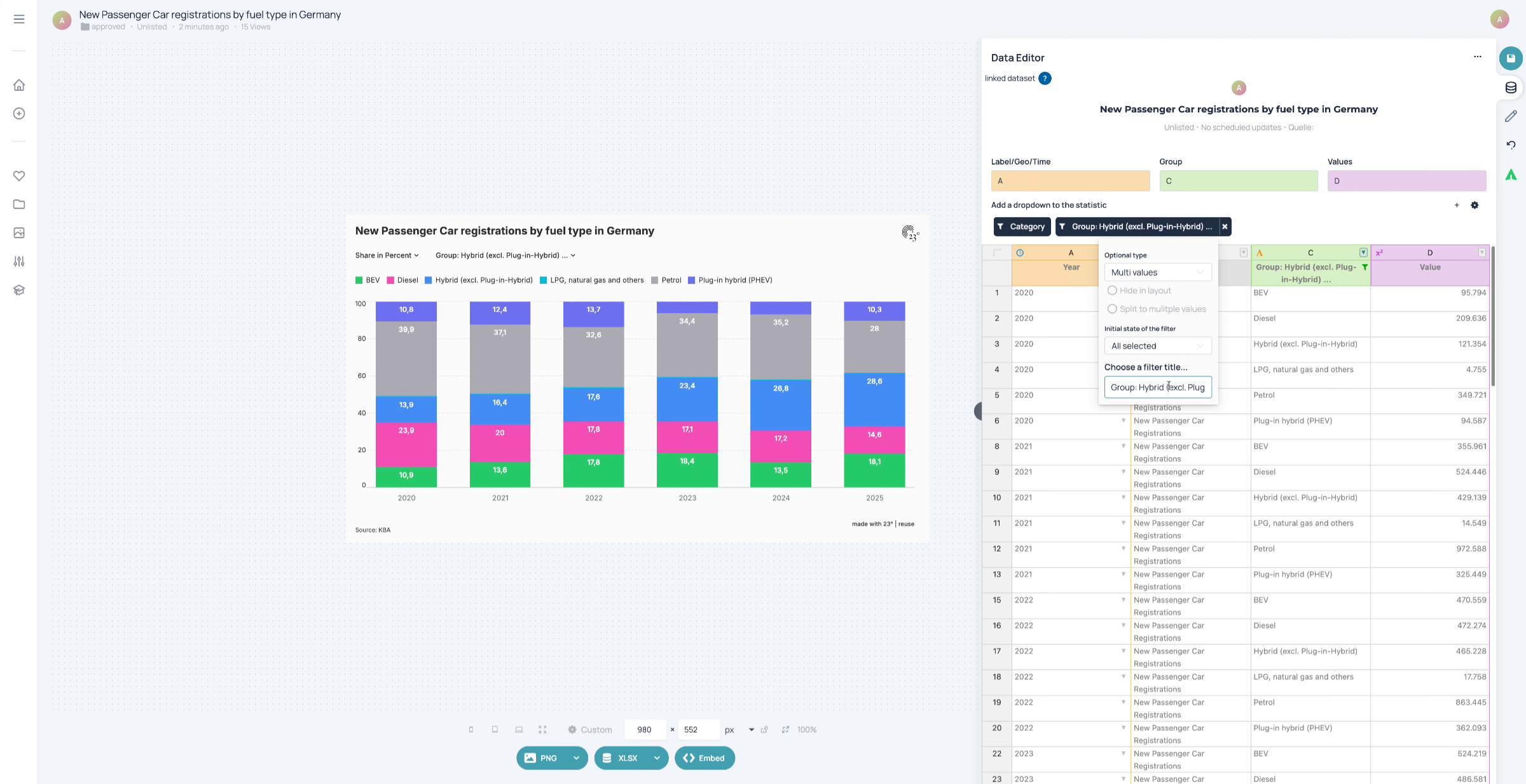
Type in a title for your filter. "Fuel type", for example.
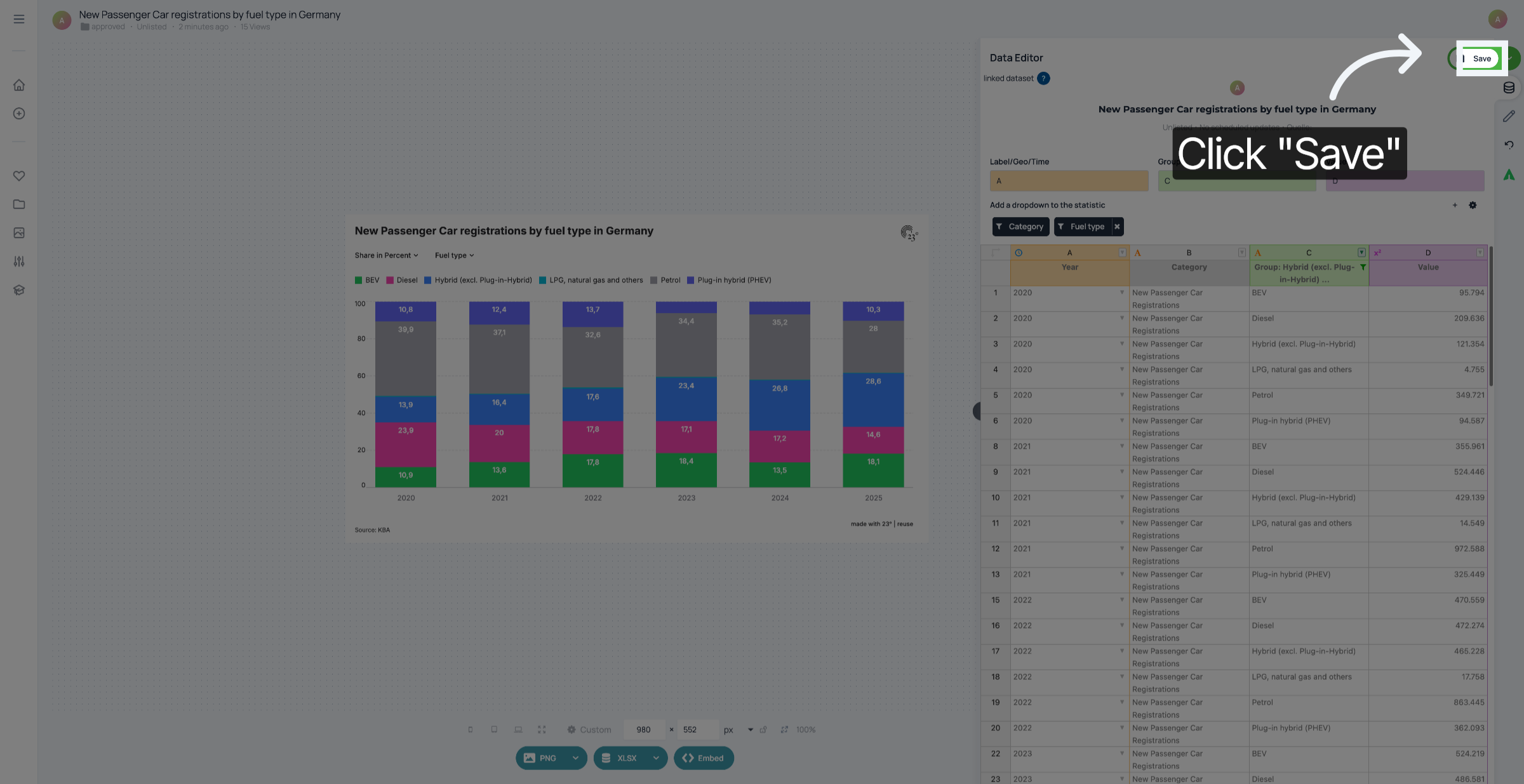
Don't forget to save your changes.
You have successfully added to your visualisation.