























Data visualization app

Create interactive charts, maps, and dashboards
without programming
Trusted by organizations that publish data at scale
  • GDV logo
  • Hays logo
  • IFW logo
  • OESTERREICHISCHER GEMEINDEBUND logo
  • RHEINISCHE POST logo
  • TAGESSCHAU logo
  • TRANSPARENCY INTERNATIONAL logo
Data visualization, fast and easy
Create charts without programming
1
Easy data import
Copy data from the web, Excel, or Google Sheets. Upload CSV/XLS files or link to a URL or Google Sheet for live updates.

Make your data visible

We help you publish statistics, studies, and datasets in a way that makes them findable, understandable, and reusable – on your own channels and in the 23° Explorer.

Examples
Solutions for your data visualization
Our platform offers tailored solutions for a wide range of industries. Whether you need to visualize data for media, associations, public authorities, or other fields, we provide the tools you need to quickly prepare your data and present it in a modern visual format.
Public sector
The 23° Explorer bundles verified data sources, indicators, and topics in a research catalog for ministries, authorities, and public institutions.
Municipalities
Create meaningful visualizations for your reports
Consultants
Compare data and gain quick insights
Media
Create maps, charts, and data-driven stories in your own brand identity with your editorial team or based on ready-to-use statistics from the 23° Explorer.
Associations
Create interactive, accessible visualizations that journalists, members, and decision-makers can use directly – on brand, easy to understand, and ready to publish immediately.
Data visualizations made easy
Data import made easy
Drop in your data and get started right away, no detours, no stress.
Make it yours
Logo, colors, fonts: your brand, your charts.
Private stays private
All charts start out private. Sharing them is your choice.
Share with control
Decide who can see what and who can collaborate.
Always live, always up to date
Connect your data sources and they update automatically.
Perfect on every device
Desktop, tablet, or phone: your charts look great everywhere.
Day mode or night mode
Light mode by day, dark mode by night: the choice is yours.
One dataset, many visualizations!
Quickly create multiple charts from one dataset: filter, adjust, and go.
Print-ready charts
Export your charts as PDFs, ready for reports, posters, or presentations.
Export the way you want
PDF, PNG, or social media: your charts are ready for anything.
Automate everything
Take your workflows to the next level with our API.
Support that is there for you
Questions? Our team helps quickly, kindly, and without annoying bots or tickets.
With 23degrees.io, you turn complex information into clear, interactive data visualizations that people can discover, understand, and use.
Bring your data to life
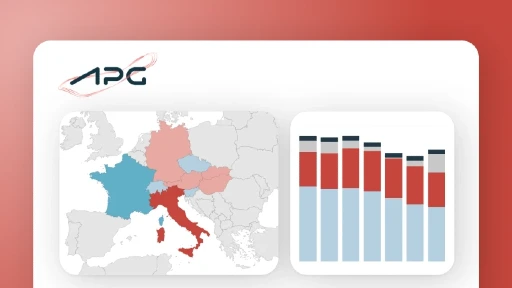
Die Energiewende ist komplex. Mit dem APG Powermonitor macht Austrian Power Grid zentrale Daten zur österreichischen Stromversorgung sichtbar.
July 3, 2026
Use Cases
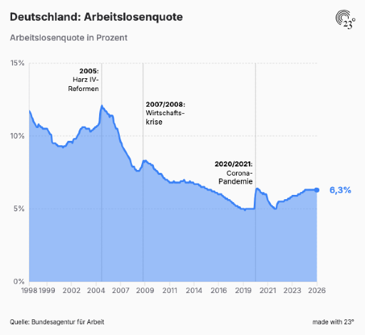
Der Fachkräftemangel ist eines der zentralen Themen der deutschen Wirtschaft. Doch wer ihn erklären will, braucht mehr als Bauchgefühl.
July 3, 2026
Use Cases
In den letzten Monaten haben wir intensiv daran gearbeitet, den 23degrees Explorer klarer, intuitiver und hilfreicher zu machen. Unser Ziel war nicht einfach ein neues Design. Unser Ziel war eine bessere Erfahrung für alle, die Daten, Statistiken und Insights schneller finden, einordnen und weiterverwenden möchten.
July 3, 2026
Product & Company Updates
FAQ