Grouped Bar Chart
Here we show you how to create and customize a grouped bar chart.
Welcome to our Grouped Bar Chart-Tutorial!
In this tutorial, we will show you how to quickly and easily create grouped bar charts with our 23° Atlas tool.
With grouped Bar charts allow you to effectively visualize data and convey complex information at a glance. In this tutorial, you will learn step by step how to create and edit these charts and how to use them for precise data analysis. Let's go!
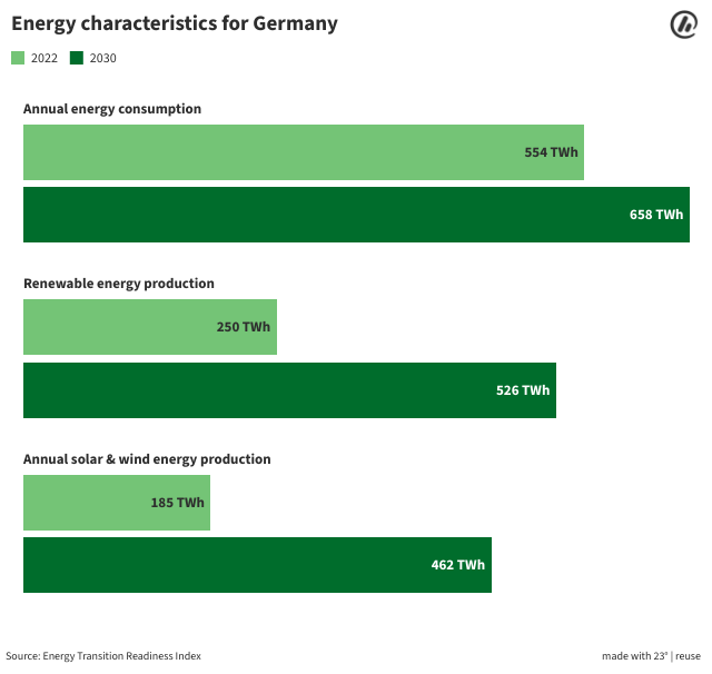
In this tutorial, we will create the following grouped bar chart together:
How do I create a grouped bar chart, what are the first steps?
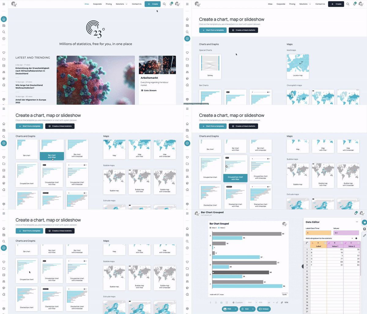
Once you have logged in to Atlas, you have two options for creating a grouped bar chart:
- At the top right you have the Create button, which will take you to the next steps.
- On the left sidebar you can access the + Create button to the various visualizations and can select the right option for you here.
- CSV-Upload: To do this, click on the three dots at the top right of the table window. The desired CSV can now either be inserted into the dashed box Drag'n Drop.csv or you can click on the dotted box to access your own file manager to import the desired CSV file in this way.
- Manual data entry: Manual data entry works in a similar way to Excel or other programs. Texts and numbers can simply be written into the cells.
- Copy/Paste: Of course, the data can also be easily copied into the data table of the grouped bar chart. You can also copy and paste the header row here.
Data Editor
Once you have selected "Grouped Bar Chart", examples will be displayed. The data editor is displayed on the right-hand side. The left-hand column is the label column and is displayed on the label axis. The 2 columns on the right represent the value columns and contain numbers that are displayed on the value axis. The basic difference to the conventional bar chart is the number of value columns.
You can replace the data in the template with your own data. You have three options for this:
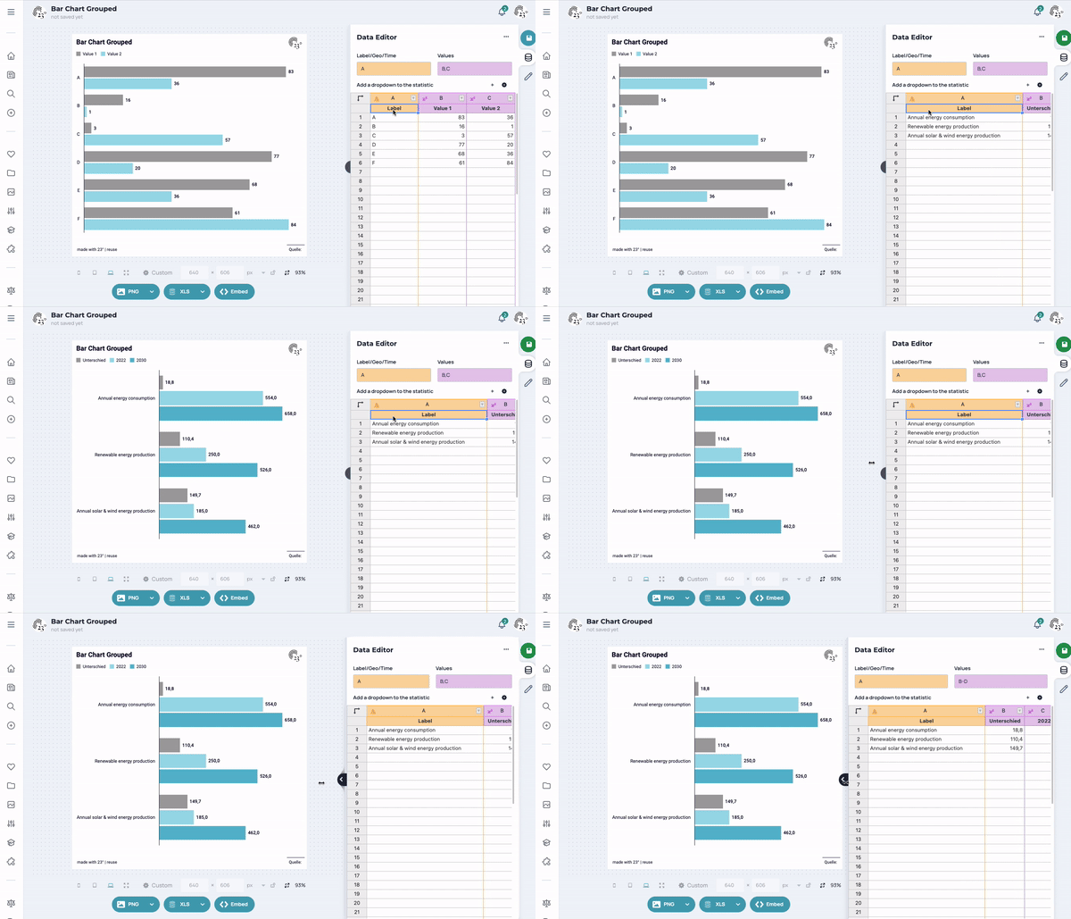
In our example, we copy/paste the data into out data editor. As you can see, the grouped bar charts adjusts just-in-time.
Above the data editor, you will see two input fields. Here you can assign the columns for the value and label axis.Each diagram requires at least one labeling column (Text or time) and a column with associated values (Values column).
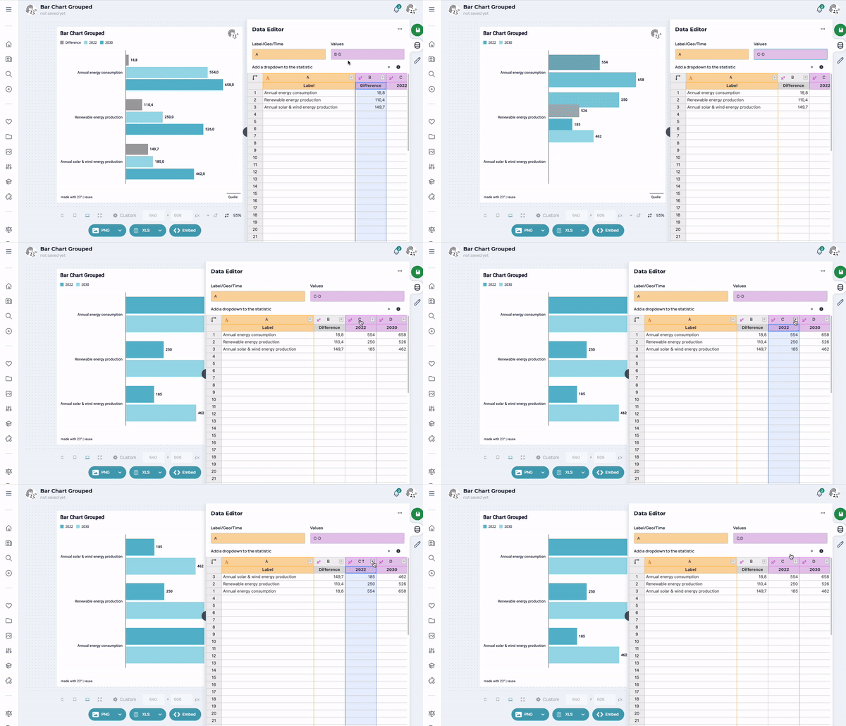
The label and value columns are freely selectable. In a grouped bar chart, you can select more than one value column (separated by a comma or hyphen). The 23° Atlas tool itself recognizes which columns are value columns.
Long and wide data format
With a wide format, you see several value columns individually. With a long format, all value columns are combined into a group, whereby an additional input field is displayed for the group.
Remove or add columns
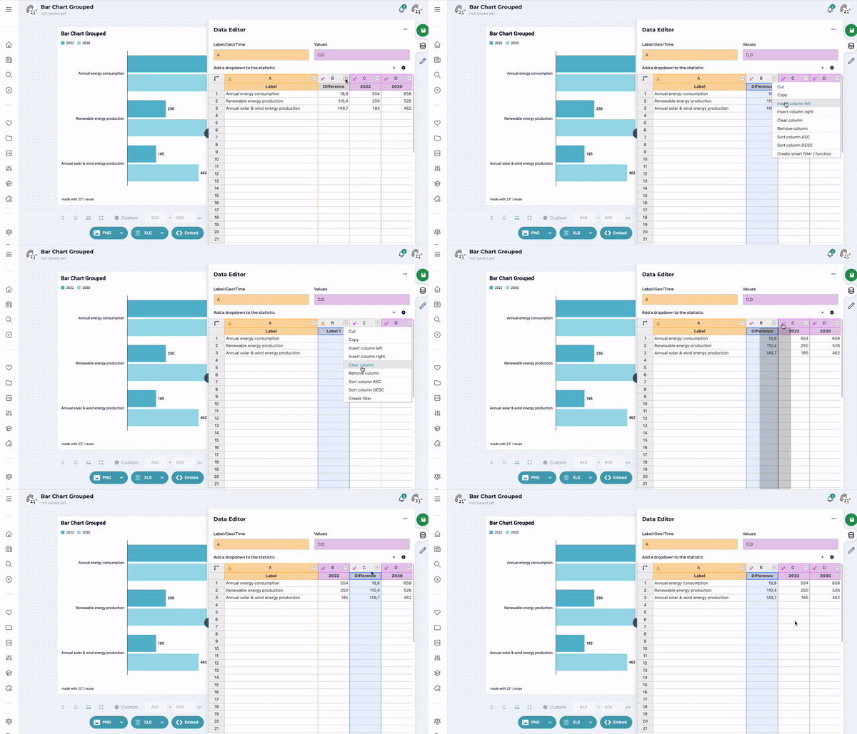
Columns can be added and removed via the column menu. You can access the column menu either by right-clicking with the mouse or by clicking on the small triangle at the top of the columns. You can move a column by selecting the entire column and dragging it in the desired direction.
Change the order of the column contents
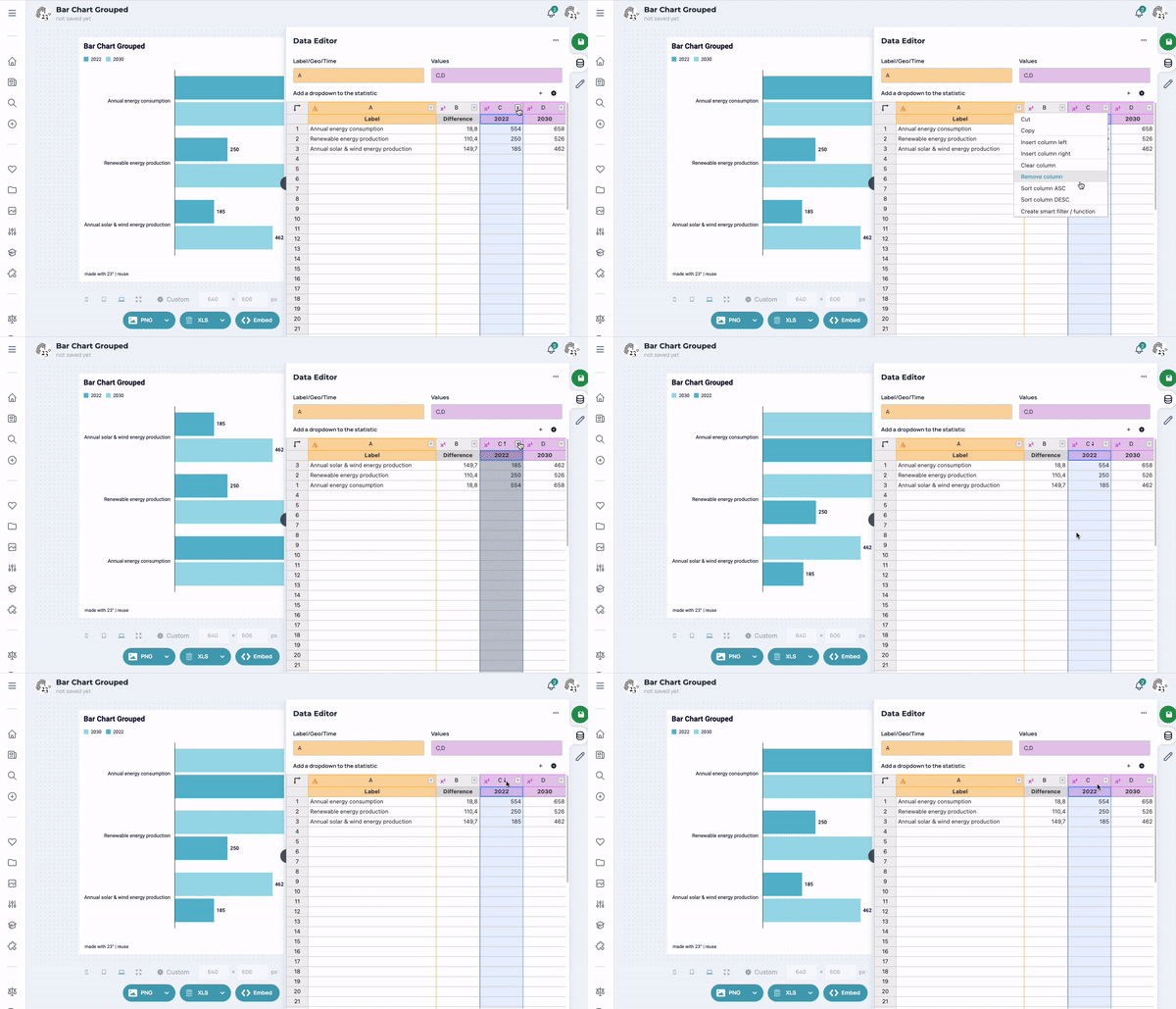
By default, the data is displayed as you upload it or type it in manually. Of course, you can then sort the column yourself by clicking on the column menu and clicking on sort column ascending or sort column descending. You can also do this by clicking on the letter without having to open the column menu. The graphic changes depending on your preferred sorting.
Filter data in the data table
Filtering helps you if you only want to display a certain age group, certain years or values. In the column menu you will find the selection Create filter. In this example, we display the bottom ten data entries.
If you want to delete a filter, you can do this again via the column menu by selecting Remove filter.
Transpose raw data
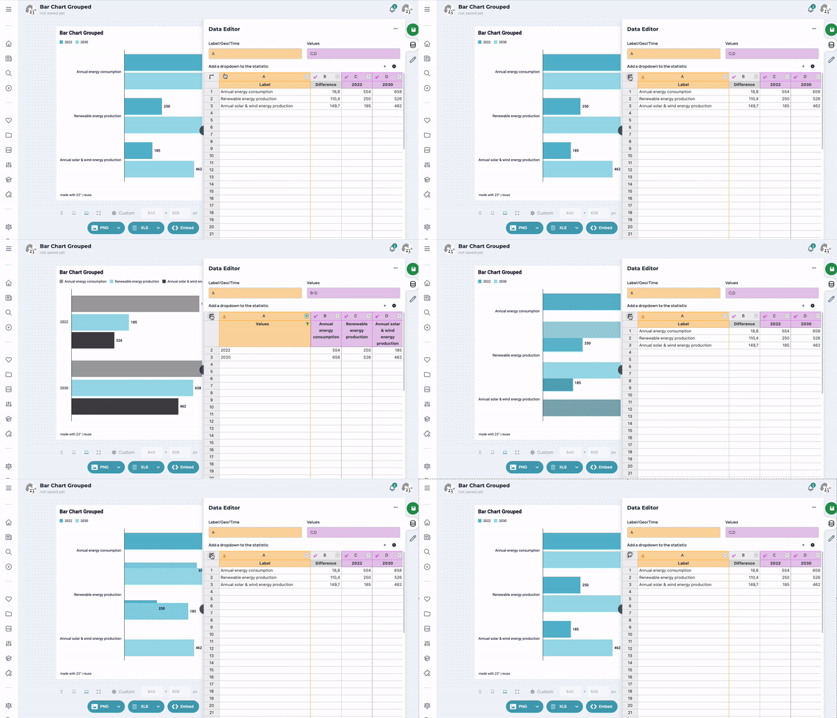
At the top left of the table is the Transpose button with which you can transpose the entire table. Please note that transposing can also become more difficult if you have several text columns in the raw data. It is best to keep trying until the chart is as desired. In our example, you can see how the chart changes. Of course, you can also go back to your original visualization by clicking the transpose button again.
I would like to display a dropdown in my visualization: How do I do that?
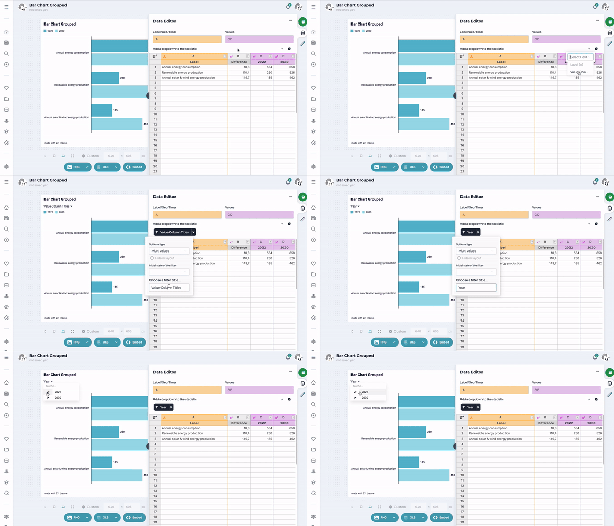
You can insert a filter (e.g. dropdown) into a diagram for each text column. To do this, simply click on the + sign next to the note Add dropdown to statistics. A selection window now opens, after which you can select the desired column. After clicking on the desired column, a filter (dropdown) is added to the statistics. At the same time, a small black field appears above the data table, where the column name is displayed. You will then see the filter directly in the graphic and can now make your desired selection.
How can I change/customize filters in the statistics?
Click on the small black field above the data table to open the Filter Editor. Here you can set which type of filter should be applied, what the initial state of the filter should be and whether the filter should have a title.
There's suddenly a dropdown in my visualization: What can I do?
Depending on what the data you want to visualize in a chart looks like, a filter (dropdown) may suddenly appear above the chart. If this is the case, a small black field will also appear above the data table.
If you don't want that, you have these options:
- If more than one value column can be selected via a dropdown, you can enter a value in the data editor in the input field Values simply deselect all value columns that are not to be displayed.
- If you have 2 text columns in your chart, one of which is used as a filter in the statistics, you can filter the data in the data table.
In addition to the data editor, you will also find a large selection of editors, such as the title editor, the color editor and the diagram editor. You can find them under the pencil icon.
The Title Editor
Here you can edit and customize titles, subtitles, references and descriptions.
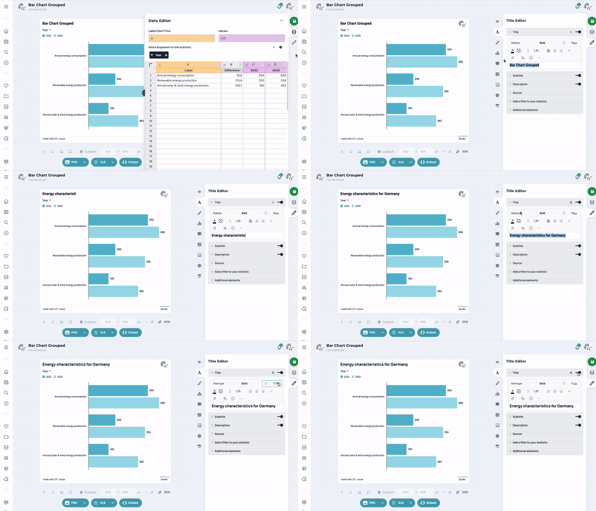
To make your own fonts available at 23°, simply contact 23° support at [email protected].
Setting the spacing of the text field
Of course, you can change the spacing of a text field to the top/bottom and to the right/left. This is done via the padding and margin settings of this text field.
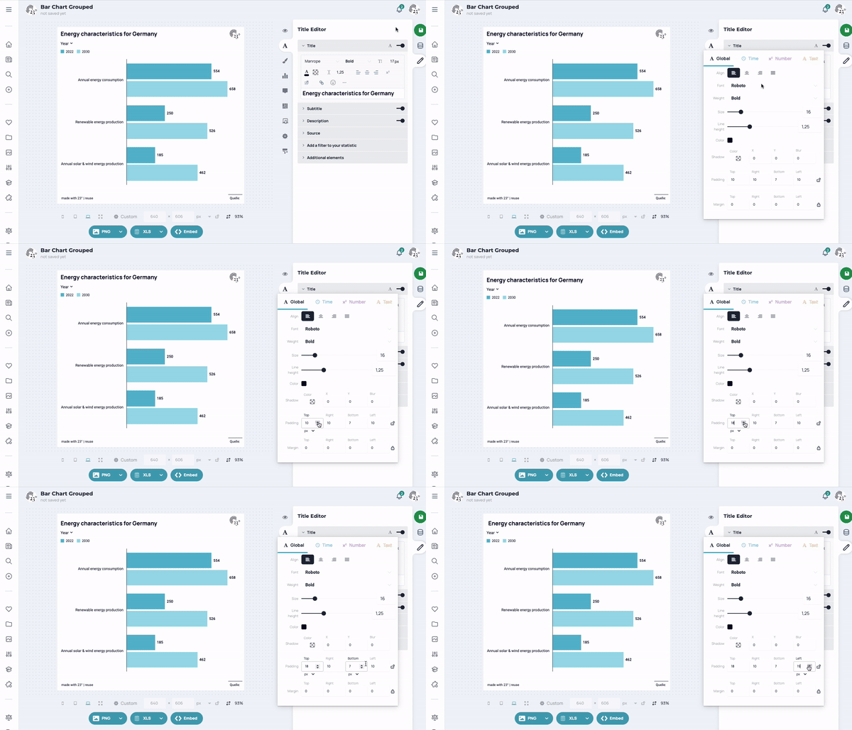
Padding
Padding is the internal spacing of an element, in this case the text element. This is the space between the content of an element and the element border. This space can be selected individually for all four sides or directions of the element.
Margin
The value Margin is used to position the element. This is the outer spacing. This is located outside the actual element. This allows the distance to other elements or to the side edges to be defined. This can also be set individually for all four sides or directions.
Save settings for the next graphic (design templates)
If you want to save templates for your next graph, click on the capital A in the top right corner. This contains global text settings for this text field, which are necessary for the creation of templates. Whatever is set here can be transferred to a design template for this diagram type. The same applies to the spacing of the text field (padding/margin). Further information on creating and using design templates can be found in this tutorial.
Tooltips are comments and notes on a diagram or map that appear as soon as you click on a specific point in a graphic or move the mouse pointer over a specific point.
You can find the tooltip editor under the diagram editor with the text field button. There you can edit and customize your tooltips.
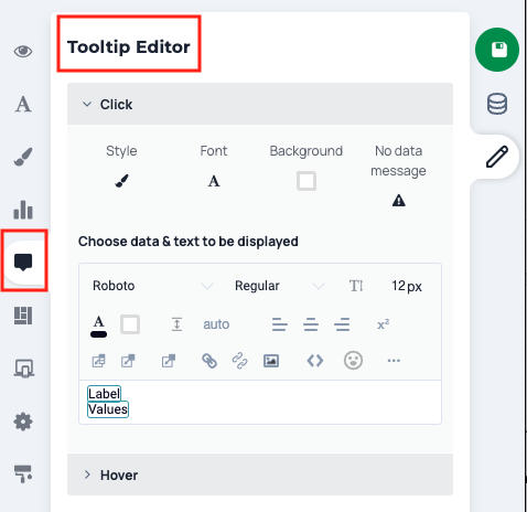
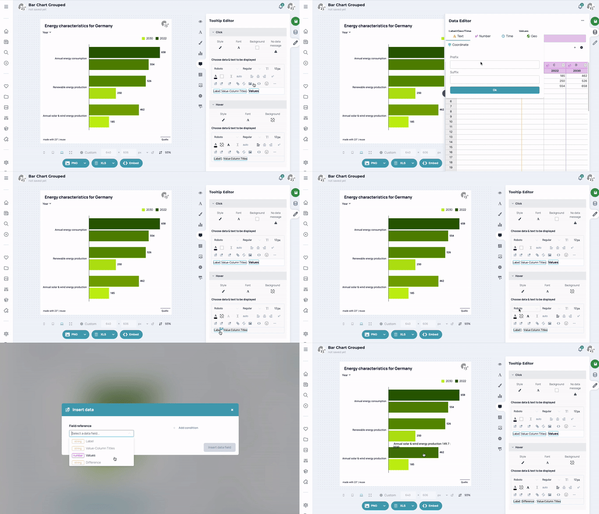
Customize contents of tooltips
Tooltips are comparable to all other text fields. In addition to the familiar options (change font), data fields from the table can also be inserted here or links can be set.
Tooltips are preset so that the name and associated value of the bar that is clicked are displayed. The two data fields Label and Value are initially displayed, which refer to the assigned column with the designations (Label column) and the corresponding column with the values (Values column).
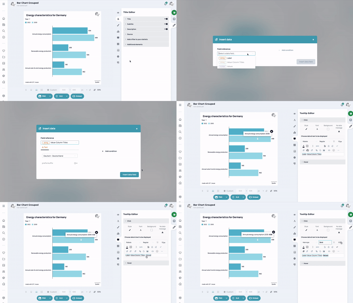
In our tooltip, we want to use the column Difference. To do this, we must first convert the value column into a text column so that we can then insert it into the tooltip. We also display hover tooltips in this example - the choice is entirely up to you.
In addition to the familiar options, such as changing the font and adjusting the font size, data fields can also be inserted from the table or links can be set. The data field input can be used to insert texts or display certain cells from the table, even with a link to conditions. You can do this simply by clicking on the Insert data field. You can find more information about inserting graphics in this course.
Customize the display of tooltips
Tooltips can look very different. Their appearance can even vary in the same diagram, depending on whether they are displayed on a mobile device (little space) or on a desktop computer (lots of space). The display options can be set under Style (selectable above the text input field) and can basically be set as a small pop-up, sidebar or full screen.
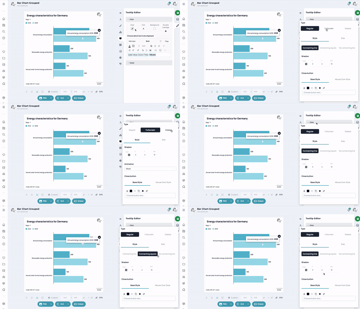
Save tooltip settings for the next graphic (design templates)
All display options (style, font, background, empty cells) can be transferred to a design template for this chart type. You can find more information on creating and using design templates inthis tutorial.
How do I get values that are not displayed in the diagram into a tooltip?
You often want to display values in a tooltip that are not already shown in the diagram. This is very easy to do. Simply change the corresponding column in the data editor (presumably a value column in which numbers are listed) to a text column. As soon as you have changed this, the desired figures are available as text (i.e. no longer formatable) and can be easily displayed in any text field.
You can color grouped bar charts very differently. Under the color editor, you have the option of making your chart visually appealing. You will find this behind the Brush Button.
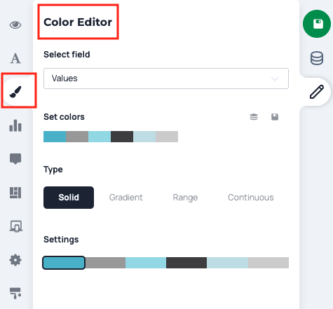
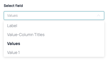
The coloring can be done either according to the names that the bars have, according to the corresponding values or according to the value columns (if there is more than one value column). You have the option with Select field at the top.
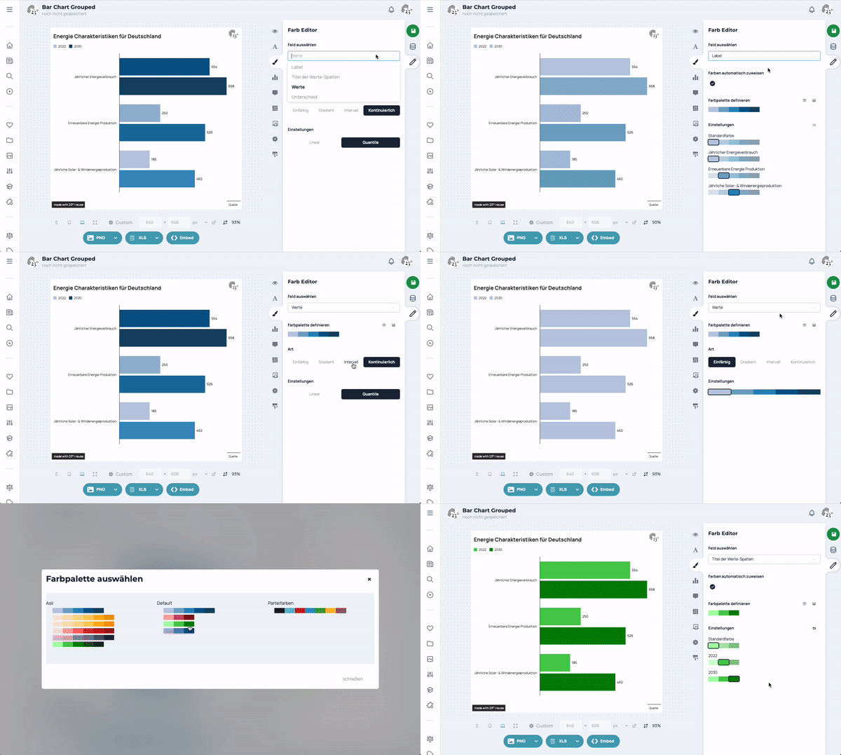
Color all bars in the same color
Many roads lead to Rome. Coloring all bars in the same color can be achieved in 2 ways, either by coloring the bars according to the bar names (Labels), or by coloring the bars according to their values (Values). Then you can select Monochrome and choose the right color.
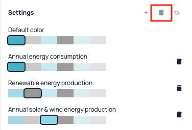
Click on Select field and then choose Labels to color over the column with the bar names. Here, you can assign the same color to all bar names. If this is too tiring, you can also delete all color assignments by clicking on the trash can so that only the standard color is used for coloring.
Highlight certain bars
If you only want to highlight certain bars, select under Select field the list entry Labels to color over the column with the names of the bars.
In the case of a grouped bar chart, you can also color the bars depending on the value column displayed.
Color the bars differently depending on their values
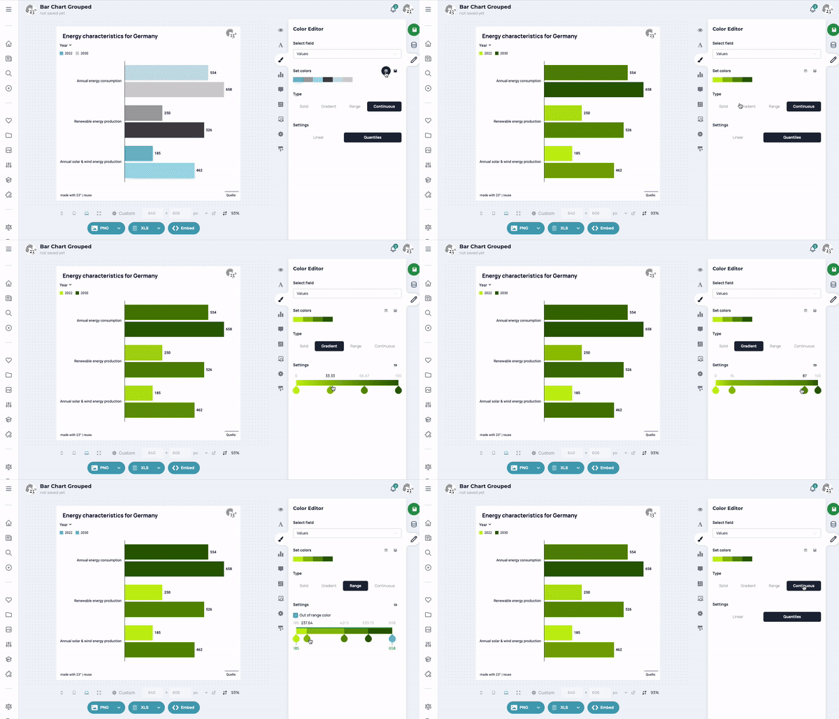
If you want to color bars depending on their values, select under Select field the list entry Values to color over the column with the bar values.
You can now choose from several options.
Solid
If you select this setting, you can give each bar exactly one color, regardless of the values.
Gradient
If you select Gradient, the underlying values are normalized for the colouring (from 0 to 100). The coloring is fluid. The coloring thresholds can be varied manually.
Interval
With interval coloring, you assign colors to certain value intervals. In a grouped bar chart, for example, all bars that are greater than any threshold value can be colored red.
Continuous
With continuous coloring, quantiles are calculated based on the values of the bars in the chart. Coloring based on these quantiles produces a rounder coloring than gradient or quantile coloring. However, this is not as sensitive if there are outliers in the data.
Selecting and changing the color palette
You can see the available colors under Farbpalette definieren. By clicking on this color palette, it can be extended and changed as required. You can also save color palettes once they have been created so that you can easily access the colors again later. You can find more information on using the color editor indhis tutorial.
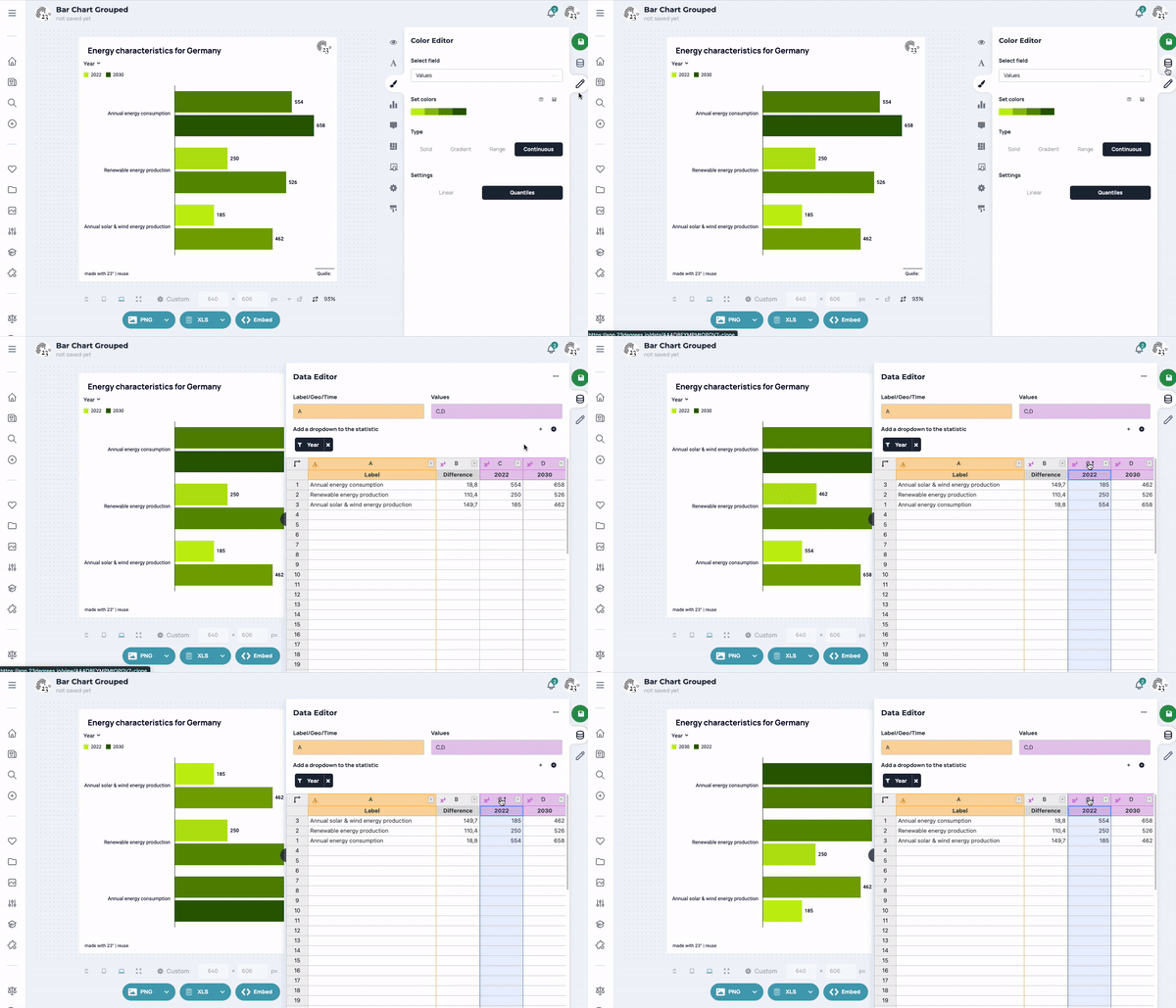
The order of the bars always follows the data entered in the data table in the Data editor are stored. There are basically two ways to change the order of the bars. Please note that both values, i.e. both bars for a value, can be moved, or the order of the 2 bars per label can be changed.
- You can rewrite the data manually at any time so that the order fits. This is particularly useful for small data sets.
- In the column menu of the table editor, you can sort the entire table according to a desired direction (ascending, descending). You can also sort by several columns, e.g. first by the first column and then by the second column. The diagram always changes according to the sorting.
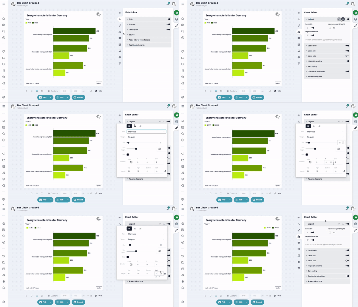
You can work on the visualization in the diagram editor. Among other things, you can adjust the legend, the values in the diagram, animations and other settings in connection with your graphic.
Customize legend settings
Here you can edit the legend and customize it according to your wishes. Among other things, you can either display a legend or omit it from your visualization.
Values in the diagram
You can position the values in a grouped bar chart very differently. Under the menu item Data Labels there are 6 selection fields for this. It is best to click through the options. As you can also display labels (bar designations) together with values in the text fields, there are many different ways to position texts in grouped bar charts.
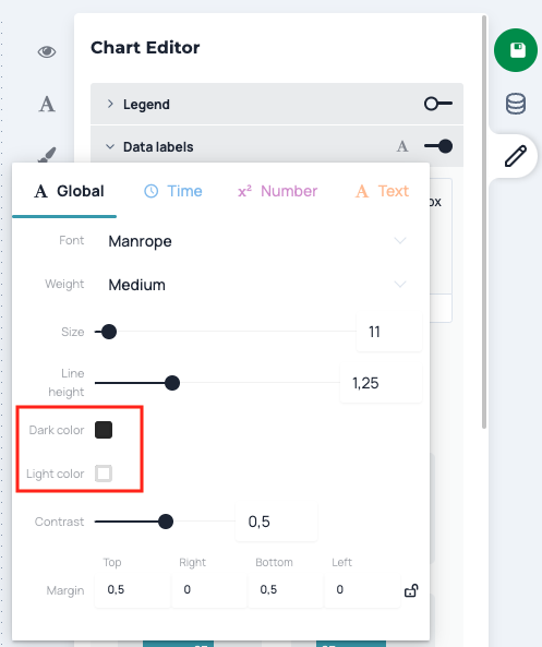
Contrast color
Unlike in other text fields, a contrasting color can be set for the values (or texts in general) in the grouped bar chart. This makes sense if you want to position values within differently colored bars, but want to ensure legibility in any case.
The contrasting color and also the factor at which it is to be adopted can be specified behind the A which can be found in the top right corner of the text editor. Here you can also set global text settings for this text field, which are necessary for the creation of templates. Whatever is set here can be transferred to a design template for this diagram type.
Format numbers
At the beginning, the data field Value (values associated with the bar) are preset and values are displayed in the bars. Normally, these values do not need to be formatted. However, if this is necessary for reasons of readability, you can do this in two ways:
- When you switch to the data editor, you can click on the x² symbol in the value column to access the format editor. Here you can very quickly and easily adjust rounds or decimal places in a variety of ways. If you format values here, this is applied everywhere (i.e. also in tooltips or if you display values in other text fields).
- By marking the field Value in the text editor, the format editor is activated at this point. This can now be opened by clicking on the x² and the values displayed in the grouped bar chart can now be adjusted. Important: This type of formatting only changes the output format of the values in the bars, but not in other places, such as the tooltips.
Only display or highlight certain values
It is possible to display only certain values or to highlight certain values. To do this, there is a selection below the text editor + Adjust certain values. Click to open a selection field from which you can activate the desired bars (and their values) in order to format them in a separate text input field.
How do I get values that are not displayed as a chart "into the chart" via a text field?
As already explained in Chapter 5 and the Difference column has been added to the tooltip, you must simply change the type of the column of the corresponding column in the Data editor (in our case Column B, Difference) into a text column. As soon as you have changed this, the desired numbers are available as text (i.e. no longer formatable) and can be easily displayed in any text field.
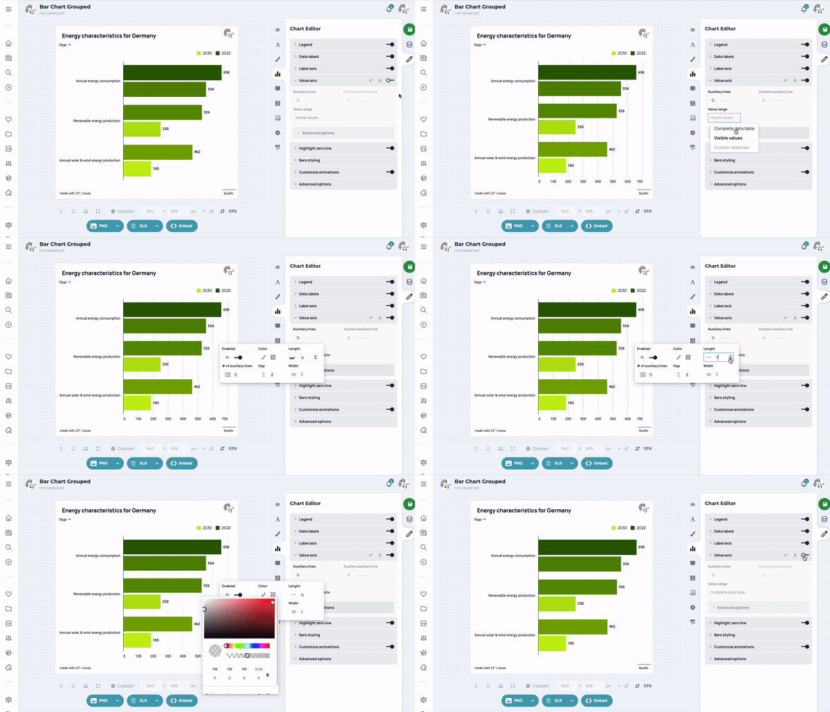
In the Chart Editor you can adjust the appearance and behavior of label and value axes.
Labeling axis
The label axis consists of two areas, the text field (including the customize option) and the Advanced settings.
Text field
In addition to the familiar options (change font), you can also insert data fields from the table or set links.
The text fields of the labeling axis are preset to display the names of the displayed bars (Label refers to the column assigned in the data with the designations Label-column).
Advanced settings
In the advanced settings, you can assign an axis title and make further settings for line breaks and the maximum width.
Save settings for the next graphic (design templates)
If you want to save your settings as a template for your next graph, click on the capital A in the top right corner. All settings made here can be transferred to a design template for this diagram type. All settings behind the Advanced settings can be transferred to a design template for this diagram type. You can find more information on creating and using design templates in this tutorial.
Value axis
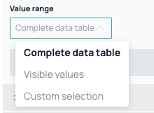
The value axis is kept comparatively simple. You can customize the value range of the axis according to your wishes by going to Set value range to the default setting Use visible values button. Here you can then specify whether the axis should be scaled once based on all the data available in the data set, whether it should only adapt to the values actually visible in the diagram or whether it should be completely user-defined (input option from - to).
Guidelines
You can set the display and style of the guides yourself. You can also set user-defined guides to emphasize certain values.
How can I prevent the value axis from changing when I use a filter in my grouped bar chart?
If you want the value axis to remain constant during user interactions with the grouped bar chart, you have to select Complete data table.
Format numbers
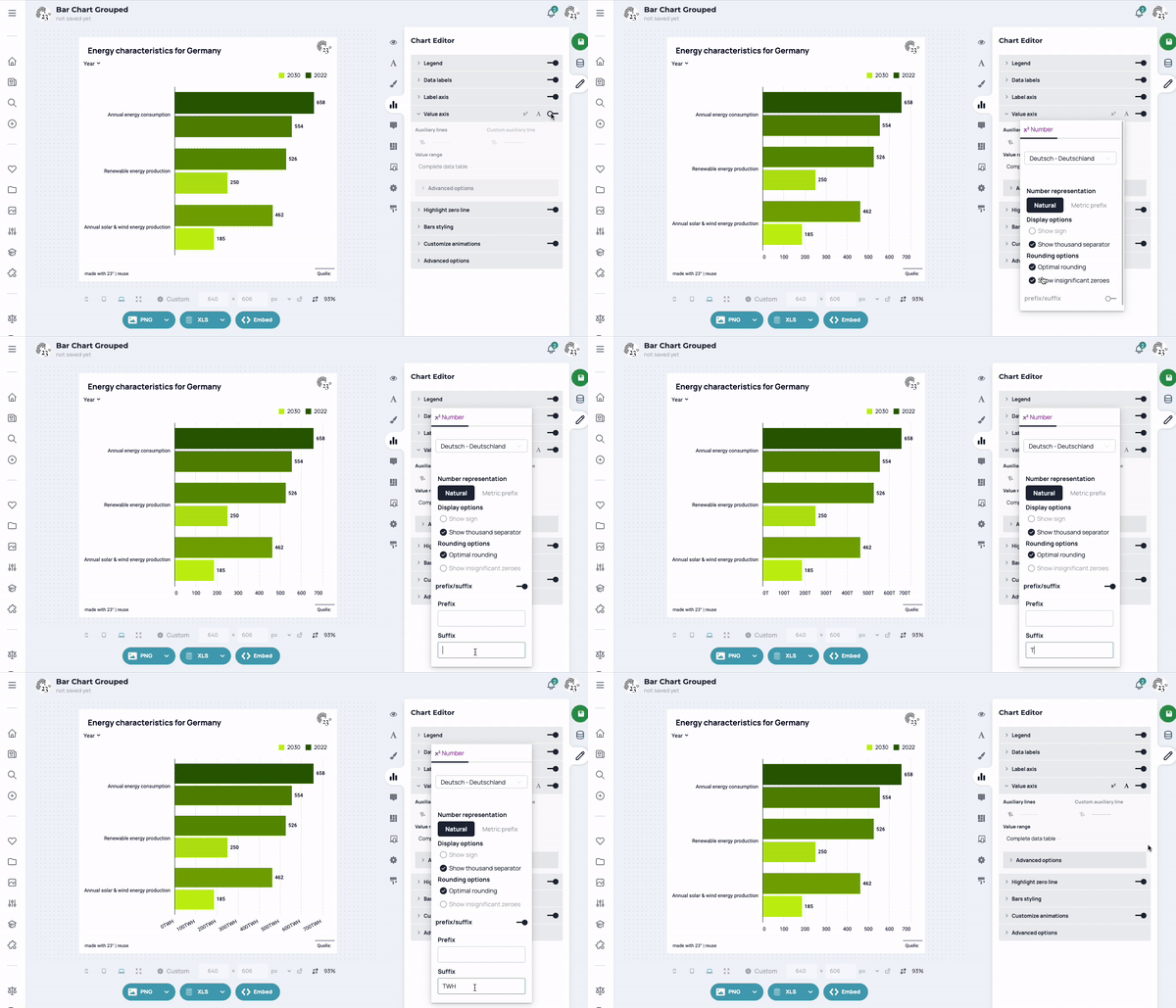
As soon as you open the menu, an x² and an A appear. Behind the x² you will find the option to format the values displayed on the value axis. It is also possible to enter additional text via suffixes and prefixes (e.g. units of measurement). Please note: you can only format the numbers if the value axis is switched on.
View preview
You can test your finished statistics in a preview before you publish them on a website.
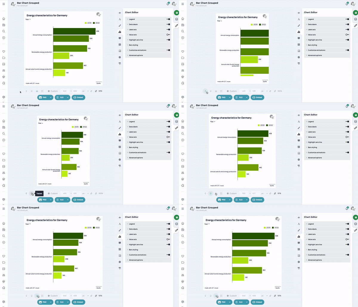
For this purpose, below a visualization there is a Size editor, which allows you to see how the statistics will look on different end devices (smartphone, tablet, desktop PC) when integrated. Behind Custom there are further size presets for a wide variety of playout paths. There is also the option of defining your own heights and widths in order to work with complete precision.
Adjust the height of an integrated statistic
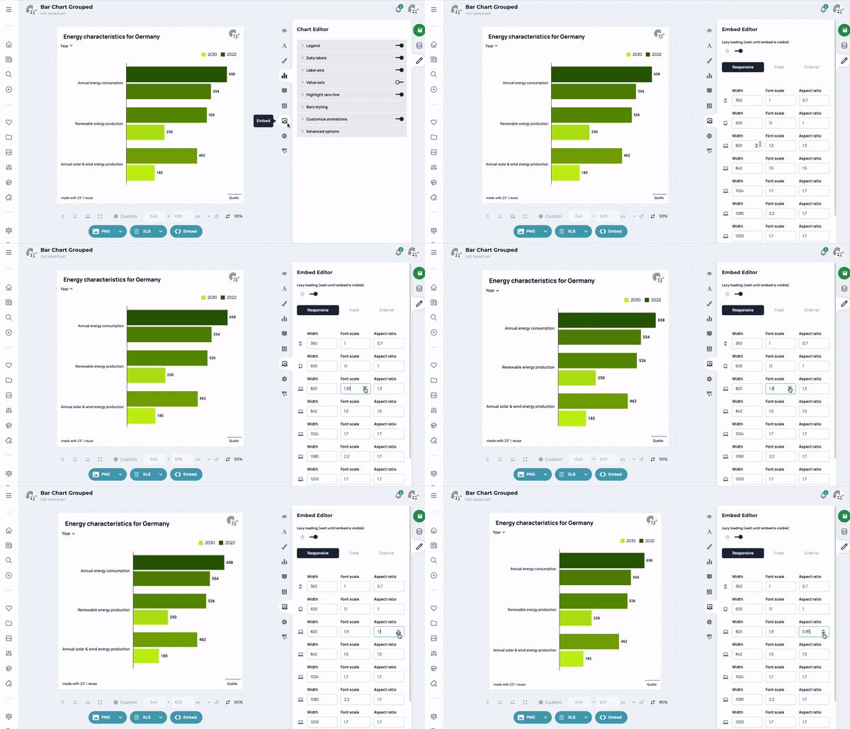
In the Statistic editor under the menu item Embed you can set how high and wide a statistic should be displayed on different end devices (smartphone, tablet, desktop PC). To do this, you can set the width from which the statistics should be displayed in a certain width-to-height ratio in the embed editor. The following generally applies:
- Aspect ratio = 1 - a statistic is as wide as it is high
- Aspect ratio is < 1 - a statistic is higher than wide
- Aspect ratio is > 1 - a statistic is wider than high
- Font scaling = 1 - the fonts in a statistic do not change
- Font scaling is < 1 - the fonts in a statistic are scaled down by this factor
- Font scaling is > 1 - the fonts in a statistic are enlarged by this factor.
You can also set the width (in px) from which the ratio (height to width) should change as desired. You can do this on the left-hand side in the Width option.
Change font scaling for statistics
In the Statistic editor under the menu item Embed, you can also set whether the font should be larger or smaller on different end devices (smartphone, tablet, desktop PC). To do this, you can use the embed editor to set the factor by which the size of the fonts in a statistic should change if it is displayed at a certain width. Basically, the following applies:
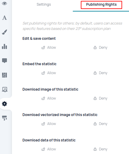
Pro and Enterprise users can offer content for further use in press releases or by sharing links to the statistics.
Behind the menu item Settings can therefore be found under Publishing rights whether or not others may simply continue to use these statistics and the underlying data.
The options for further use include embedding statistics on websites (<> Embed), downloading the statistics as PNG or JPEG, and downloading the raw data as Excel, CSV or JSON file.
Important: Below a visualization there is a size editor that allows you to see how the statistics will look on different end devices (smartphone, tablet, desktop PC) when integrated.
The size set when saving a statistic is also saved and initially preset for anyone viewing the statistic in the 23° Atlas.
Like any other graphic, grouped bar charts can be integrated into websites, exported as PNG/JPEG or the data can be downloaded in structured form as Excel, CSV or JSON.
Integrate diagram on the website
Statistics can be easily integrated into websites via iFrame. We offer different variants for this.
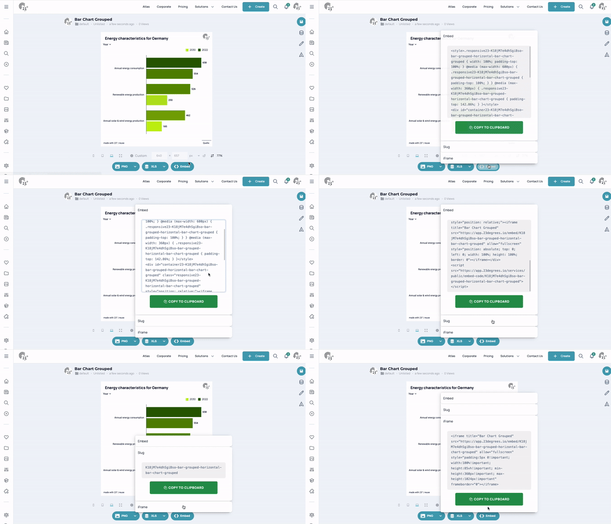
Embed Script
The embed script offers the option of integrating statistics with our height controller. This allows the breakpoints to be set directly via our application. If the breakpoints are subsequently adjusted, the embed script does not need to be replaced, as the updated settings are also applied after integration.
iFrame
The statistics can also be integrated in the classic way via iFrame. However, only fallback inline styles are supplied here. Therefore, the height controller is not supplied and the user has to take care of the correct height adjustment for different widths themselves.
Slug / API
Only the unique identifier of the statistics is displayed here. This variant is popular with users who use our Wordpress plugin or who have adapted their CMS so that only the slug is required for integration.
Wordpress Plugin
Please contact us at [email protected] to get access to our Wordpress plugin.
Download PNG/JPEG/SVG
View & set image size
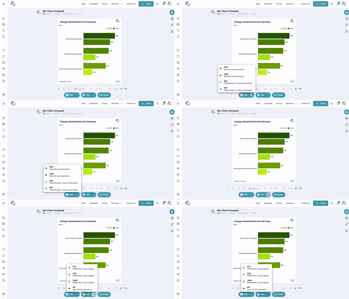
You can export a graphic/map in different sizes as PNG/JPEG/SVG/PDF.
For this purpose, there is a size editor below a visualization that allows you to see how the statistics look in different sizes (smartphone, tablet, desktop PC). Behind Custom there are further size presets for a wide variety of playout channels (social media post, presentation, etc.). It is also possible to define your own heights and widths in order to work with complete precision.
Download image
Once you have set the desired size, you can now download the graphic. Click on the arrow to access the format selection (PNG, JPEG, SVG, PDF) and simply select the desired format. Downloading graphics can sometimes take a little longer, as they are created just in time for users.
The fonts become larger or smaller when I change the image size: What can I do?
It can happen that the font size grows or shrinks with the width of the desired image format. If this is the case, you can easily set in the statistics editor under the Embed menu item whether the font should be larger or smaller in different playout widths (e.g. smartphone, tablet, desktop PC). To do this, you can set the factor by which the size of the fonts in a statistic should change in the embed editor if it is displayed in a certain width. Basically, the following applies:
- Font scaling = 1 - the fonts in a statistic do not change
- Font scaling is < 1 - the fonts in a statistic are scaled down by this factor
- Font scaling is > 1 - the fonts in a statistic are enlarged by this factor.
To prevent font scaling, simply set all values to 1.